| Image |
Comment |
| 11/02/2004 11:13:52 AM |
Open Eyesby magnetic9999Comment: Has a somewhat Steve McCurry look to it. I have no experience with people portraits so my opinions are purely personal. I think there is a little too much black cloth at the bottom of the shot and probably would have preferred that the face fill the frame a little more and had the cloth down to the first crease under the chin. the lighting looks good although there is a fairly heavy shadow from her nose. The eyes look clear and sharp and the skin tones look good too. |
 Photographer found comment helpful. Photographer found comment helpful. |
| 11/01/2004 01:01:50 PM |
Just before sunriseby tp-fcpComment: The color of the water is great and the pastel shades contrasts nicely with the grey of the rock. I like how still the water is also, the rocks under the water that look like patterns within the blue coloring, and the slight green of the rock reflection. Good sharpness too. I'm guessing the rock was attached to something, which is a shame as I think having room completely around the rock would have looked good, but I like this nevertheless. |
| Photographer found comment helpful. |
| 11/01/2004 12:55:43 PM |
Ragin' Cajunby sherComment: There is a lot of energy in this shot. The tones are good, nice isolation, a little bright on the hat but I think it blends well with the darker tones of the shot that it is not distracting at all. The diagonal line of the body is good too. A technically good shot but overall it's the energy and sense of fun and enjoyment that comes across. Good shot!
On a side note, this was my 1000th comment! |
| Photographer found comment helpful. |
| 11/01/2004 11:49:56 AM |
blue shawlby ursulaComment: I dont know much about portraits so my opinions are completely personal preference. I like that you filled the entire frame with the frame. The hair and scarf do a good job of being a natural frame. Her expression seems natural and warm and comes across as genuine. There are no distracting shadows and the lighting is soft yet warm. Her eyes seem a little soft and dark - a little editing work and I think it would really raise the level of the portrait as the eyes seem to be one of the main focal points. |
| Photographer found comment helpful. |
| 11/01/2004 11:44:58 AM |
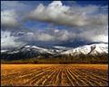
A Good Day's Workby dsidwellComment: Wonderful shot, the colors blend really well and the golden wheat stalks with the blue of the sky compliment each other nicely. The layers of field, mountains, sky also works extremely well. Very nice shot. |
| Photographer found comment helpful. |
| 11/01/2004 11:42:53 AM |
Silence of Fallby LegatoMuzicComment: Good colors and reflection. Looks almost like a painting. I would have loved to have seen a timeless person leaning over or walking across the bridge just to give it a Thomas Kinkade-like feel to it, although it's good as is. |
| Photographer found comment helpful. |
| 11/01/2004 11:18:06 AM |
There's a clown in us all.by kirtiebuComment: It looks like your subject was a little too close to the background as the texture/creases in the sheet has become part of the image. Having your subject step farther way and also separately light the background may have helped isolate it more. The closeness factor can also be seen with the shadows on the lower left and around the hair from the flash. The yellow of the flower looks either too bright or oversaturated. I know some people say it's best to have the subject look away from the camera but I think in this particular case having him look directly at the camera may have made him more engaging with the viewer, he's a clown after all and that's what they do. On a totally non-related to your image opinion - clowns are evil! |
| Photographer found comment helpful. |
| 11/01/2004 10:42:04 AM |
Amida Autumnby BigZenDragonComment: Good coloration, depth of field, composition. I like how you've established the environment for the statue. It's certainly an image I would expect to see used in travel guides or the like. It makes a great stock image, and I dont mean that in a bad way. The only thing I dislike is the grass shaft in the lower left corner and the out of focus branch near the head. |
| Photographer found comment helpful. |
| 11/01/2004 10:38:10 AM |
The Rabbits Islandby MambeComment: Good position of the horizon line, although I'd be tempted to crop out some of the sky down to the start of the clouds so the emphasis is more on the land and waves. Nice use of near, middle, far elements. The lighting seems a little harsh and as such the image falls a little flat for me. Looks like a great location, though. |
| Photographer found comment helpful. |
| 11/01/2004 10:33:20 AM |
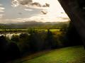
Almost Edenby mocabelaComment: There is a little too much dark areas in the image and it is also lacking a central focal point. The sky also looks blown out. Only suggestions I can make would be to shoot away from the sun in a different location. Perhaps moving more towards the lake and getting reflections instead of large clumps of dark treeline. |
| Photographer found comment helpful. |
Home -
Challenges -
Community -
League -
Photos -
Cameras -
Lenses -
Learn -
Help -
Terms of Use -
Privacy -
Top ^
DPChallenge, and website content and design, Copyright © 2001-2025 Challenging Technologies, LLC.
All digital photo copyrights belong to the photographers and may not be used without permission.
Current Server Time: 08/02/2025 01:31:24 AM EDT.