| Image |
Comment |
| 03/16/2005 12:12:04 PM |
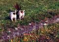
two buttiesby marxusComment: Very cute and I like the diagonal line of the water. Overall the image just seems either too sharp or has too much contrast. |
 Photographer found comment helpful. Photographer found comment helpful. |
| 03/16/2005 12:05:40 PM |
durex is a girl's best friend...by cwalmyeComment: The near/far perspective shot is good and so is the idea. The low light seems to have caused noise on the face and it is also rather red. Having a secondary light on the face may have helped, as well as using color balance in post processing to lessen the red. |
| Photographer found comment helpful. |
| 03/16/2005 11:53:24 AM |
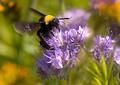
Friends for Life: Mutualistic Symbiosisby brianlhComment: Hrm, seems to be pushing it in regards to the challenge topic. Can a food source be a best friend? I'm sure some psychoanalyts or chocolate addicts say so. Completely disregarding the challenge it's not a bad shot. The mix of sharpness and motion blur on the bee is good. It's a very colorful image. The out of focus grass or plant stems on the bottom left is a little bit of a distraction. It's not a perfect shot but certainly marketable. |
| Photographer found comment helpful. |
| 03/16/2005 11:41:15 AM |
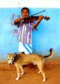
He Leads, I Followby beamsclanComment: Seems a little oversaturated, especially on the reds. Crouching down and shooting up may have given it a little more bond between the two and also the slightly different angle could possibly add some interest. Additionally it may have helped remove the white band on the top of his head, which stands out a little too much. |
| Photographer found comment helpful. |
| 03/16/2005 11:37:51 AM |
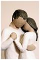
Best Friends Foreverby eostylesComment: The lighting is good and the close-up composition is also good. I'm torn between liking and disliking the color cast. On one hand it is soft and romantic and on the other it's a little too peach. The artist certainly did a good job of rendering emotion with this piece. I like it, but you'll likely find a few people who dont like photographs of art. |
| Photographer found comment helpful. |
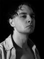
| 02/14/2005 08:11:56 PM |
grahampby grahampComment: I like the shadow/light mix and the eyes can be clearly seen. Not so sure about the center composition. You seem to be looking at something and also maybe pondering and I think having more negative space on that side would strengthen that some. The skin tone is a little too red/warm for me also. |
| Photographer found comment helpful. |
| 02/14/2005 08:07:33 PM |
Self Portrait with Flowersby banmornComment: Woo very manly! (Just kidding) The first thing that strikes me is that the edges on some of the flowers and the left side of your face look very 'sharp' almost like they've been masked to get the background black. As such they stand out, but kinda in that disjointed floating in nothing way. The seemingly separate lighting also helps with that feeling. Part of me wonders if you're involved with flowers and that's why they are there or else it's a DPC joke thing. Personally, I think overall the image would probably have had a better impact without them. |
| Photographer found comment helpful. |
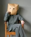
| 02/14/2005 11:37:08 AM |
Hidden During Votingby e301Comment: This is great! Not only is it funny but it's a good portrait too. The lighting is good, even with the shadows, the pose, the grey suit and walls compliment each other and the chair adds a splash of color contrast. The only thing I would have liked to have seen is a fuller shot without the legs cropped out. |
| Photographer found comment helpful. |
| 02/14/2005 11:32:22 AM |
Bring it!by nagangelComment: The one long water streak almost makes it look like you're crying. I like the shadowy light, gives it a nice broody feel and drama that compliments the harsh head pose and look. The eye is not completely 'dead' but I think I would have preferred to see it a little wider and/or with a little more light on it to show the eye more. |
| Photographer found comment helpful. |
| 02/14/2005 11:25:46 AM |
Grandma-Mother- Friend- that's meby trainComment: The lighting seems a little harsh from the left. I realise you're going for the high-key look but you have the wrap with details on the right and it disappears into the background on the left, which seems a little odd to me. The left side of your face is also a little too bright from the light also. I like the tilt coming in from the corner. |
| Photographer found comment helpful. |
Home -
Challenges -
Community -
League -
Photos -
Cameras -
Lenses -
Learn -
Help -
Terms of Use -
Privacy -
Top ^
DPChallenge, and website content and design, Copyright © 2001-2025 Challenging Technologies, LLC.
All digital photo copyrights belong to the photographers and may not be used without permission.
Current Server Time: 07/31/2025 06:20:04 PM EDT.