|
|
|
Showing 2751 - 2760 of ~3000 |
| Image |
Comment |
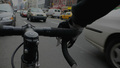
| 01/15/2006 05:31:08 PM | nyc through the eyes of a messengerby samhallComment: ::: Greetings from Critique Club :::
Hi, as requested, here is an indepth critique of your submission.
First Impression - the most important one:
I really light your take on City Life here - an insider's view. Very creative.
Composition:
Composition is quite interesting. It is very obvious we are seeing through the eyes of a messenger.
Subject:
Subject is clearly defined.
Technical (Colour, focus, and light):
Colour: Color is a bit grey. This can be good, if intentional, but I feel it may have more to do with exposure.
Focus: A little soft, but this could be from vibrations of shooting from a moving bicycle.
Exposure: Quite a bit underexposed, which is affecting color.
Lighting: This was a good concept, but it seems you may have shot at the wrong time. Lighting is really flat. Appears there was heavy cloud cover, which flattens the light quite a bit.
To grow its vote?:
I can see this as a wonderful late afternoon shot with headlights wizzing by the messenger. A burst of flash to light the bicycle and hands.
Summary:
It was a great concept and shows a lot of creativity. However, some technicals kept it from reaching its full potential. It was however a very challenging shot.
Hope to see more from you soon,
Leroy |  Photographer found comment helpful. Photographer found comment helpful. |
| 01/13/2006 07:07:30 PM | Green Sees Redby KitaComment: ::: Greetings from Critique Club :::
Hi, as requested, here is an indepth critique of your submission.
First Impression - the most important one:
This was one of my favorites in the Shapes 2 challenge. I found it vibrant and that it fit the challenge well.
Composition:
Your composition is very nice. I like its balance.
Subject:
Subject is very clear and is brought out by a use of a nice complementary background.
Technical (Colour, focus, and light):
Colour: Very vivid, very crisp.
Focus: Sharp!
Light: No blown highlights, no distracting shadows. Very well done.
To grow its vote?:
Not actually sure, how to grow the vote on this image. It's technical perfection. But, in general, photos with waterdrops help... lol... seriously, nothing really could be improved on this photo, you were just at the hands of the voters at this point.
Summary:
You've created yet another wonderful shot. Keep up the good work. You are very talented and have a good eye for photography.
Hope to see more from you soon,
Leroy | | Photographer found comment helpful. |
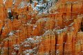
| 01/13/2006 06:59:31 PM | Hoodoosby NitinComment: ::: Greetings from Critique Club :::
Hi, as requested, here is an indepth critique of your submission.
First Impression - the most important one:
This is indeed fitting for the Challenge Shapes. Nice color and very sharp.
Composition:
I'm by no means an expert on landscape photography, but the composition is the biggest problem with this shot. There are points of interest all over the shot, but nothing to draw my eye around the shot.
Subject:
The subject is clear and fits well with the challenge.
Technical (Colour, focus, and light):
Colour : Awesome, very nice saturation. Very vivid but natural.
Focus : Is very sharp. Perhaps an even tighter crop from the original image would have brought even more detail, since we are restricted to 654 pixels.
Light is very nice. Not too harsh, not too flat. You seem to have captured this at just the right time.
To grow its vote?:
Once again, I'm not a landscape photographer. But compositional elements to draw the eye to points of interest would have added a lot to this photo.
Summary:
You've captured a nice shot here. It fit well in the challenge and got an above average vote. But, comparing it to your other works, it is not your personal best work. Landscape, in particular, is a very challenging field of photography, but you seem to have a nice grasp on it.
Hope to see more from you soon,
Leroy | | Photographer found comment helpful. |
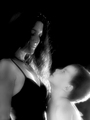
| 01/13/2006 05:34:11 PM | The Mothers Look!!by JudiComment: ::: Greetings from Critique Club :::
Hi, as requested, here is an indepth critique of your submission.
First Impression - the most important one:
My first impression is that it is too dark to feel motherly. Also, high contrast vs. diffuse glow is sort of contradictory to me.
Composition:
Composition is good. Follows rule of thirds quite well. Compositionally, you nailed this image.
Subject:
While the overall subject of your shot fits the challenge, the forementioned contrast and darkness diminishes the effect the subject has. Also, as mentioned below the outfit does not fit the idea of mother well.
Technical (Colour, focus, and light):
Colour: I like your treatment of this in B&W, if not for the high contrast I would love it.
Focus: Fairly sharp. I'm seeing a little motion blur on your child that diminnishes the focus some.
Light: A bit harsh, considering your subject. Also, we are seeing a few hot spots around the photo that draw attention.
To grow its vote?:
Soften up the lighting some, lighten up the scene. Mother tends to be a soft subject, so high contrast doesn't work so well here. If I were just seeing the photo of just you, I would consider it a nice dark portrait, but just doesn't work for this subject.
Summary:
A few lighting technicals kept this photo from reaching its full potential. COmparing it to your other work, it just doesn't stand up to your talent. Maybe you were rushed or something other distracted you, but this time you just didn't put your best foot forward.
Please, don't take my critique as harsh. You are better than this photo is all I want to really get across.
Hope to see more from you soon,
Leroy | | Photographer found comment helpful. |
| 01/12/2006 06:51:20 PM | Shaped Ignitionby MQuinnComment: First Impression - the most important one:
I rated your image an 8. It was fun and creative and I was very curious how you captured the spark.
Composition:
Composition is intersting. Perhaps moving the spark-plug to the left a little and putting it into the top right third of the image would have made it a bit stronger.
Subject:
While I found the subject fun and creative. I know what a spark-plug is and how fst they spark. Probably not a lot of voters got that.
Technical (Colour, focus, and light):
Colour is one of your strongest features of the image. Lighting is good, but I'm seeing it as slightly underexposed.
Focus is one of my problems with it. It is in sharp focus, but I'd like to see the DoF a little deeper and get some more of the sparkplug into focus.
To grow its vote?:
Do something boringly like everyone else? That is just my opinion. But, perhaps many didn't see this as fitting shape.
Summary:
While I admired your photo and gave it an 8, I think getting closer to challenge 'expectations" is the only way to get the really high scores. You should be proud of this photo. | | Photographer found comment helpful. |
| 01/12/2006 06:13:55 PM | Tired Motherby pidgeComment: ::: Critique Club :::
As requested, here is an indepth critique of your submission.
First Impression - the most important one:
My first impression of this image didn't say mother. But, you mentioned if was a shoehorn, so that's not suprising, huh? We're all guilty of feeding that addiciton.
Composition:
This says really good snapshot to me in composition. Nothing compostionally interesting, but it's a lovely pet photo.
Subject:
I pretty much summed it up in my first impression, as you did in your comments. It was a shoehorn, thus subject isn't very strong at all.
Technical (Colour, focus, and light):
Focus: Dead on. Doesn't get much sharper than this.
Light: Again, good. No distracting shadows. No blown highlights. Everything is good.
Colour: Wonderful, warm sepia treatment. Very natural feel.
To grow its vote?:
Quit feeding the addiciton. :-) We both know you are very good photographer. If you're at a loss for ideas, try some google searches, maybe you will see something you'd like to try.
Summary:
You are better than this photo. Please don't take my critique as harsh, I'm only wanting to inspire you to look beyond the family pet when you are lacking ideas. I'm looking at your other images now and you have some beautiful work.
Hope to see more from you soon,
Leroy | | Photographer found comment helpful. |
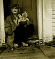
| 01/12/2006 06:02:25 PM | Once upon a timeby jmritzComment: ::: Critique Club :::
As requested, here is an indepth critique of your submission.
First Impression - the most important one:
I love this image. I found the subject very powerful and intriguing. I imagine it as an older mother that has been abandoned by her adult children. Works well for me.
Composition:
A tad off. You've used the Rule of thirs fairly well, but the image is slightly rotated CCW and I find it somewhat distracting.
Subject:
The subject, as stated in my first impression, is very strong. The baseball cap is a little unneccesary in my opinion, but not so much as to destroy the image.
Technical (Colour, focus, and light):
Focus is good as is the DoF you've chosen here. Maybe a little fill-flash in the would help the lighting, but it's not bad overall.
Colour ... I'm not real fond of the colour treatment here. It comes out a bit too green for my eye. A more natural sepia would have been a better choice for the color. B&W only may have been a lot stronger.
To grow its vote?:
More than likely, the lower votes were from the composition problem with rotation and the colour choice. Subject is obviously not the problem.
Summary:
You have a really good image here. A few technicals could have made it a very strong contender and perhaps even ribboned. Overall, this is a image in which you should take pride.
Hope to see more from you soon,
Leroy | | Photographer found comment helpful. |
| 01/12/2006 05:41:19 PM | | | Photographer found comment helpful. |
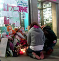
| 01/12/2006 05:36:35 PM | A City's broken heart - In Memory of Jane Crebaby Rae-AnnComment: I voted you a 10... based solely on the message. Technically it wasn't the best work, but the message was so strong I couldn't resist the 10 button. Perhaps I was a little tired of Cityscapes also when I came across your image.
If you had the focus and other technicals, I'd say you would have come very close to a ribbon with this image. Just my 2 cents and why I gave you one of 8 10's. | | Photographer found comment helpful. |
| 01/12/2006 04:13:30 PM | Mom The Taxiby TommyMoe21Comment: ***Greetings from Critique Club***
What a nice presentation you have made here for the Mother Challenge. Good job. I especially like that you chose to show Mother without using a human subject. I belive this adds for depth to the idea of motherhood.
I see from the comment you shot this in very low light. I'd say so, with f/2.8 at 1/40th even at 1600 ISO. Given these numbers, I must give you props on having a steady hand.
Focus is good, especially considering your circumstances. Although DoF may be a little shallow. I'd like to see a little more focus on mom's face... but then again... you were pretty much forced to use a wide aperature.
I love the monochromatic look of this color photo. The many shades of brown is very appealing to my eye and feels very earthy.
Compostion: I feel the compostion could have been improved with a slightly deeper DoF. Mom's face is a major element of this photo, but is a little soft. Not that it is bad. But people tend to want the foremost object to be in focus.
Since you had to shoot at f2.8 focusing on mom's face may have strengthened the composition a bit. But artistically, I see nothing wrong with the way you have it now.
Overall, I see a very nice capture here that fits the challenge well. Good work. Very well done!
Thanks for adding to the beauty on DPC,
Leroy | | Photographer found comment helpful. |
|
Showing 2751 - 2760 of ~3000 |
Home -
Challenges -
Community -
League -
Photos -
Cameras -
Lenses -
Learn -
Help -
Terms of Use -
Privacy -
Top ^
DPChallenge, and website content and design, Copyright © 2001-2025 Challenging Technologies, LLC.
All digital photo copyrights belong to the photographers and may not be used without permission.
Current Server Time: 06/20/2025 12:20:05 AM EDT.
|