| Author | Thread |
|
|
01/13/2006 07:30:42 PM |
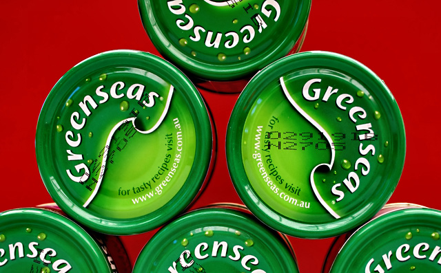
I gave this a 5. The shapes were fairly 'strong' and sat well against the red background. The 'criticism' I had was that for a 'front on' shot, there seemed to be a slight 'leaning' at the top, going 'backwards' - if that makes sense. Also the 'barcodes' detracted (took attention away from the main subject(s)) a little, but not much you could have done about that. Honestly, I didn't 'connect' with the title 'pun' (play on words) while voting, but perhaps should have - it was a good use of title. Perhaps a slight variation in lighting, trying to create more 'depth' in the shot 'somehow', plus what I mentioned about the overall 'surface' of the cans/tins being 'level' - likely have given this even more impact in my opinion. Looks like you paid attention to the direction of the 'swirls' on the cans/tins and the direction of the writing, so well done, minor details like that will always help. On a closer look, not sure if you had these 'stacked on top of each other' (if so I bet they kept falling down and you had to 'prop them up' on the sides) or if they were flat on a surface and you took this 'overhead' - either way, I think a variation in lighting and either completely 'level' surfaces, or perhaps some type of variation to make one, or two, or whatever, 'pop up' to emphasize (make it stronger) the shape(s), may also have helped give this a little extra, not sure. edit:typos
Message edited by author 2006-01-13 19:33:59. |
|
 Photographer found comment helpful. Photographer found comment helpful. |
|
|
01/13/2006 07:07:30 PM |
::: Greetings from Critique Club :::
Hi, as requested, here is an indepth critique of your submission.
First Impression - the most important one:
This was one of my favorites in the Shapes 2 challenge. I found it vibrant and that it fit the challenge well.
Composition:
Your composition is very nice. I like its balance.
Subject:
Subject is very clear and is brought out by a use of a nice complementary background.
Technical (Colour, focus, and light):
Colour: Very vivid, very crisp.
Focus: Sharp!
Light: No blown highlights, no distracting shadows. Very well done.
To grow its vote?:
Not actually sure, how to grow the vote on this image. It's technical perfection. But, in general, photos with waterdrops help... lol... seriously, nothing really could be improved on this photo, you were just at the hands of the voters at this point.
Summary:
You've created yet another wonderful shot. Keep up the good work. You are very talented and have a good eye for photography.
Hope to see more from you soon,
Leroy |
|
| Photographer found comment helpful. |
Comments Made During the Challenge  |
|
|
01/10/2006 10:16:54 PM |
|
Beautiful, crisp, colorful shot. Great job! |
|
| Photographer found comment helpful. |
|
|
01/08/2006 11:32:36 AM |
interesting appearance, i like the colors a lot but there's not so many different shapes though...
nice anyway
good luck |
|
| Photographer found comment helpful. |
|
|
01/07/2006 12:04:10 PM |
|
| Photographer found comment helpful. |
|
|
01/07/2006 10:05:36 AM |
|
| Photographer found comment helpful. |
|
|
01/07/2006 06:00:55 AM |
|
Strong colors, and strong shapes as well..... |
|
| Photographer found comment helpful. |
|
|
01/05/2006 02:14:14 PM |
|
Damn that due date...great shot! |
|
| Photographer found comment helpful. |
|
|
01/04/2006 05:54:25 PM |
|
very nice, but too christmas like |
|
| Photographer found comment helpful. |
|
|
01/04/2006 03:03:28 PM |
|
| Photographer found comment helpful. |
|
|
01/04/2006 12:53:22 PM |
|
The greens against the red background really makes this one "pop" - Good luck |
|
| Photographer found comment helpful. |
|
|
01/04/2006 11:51:38 AM |
|
| Photographer found comment helpful. |
|
|
01/04/2006 02:17:07 AM |
|
Clever title...nice shapes. |
|
| Photographer found comment helpful. |
|
|
01/04/2006 01:56:06 AM |
|
Are you advertising? lol Nice shapes within shapes... good comp.. lighting is flawless. |
|
| Photographer found comment helpful. |
Home -
Challenges -
Community -
League -
Photos -
Cameras -
Lenses -
Learn -
Help -
Terms of Use -
Privacy -
Top ^
DPChallenge, and website content and design, Copyright © 2001-2026 Challenging Technologies, LLC.
All digital photo copyrights belong to the photographers and may not be used without permission.
Current Server Time: 06/29/2026 08:49:23 AM EDT.