| Image |
Comment |
| 12/07/2007 04:16:07 PM |
me, myself and Iby GordonComment: Cool idea, different. Nice composition. The red thin on top right is taking my attention when I look at the nose somehow. A bit brighter than I would like to see. Overall, is a god photo. |
 Photographer found comment helpful. Photographer found comment helpful. |
| 12/07/2007 04:14:25 PM |
Self Portraitby jaysonmcComment: Interesting. Different point of view. Although I like those photos, I think you should of show a bit more of your face. As a "photography" piece, it's very nice, cool... but for the challenge, I think more face would do better. |
| Photographer found comment helpful. |
| 12/07/2007 04:11:06 PM |
First Snowby rmezzoComment: Simple, clean photo. Nice composition, Eyes definitely taking attention here. I think it's a nice portrait photo. Not much going on, but it would do the job :) |
| Photographer found comment helpful. |
| 12/07/2007 04:09:36 PM |
25 or 6 to 4by walrus451Comment: Simple, yet very powerful photo. nice DOF, clean sharp eyes. Very nice photo overall. |
| Photographer found comment helpful. |
| 12/07/2007 04:08:22 PM |
Au Naturelby MambeComment: Clean, nice pastel colors. Good positioning in the frame. I think overall good photo. I wonder how would it look if face had a bit more contrast! |
| Photographer found comment helpful. |
| 12/07/2007 04:06:57 PM |
Anger Managementby SJCarterComment: Intense, very good composition, clear, eyes are perfect... I can hear you from the photo, so whatever you did works. DOF nice, overall very good photo :) |
| Photographer found comment helpful. |
| 12/07/2007 04:04:03 PM |
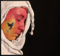
Rise From The Ashesby mistchild2008Comment: I like the composition. I like the dark area on right side. If you'd leave your face without paint, it feels like it would be better. You look like "tried very hard" to get something going. Which is good, but normal skin color with the same setup, I think I would like it better. Maybe no colors but just the black tattoo! |
| Photographer found comment helpful. |
| 12/07/2007 04:00:25 PM |
Three Times the Funby mattchristopherComment: I think good photo, but if the white areas would be little less "bright" how would it look... it looks like a movie poster, without text. Nice frame, cool photo overall. |
| Photographer found comment helpful. |
| 12/07/2007 12:36:50 PM |
|
| Photographer found comment helpful. |
| 12/07/2007 12:33:53 PM |
|
| Photographer found comment helpful. |
Home -
Challenges -
Community -
League -
Photos -
Cameras -
Lenses -
Learn -
Help -
Terms of Use -
Privacy -
Top ^
DPChallenge, and website content and design, Copyright © 2001-2025 Challenging Technologies, LLC.
All digital photo copyrights belong to the photographers and may not be used without permission.
Current Server Time: 08/15/2025 11:56:22 PM EDT.