| Image |
Comment |
| 06/30/2004 12:22:16 PM |
The Journalistby ImagineerComment: Very good choice of subject matter and I like your angle of view getting a clear shot of his face and the newspaper, as well. I find the lighting to be too harsh and I wish the print on the newspaper was more blurred so as not to be distracting...in other words, get a shallower DOF. |
 Photographer found comment helpful. Photographer found comment helpful. |
| 06/30/2004 12:07:29 PM |
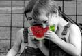
Where's the Party?by photomComment: Great baby picture! Love the look on his cute face. while the lighting appears good, it also looks as if you did it with some post process editing. I'm not particularly fond of the neckless around his neck, though. |
| Photographer found comment helpful. |
| 06/30/2004 11:51:12 AM |
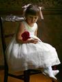
Bella Fioreby scalvertComment: I love this vey classic looking picture! Your little model is beautiful and meticulously made up. The chair and background give an antique look to the picture without being distracting, and I love the girl's gaze at the rose. Lighting is very good, but I think that a spot on the flower could bring out more detail and maybe a little less light on the floor. Other than that I love it. High mark. |
| Photographer found comment helpful. |
| 06/29/2004 02:22:49 PM |
Save a Horse, Ride a Cowboyby L1Comment: Great portrait! I like the composition and subdued colors. I do however think that the hat could have gotten more light to bring it out, and it appears that a noise reducing program was used to excess. Still, a compelling picture, imo. |
| Photographer found comment helpful. |
| 06/29/2004 02:19:16 PM |
Send in the Clownsby Prime_TimeComment: I like this version of a clown picture (the sad clown), but I think the picture is too dark on the whole. Could have used a spot for his hair and face to brighten things up. |
| Photographer found comment helpful. |
| 06/29/2004 02:16:53 PM |
Contemplationby waterliliesComment: Beautiful and captivating model, I like her pose. I do wish the lighting was better so there was more seperation between her and the background wall. I feel the wall to her right, picture left is too dark. |
| Photographer found comment helpful. |
| 06/29/2004 01:56:30 PM |
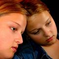
Me and Myselfby artvetComment: I like the composition and pensive look of the subject, but her skin and hair tones appear to orange/red on my monitor. |
| Photographer found comment helpful. |
| 06/28/2004 12:22:38 AM |
Summer at the Farm by L1Comment: You're getting real good, Laurie. Awesome shot! Congratulations and looks like there's many more ribbons to come in the future for you. |
| Photographer found comment helpful. |
| 06/14/2004 12:05:41 AM |
|
| Photographer found comment helpful. |
| 06/03/2004 06:13:21 AM |
Tap-inby spydrComment: Composition isn't especially compelling for me, but great detail on the ball. Would have liked this shot better with the pices of dirt removed and a cleaner pole since I find those elements in the pic distracting. |
| Photographer found comment helpful. |
Home -
Challenges -
Community -
League -
Photos -
Cameras -
Lenses -
Learn -
Help -
Terms of Use -
Privacy -
Top ^
DPChallenge, and website content and design, Copyright © 2001-2025 Challenging Technologies, LLC.
All digital photo copyrights belong to the photographers and may not be used without permission.
Current Server Time: 08/15/2025 06:19:53 PM EDT.