| Image |
Comment |
| 10/15/2004 08:35:34 PM |
Those Wide, Innocent Eyesby mocabelaComment: Funny look. Interesting subject, but it looks like you've cut his left arm off. Eyes have no catchlights to give him some spark and life and I think the lighting is a bit too harsh. If you're going to go with a high-key brightness and just black and white as the colors, I would hope that you would get more detail and better color in the skin. It appears a littel too blanched to me. |
 Photographer found comment helpful. Photographer found comment helpful. |
| 10/15/2004 08:28:46 PM |
An Officer and a Gentlemanby drydocComment: Composition and concept here is excellent. Really like it but the image could use some improvement in other areas, such as, exposure (too dark) and it looks a little soft to me. Also, skin tones appear a bit too red to me. Other than those issues, which can easily be fixed, this is a great photo! Well done on the composition. 9 |
| Photographer found comment helpful. |
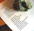
| 10/14/2004 11:46:19 PM |
Way with wordsby lytaComment: I like the composition and grainy appearance a lot but certain improvements, I feel could give it more impact. First, what's your keyboard doing in there???!!! Secondly, I would like to see more even lighting and possibly some fill light on top to illuminate the rock and top of the paper better. Wish you had photographed this on some old antique desk or something. Also, the color grain could be eliminated with a noise reduction program like Neat Image and would like to see the luminance grain left Good idea, but needs improvement. |
| Photographer found comment helpful. |
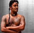
| 10/14/2004 11:19:00 PM |
Tattoosby tyt2000Comment: Very interesting subject, but I would have liked to have seen some kind of prop or setting to help me understand what he is about rather than just the non-descript and cold background. Skin tones look a bit too orangy/red. |
| Photographer found comment helpful. |
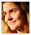
| 10/14/2004 12:27:57 PM |
Smiling eyesby arpitaComment: Nice intimate portrait and I like the close cropping, but I find the yellow color cast unattractive and the thick white and black border reduces it's impact as it suggests to me a snapshot. Also, lighting is a bit too harsh. |
| Photographer found comment helpful. |
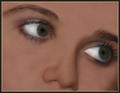
| 10/14/2004 12:24:53 PM |
Eyesby faidoiComment: I don't particularly find these eyes attractive or interesting, but find them to look weird. There is no color and both eyes lack detail. In addition, I don't like your treatment of the right eye. I can not visualize the pupil and it's got two catchlights compared with the one for the left side. I guess you could say that eyes are defining features for different people, but unless your intent was to display oddity, I don' t think you've accomplished your goal. One thing that I think could have helped is to reduce the harsh lighting in favor of more diffuse lighting. I hope this helped. |
| Photographer found comment helpful. |
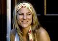
| 10/14/2004 12:10:57 PM |
|
| Photographer found comment helpful. |
| 10/14/2004 12:00:14 PM |
Mr. Mischieviousby JesuispeureComment: Looks a bit soft, but probably from subject movement. Interesting portrait subject and the vibrant colors and angles of the background support the energy of this person. Nice job. |
| Photographer found comment helpful. |
| 10/13/2004 06:54:19 AM |
Natalie's Eyes: Compassionby SandyPComment: I like the composition/close up, but find that the image is a bit too dark and there's no "pop" in the eyes. They lack catch-light. In addition, I think you've used a noise reduction program a little too stronly here. Would have preferred to see more detail in the skin. |
| Photographer found comment helpful. |
| 10/12/2004 08:33:08 PM |
her glow...by melongrindComment: Great subject, but ugly background. If you couldn't move her to a different, more appealing location, then I wish you would have blurred the background more with a narrow DOF. |
| Photographer found comment helpful. |
Home -
Challenges -
Community -
League -
Photos -
Cameras -
Lenses -
Learn -
Help -
Terms of Use -
Privacy -
Top ^
DPChallenge, and website content and design, Copyright © 2001-2025 Challenging Technologies, LLC.
All digital photo copyrights belong to the photographers and may not be used without permission.
Current Server Time: 08/14/2025 11:56:05 AM EDT.