| Image |
Comment |
| 02/01/2006 12:32:19 AM |
|
 Photographer found comment helpful. Photographer found comment helpful. |
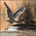
| 10/24/2005 01:23:04 AM |
dawn's early light by coolharComment: Awesome shot, Harvey, and I mean AWESOME! Congratulations and I'm sure there's more to come. |
| Photographer found comment helpful. |
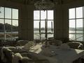
| 10/21/2005 02:35:01 PM |
Party for more than twoby HoddssonComment: I like the elegant indoors setting matched against the outdoor scene very much. However, I think the lighting could have been improved greatly. For one, I think you should have photographed at a different time of the day when the sun wasn't directly behind one of the walls and creating a glare on the water and dark shadows on the table. Maybe photographing at sunset when the sky had more color would have made it more interesting. Also, the walls and table are quite dark from those shadows created by the sun and I think either using fill flash or a slow synch flash setting where you meter on the outdoors would have shown more of the detail on the table and walls and made for a more attractive picture. Also, I think shooting at a different angle of view so that the outdoor scene showed more of the trees and grass of the marsh, like the window on the left, would have improved the shot. Finally, I think you should have removed the chairs against the windows (not the ones at the table), as they create clutter. |
| Photographer found comment helpful. |
| 10/21/2005 01:28:31 PM |
|
| Photographer found comment helpful. |
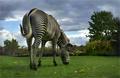
| 10/21/2005 01:16:51 PM |
Stripedby Joey LawrenceComment: Great capture and angle of view! It really shows off your subject well, including the zebra's pose. I'll bet that you will have some people stating the background is distracting and that you should have used a more narrow DOF to isolate your subject. I probably would have agreed with that assessment if the composition was not as good as it is...very well balanced and simple. Outstanding work. 10 |
| Photographer found comment helpful. |
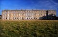
| 10/21/2005 11:59:53 AM |
Petworth Houseby marboComment: Dark shadow on the side of the building is distracting and the image appears a bit underexposed. Nice color of the sky, but I find the subject matter and the large amount of grass included in the foreground to be uninspirational. |
| Photographer found comment helpful. |
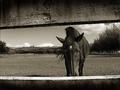
| 10/21/2005 11:54:20 AM |
Steedby anthonyczajaComment: Like the image very much, especially its tonality, texture of the fence and it's use for framing, as well as, inclusion of the environs. I do, however, think it would have been better to not cut off the horse's nose and I wish the background sky was more interesting. |
| Photographer found comment helpful. |
| 10/21/2005 11:47:29 AM |
|
| Photographer found comment helpful. |
| 10/21/2005 11:38:25 AM |
|
| Photographer found comment helpful. |
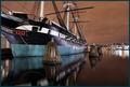
| 10/21/2005 02:32:10 AM |
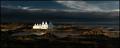
Calm Groundsby TUBORGComment: Beautiful dramatic shot. The building is just on the threshold of being blown out but not quite. Love the lighting. Excellent work. |
| Photographer found comment helpful. |
Home -
Challenges -
Community -
League -
Photos -
Cameras -
Lenses -
Learn -
Help -
Terms of Use -
Privacy -
Top ^
DPChallenge, and website content and design, Copyright © 2001-2025 Challenging Technologies, LLC.
All digital photo copyrights belong to the photographers and may not be used without permission.
Current Server Time: 08/13/2025 02:08:24 AM EDT.