| Image |
Comment |
| 06/24/2005 12:52:32 PM |
eyes of fireby focus57Comment: Unique concept challenging the viewer to carefully consider exactly what the fantasy is. Generally the colors are good and the firey eyes are the strength of the composition. This image has no hot spots that hurt the composition.
Meets the challenge but some voters probably will not think it all that exciting. Who cares about them, anyway? :)
A few technical things...
The mask is slightly off center and tilted downward on the right side. The human eye wants subconciously to correct for those things and even if the viewer does not conciously recognize it they will be bothered. It is more pleasing to the viewer if the mask is absolutely centered and the frame rotated slightly counterclockwise for leveling.
The chin is right at the bottom on the frame. You might consider raising it in the frame so the chin is not so close to the edge. You might consider recomposing for the rule of thirds for added visual interest.
The color of the eyes unnaturally bleeds over onto the rest of the mask. This may be purposeful for effect but most viewers will probably interpret this as an image defect. You can easily clone around the edge of the eyes to remove edge effect and that might even make the eyes seem more intense after the edge distraction is removed.
The biggest issue is with contrast. If you apply a simple autocontrast adjustment you will see a vast improvement that adds considerable "pop" to the composition. It could, however, result in lost detail so you may want to experiment with various techniques to improve the contrast without significant loss of detail. |
 Photographer found comment helpful. Photographer found comment helpful. |
| 06/24/2005 12:14:43 PM |
Botby cabaComment: Interesting surrealistic image. Reasonable high technical quality. Colors and framing done well.
Image meets the challenge well and engages the viewer to think about what it might be. It has the general shape of the alien spacecraft in the old movie version of War of the Worlds.
On the technical side the image has two noticable hot spots. One is on the left tip of the 'craft' and the other near the joint in the left 'arm'. They are slight distractions in the composition.
It is slightly low in contrast. You can tell because a simple autocontrast increases the contrast. Increasing contrast will make the image pop more and have greater eye impact. This one, however, is very challenging. There is a lot of fine detail in the light shadow that you don't want to lose which easily gets lost in a levels, curves, selective color or even just a strait black point adjustment. That further blows out the two hot spots. You might try an increase of about +4-5% in black with a selective color adjustment. This will effectively increase contrast without making the hot spots bigger. Then apply dodge and burn to bring out shadow detail in the interesting areas and tone down the two hot spots.
All in all this is one of the top images in the challenge and should place very high, perhaps in the ribbons. |
| Photographer found comment helpful. |
| 06/23/2005 06:32:52 PM |
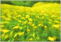
In The Land of the Fairiesby shutterphunkComment: You have successfully created a fantasy world with color and soft image processing. Green and yellow together are very appealing to the eye. This is a tranquil image that will have strong appeal to some viewers.
Some viewers may wonder what the objects at the top right side of the frame are and may even think they are distractions. |
| Photographer found comment helpful. |
| 06/23/2005 06:29:43 PM |
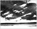
The Ninth Planetby CutterComment: A good try at a fantasy world. The people add perspective to the grandeur of the scene.
Most of the lower frame and snow is overexposed. This will be a distraction for most viewers. The rocks have a granular appearance that will be interpreted as a poorer quality image. It is very difficult to get fine detail like that to be focused properly. |
| Photographer found comment helpful. |
| 06/23/2005 06:25:51 PM |
?by kcumanComment: A fascinating and good composition. Nice the way you have the bottom stem go to the lower right corner. B&W is a great choice for this picture. General image quality is good but not great. It has a few digital 'jaggies' along some edges. |
| Photographer found comment helpful. |
| 06/23/2005 06:23:02 PM |
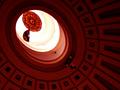
The Oculusby RikkiComment: A good idea that gets within the concept of a fantasy world.
Compositionally it might be a little better if you included the full oval that is cut off at the bottom center of the frame. This is a very hard image to get the exposure correct because it is several stops brighter in the center than the rest of the frame. That will be distracting for some viewers.
The darker reddish inside may look artificially colored and cause it to get a lower score. You might try making the orangish color brighter or more shimmering. |
| Photographer found comment helpful. |
| 06/23/2005 06:16:52 PM |
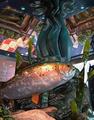
Atlantisby U622Comment: Decent color, detail and image quality. Composition is OK. Good subject for the challenge.
On the technical side the contrast is just a little weak and a simple autocontrast will add pop to the image. You might consider a color adjustment to add about 10-15% saturation to yellow, red and light blue for added viewer interest. A small amount of dodge and burn would give the image more texture. |
| Photographer found comment helpful. |
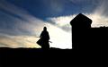
| 06/23/2005 05:56:11 PM |
Enter the 36 Chambersby justinbrookComment: Nice silhouette and medieval concept. Clouds give the sky definition.
The overexposed area at the center of the image is a major distraction that will hurt this image in voting. There is some digital 'jaggies' along the horizon edge that should be cloned out to make a nice stark black edge. You might consider some dodge and burn to add more texture and interest to the clouds. |
| Photographer found comment helpful. |
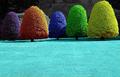
| 06/23/2005 05:52:26 PM |
Gum Dropsby CEJComment: Great attempt for this challenge. The fine detail clarity in it is FANTASTIC and the similar trees are good choices for your experiment. The grey background is a great idea.
It will be interesting to see how viewrers react to it, but if left to just technical quality then this image should place very high.
On the technical side the bottom left of the center blue tree looks like it migh flow over the true boundary and the amount of foreground grass may be little more than the composition needs.
Like this image a lot. |
| Photographer found comment helpful. |
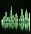
| 06/23/2005 05:42:44 PM |
The Emerald Cityby wetlandComment: An interesting concept. Particularly intersting is that it consists of recognizable structs from different cities. Including the reflection is good.
Looks like a black dropcloth or electronic noise is visible in the black background. This should be corrected to be solid black or made twinfling green or something.
The general image quality is weak and that will affect it in voting. |
| Photographer found comment helpful. |
Home -
Challenges -
Community -
League -
Photos -
Cameras -
Lenses -
Learn -
Help -
Terms of Use -
Privacy -
Top ^
DPChallenge, and website content and design, Copyright © 2001-2025 Challenging Technologies, LLC.
All digital photo copyrights belong to the photographers and may not be used without permission.
Current Server Time: 08/18/2025 08:03:28 AM EDT.