| Image |
Comment |
| 02/03/2005 09:26:23 AM |
Impressions of Whiteby dartompkinsComment: Overall a really nice image. B&W is a good choice for this picture. The bright area on the upper right side along the right border in the background is a slight distraction to the beautifully setup rose. I might have cloned that out to black. |
 Photographer found comment helpful. Photographer found comment helpful. |
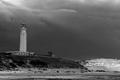
| 02/03/2005 09:07:39 AM |
Light on the Lighthouse at Cape Trafalgarby AranchaComment: Nice try, good image. Looks like you did something that I do, process the sky separate from the rest of the image as a way to bring out detail. That part worked but, like me, you need to work on the transition boundary. Something I do is re-select the sky then clone out the boundary transition, like is most apparent on the right side of the image along the horizon line. Sometimes I might need to expand or contract the selection by a pixel or two to setup for cloning. If the sky is in a separate layer then you will have to flatten the affected layers first. |
| Photographer found comment helpful. |
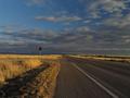
| 02/02/2005 05:11:20 PM |
Lonely Signby supradaComment: Concept is good. Lighting is right is intersting to. Getting closer to the sign, but still having it all (including the pole) in the frame might work better. It would be particularly good with the high grass right next to the pole. Sharpness and noise reduction would improve the final image. |
| Photographer found comment helpful. |
| 02/02/2005 05:08:23 PM |
Coincidental Intersectionby 4scoreComment: Like the connection, but not the execution of this image. Colors are on the dull side and the focus is not sharp. Re-Positioning to the rule of thirds would add interest to the image. |
| Photographer found comment helpful. |
| 02/02/2005 05:06:05 PM |
|
| Photographer found comment helpful. |
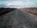
| 02/02/2005 05:04:39 PM |
Where Are The Signs?by Lone_WolfComment: looks like an ancient Roman highway. Curious concept for this challenge, but the thing that hurts this image most is its overall poor quality. That may have been intentional but it did not work. |
| Photographer found comment helpful. |
| 02/02/2005 05:01:25 PM |
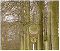
Elm Revisisted from 1st challengeby nruterComment: The composition is excellent, but the general quality of the image is not very good. The signs and other lines suffer digitalization and haloing and hash marks and the color seems to clipped, perhaps due to post processing. |
| Photographer found comment helpful. |
| 02/02/2005 04:55:34 PM |
Weather Neglectedby nordicgirlComment: The idea for this image is OK, but the execution is not so good. It looks as though it has had Neatimage applied poorly and that it is oversharpened. Both combine making the image poor quality. Positioning the main subject (the sign) in one of the rule of thirds intersection points would improve the composition. |
| Photographer found comment helpful. |
| 02/02/2005 04:51:26 PM |
|
| Photographer found comment helpful. |
| 02/02/2005 04:49:41 PM |
|
| Photographer found comment helpful. |
Home -
Challenges -
Community -
League -
Photos -
Cameras -
Lenses -
Learn -
Help -
Terms of Use -
Privacy -
Top ^
DPChallenge, and website content and design, Copyright © 2001-2025 Challenging Technologies, LLC.
All digital photo copyrights belong to the photographers and may not be used without permission.
Current Server Time: 08/22/2025 06:33:47 AM EDT.