| Image |
Comment |
| 06/21/2005 09:28:12 AM |
Urban Ampby er0kComment: Good attempt to add interest to the composition though use of perspective. This urban study peaks the interst of the viewer. The harsh lighting on the building is the strength of the composition. General photographic quality is OK.
Generally speaking the two overexposed areas where the lamps are would be a photographic error but appear to support the nature of this particular composition. That will work for some viewers but not for others. Some viewers will have difficulty finding something in the composition they care much about or can relate to and will vote it lower because of it. |
 Photographer found comment helpful. Photographer found comment helpful. |
| 06/21/2005 09:04:48 AM |
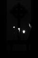
Contemplativeby charliebakerComment: Outstanding clarity. Good tonal range. B&W is a good choice of presentation. You are to be commended for including very, very faint detail. Interesting way to convey the idea of darkness.
The outstanding photographic quality is the strength of your image. Most viewers will understand it fits the challenge, but there will be a few that do not.
The rightmost candle is a little overexposed which will hold down your score slightly.
Overall this is an outstanding image that should score decently if studied closely by viewers. Message edited by author 2005-06-22 15:30:21. |
| Photographer found comment helpful. |
| 06/21/2005 08:54:01 AM |
And in the dark she dancedby GoldBerryComment: Unique coloring, action pose and good use of the rule of thirds. Different interpretation of the challenge topic. Overall photographic quality is good.
Your presentation very interesting. The use of blur to convey the sense of action by your model is a very interesting idea that wil work for some viewers but not for others. |
| Photographer found comment helpful. |
| 06/21/2005 04:16:47 AM |
Sensing Youby datcatComment: Interesting and creative idea for this challenge. Color is OK and clarity of the open eyes is good. Generally decent photo quality.
You will be rewarded by viewers for a creative idea but to what degree is to be seen.
On the technical side there is a bright patch of light on the upper right side that will act as a distraction to the average viewer. It probably should be removed. Viewers will be curious to know what the jagged edge around the eyes is and why it was set up that way but the image itself does not provide an answer.
You might score higher if the eyes occupied a physically larger area of the frame. |
| Photographer found comment helpful. |
| 06/21/2005 04:09:48 AM |
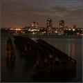
Darkness Fallsby howardjComment: Nice evening cityscape that conveys a concept of darkness well. Good clarity, composition and the horizon is level.
The image is slightly low contrast and you can give it a little more visual appeal by setting a true black point or by using selective color to make blacks just a little balcker. It will loose some detail but will have better contrast as a payoff.
You might consider color processing to bring out brighter and more eye catching color in the sky at the top of the frame.
Overall this is a nice image. |
| Photographer found comment helpful. |
| 06/21/2005 03:58:02 AM |
SandSeaStarsby pollComment: Curious photograph.Apears focused for the stars at the infinity position. What is surprising is that you could capture anything at all. The stars are best focused but it seems like you would have to have the shutter open so long that the waves would be completely blurred out.
The idea for this image seems solid but it will score poorly primarily because of poor focus of the foreground elements of ocean and sand. It almost looks hand held. If this is the case then using a tripod would be recommended. You will need a longer exposure time and a narrower aperature in order to get everything clear in this image. That will likely result in the ocean being blurry because of wave action motion during the time the shutter is open, but that might turn out to be a neat effect. |
| Photographer found comment helpful. |
| 06/21/2005 03:38:19 AM |
Fireworksby photogenixComment: Good colors and nice black background. Captured at an optimum time. Lighting and exposure good. Composition fine. |
| Photographer found comment helpful. |
| 06/20/2005 09:17:55 PM |
Another Dark & Lonely Storm for Mr. Sharkyby mihaibadicComment: Hmmmmmmmmmmmm...
Perhaps it is the snapshot-like perspective... perhaps it is the large amount of noise in it... perhaps it is the weak tonal quality and/or overexposed surface on the right... perhaps it is the concept itself... but if you combine all of that it is hard to imagine reviewer's giving this image a very good score. Sorry. If it means anything to you, I gave it a 10. |
| Photographer found comment helpful. |
| 06/20/2005 09:13:18 PM |
Stargazingby timluComment: Good way to convey a pleasant dark activity. The image is great as long as viewers don't notice the sky is overcast. LOL The perspective is good and the blue tones in the sky touch off the composition nicely. The silhouette works well to.
On the technical side there is a lot of noise in the sky and you should consider applying some noise reduction to get rid of it.You have no control over the white specks in the sky but they are still distractions just the same that will affect your score.
Outside the noise this image should do well in scoring. |
| Photographer found comment helpful. |
| 06/20/2005 08:15:03 PM |
Noirby nico_blueComment: A very haunting image. Making the eyes black holes is a stroke of genius. The tonal range is good and technical quality and composition itself of the image fine.
The are some minor technical issues that will affect this image's score.
There are a number of tiny white specks that are distracting to the viewer.
The fingers closest to the camera are out of focus and orovide a minor distraction as well. That may have been intentional but will not appear that way to viewers.
Lastly, the transition areas from dark to shadow on the left side of the image looks unnatural. But that is probably a necessary artifact of your post processing.
Overall this is a very fine image that should score in the upper tier of the challenge. |
| Photographer found comment helpful. |
Home -
Challenges -
Community -
League -
Photos -
Cameras -
Lenses -
Learn -
Help -
Terms of Use -
Privacy -
Top ^
DPChallenge, and website content and design, Copyright © 2001-2025 Challenging Technologies, LLC.
All digital photo copyrights belong to the photographers and may not be used without permission.
Current Server Time: 08/18/2025 08:04:17 AM EDT.