| Image |
Comment |
| 06/23/2005 05:38:54 PM |
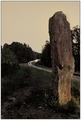
Messages from space maybe?by BoltiComment: Good attempt at a fantasy world with the times exposure headlight trail and low-saturation colors. Use of the rule of thirds adds interest. Looks like a juxtaposition of old and new. The lighting at the bottom of the monument is curiously interesting.
Telephone poles and wires generally are distracting items. The should probably be removed from this compostion. They destroy the illusion of a fantasy world. The composition would be stronger if there were something in the lower left. The white spot over on that side is distracting. |
 Photographer found comment helpful. Photographer found comment helpful. |
| 06/23/2005 05:24:22 PM |
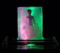
Cryonics perfectedby BeetleComment: Curious composition with interesting colors and a good solid black background. Good concept!
Some viewers may find the use of a doll unrealistic. I know, sounds dumb in a fantasy challenge but people often expect the illusion of reality in their fantasies. I always do with my fantasies about women. :)
It is hard to tell exactly what the glass support is and it does not add lots to the composition. You might consider cropping it down so the the whole support is not included in the composition.
The focus is a little soft and will be interpreted as indicating a lower quality image. |
| Photographer found comment helpful. |
| 06/23/2005 05:16:18 PM |
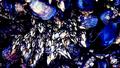
Fasicleby CaltropComment: A fairly nice abstract composition of ocean muscles. A nifty idea! Your title fits the clustered group creatively well though it usually refers to flower groupings.
Some viewers will find the out of focus muscles at the top of the frame are distracting. They may also feel the colors are artificially manipulated and give lower scores.
The focus is on the soft side and detail mottled and the central focal point does not have lots to offer. |
| Photographer found comment helpful. |
| 06/23/2005 05:05:00 PM |
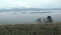
Hidden valleyby tasha4pawsComment: The fog with the wind generators is the main strength of the image and the connection to the challenge theme. Most voters will make the connection. The trees silhouetted against the fog is also super nice.
Most of the really interesting elements are tiny in the frame. Zooming in or cropping out a lot of the image would make the composition stronger. You could crop from just below the fence posts to the left of the trees upward and righ to just above the dark bank of clouds. This will include everything interesting and get rid of the rest that is repetative and less intersting. You might consider making this B&W. |
| Photographer found comment helpful. |
| 06/23/2005 04:58:01 PM |
A plain looking ad for an iPod? ONLY in a fantasy world!by thewritersideComment: An excellent stock photo image. Very clean and the lighting is outstanding without any overexposed areas. The iPod looks surrealistic.
Some viewers will feel this image does not fit the challenge topic and will vote it lower.
Technically there is little wrong with it. It does seem a little unbalanced with darkening between the left and right side of the image but that may be just individual taste. If the middle left side were darked about 15-20% more than it be balanced better with the right side.
Good picture. |
| Photographer found comment helpful. |
| 06/23/2005 04:52:03 PM |
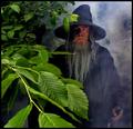
Journey Through Middle-earthby Joey LawrenceComment: Color, lighting and framing are excellent without excessive noise.
This natural looking image fits the challenge perfectly in a way most all voters can recognize. The Gandolf character is outstanding and the misty look a nice touch. That coupled with its high technical quality will likely put this in the ribbons with the blue possible.
On a technical note a few things can be said.
There is some minor haloing around the main characters garments near the top that can be removed.
The nearest leaves are out of focus. It could be validly argued it is that way on purpose to convey the sense of a journey through middle earth but most viewers will probably find that slightly distracting. That is generally true of most foreground elements that occupy a prominent position in a composition.
The image is lower contrast. Even a simple autocontrast adjustment will add considerable "pop" to an already amazing image. Again it might be said low contrast is purposeful to retain greater image detail and a sense of the mystical but most viewrs would likely think the added "pop" outweighs the other items.
If this image fails to get the blue ribbon it is likely because of the contrast.
A super photograph! Kudos to you for a great shot! Message edited by author 2005-06-27 03:20:32. |
| Photographer found comment helpful. |
| 06/23/2005 11:44:16 AM |
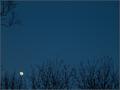
Rising Moonby LadeeMComment: From a technical standpoint this image is one of your best. What is great about it is that the moon is properly exposed with respect to the rest of the image and the fine detail shows up nicely.
Though you don't like them, the trees add considerable interest to the composition. The branch in the upper right isn't really a distraction so much as it makes the image seem unbalanced without a similar branch on the upper right side. It is debatable whether or not the tiny branches should touch the moon or not. Usually it is a little more eye appealing if they do not.
The sky color is a dull blue resulting from use of curves to bring out that great lunar detail. You could apply color painting on a 50% greyscale layer to bring out a deeper, darker blue that would make the moon stand out spectacularly and look great. It would also help mask the slight haloing around the branch detail. The sky is noisy and needs noise reduction applied. |
| Photographer found comment helpful. |
| 06/22/2005 02:10:38 AM |
Grok the Darkby MickComment: Mick... congrats on another great shot!
I get so homesick for Oregon I can't stand it sometimes when I see your guys' work. My son, Orion, is going to school at OSHU (Oregon Health Sciences University) right now and I'd sure like to get back up that way again. If I get there I want to go on a photo safari with you guys. Your planned Silver Creek Falls trip is only 26 miles from where I grew up so I am really jealous about that! :) |
| Photographer found comment helpful. |
| 06/21/2005 12:15:19 PM |
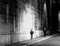
Night walkby pmottaComment: What a fascinating composition! It is higher contrast yet still retains decent mid-tones. It has a full range of tonality. Capturing the girl in the center of the overexposed wall space is a stroke of genius. The use of motion blur is terrific.
This image provides the viewer with so many things to think about that it is doubtful all of them could be identified.
There are not enough superlatives to describe this image. Kudos to you for an incredible photograph! |
| Photographer found comment helpful. |
| 06/21/2005 12:06:33 PM |
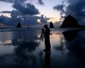
One last chance to play before bedtimeby scalvertComment: Playing in the dark is a worthy concept for this challenge topic. You have chosen a unique and intersting way to present it to viewers. The general quality of the photograph is good. The main lights are not overexposed and the background black is solid. You've done a good job.
Some viewers may not like that your model's face is not completely visible and will score it lower. They want to see the boy's eyes while he plays.
|
| Photographer found comment helpful. |
Home -
Challenges -
Community -
League -
Photos -
Cameras -
Lenses -
Learn -
Help -
Terms of Use -
Privacy -
Top ^
DPChallenge, and website content and design, Copyright © 2001-2025 Challenging Technologies, LLC.
All digital photo copyrights belong to the photographers and may not be used without permission.
Current Server Time: 08/18/2025 06:17:43 AM EDT.