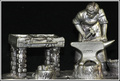
Blacksmith in Cu Sn & Sb {pewter}by
TerComment: Greetings from the Critique Club Terrence!
First Impression: Decent photo, but doesn't strike me as anything special.
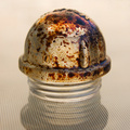
Composition: Decent composition. The crop is too tight for me. I would have liked to have seen a little more black around the edge of the subject. It feels very tight near the top of his head and the right side of the anvil. The lighting is also a tad harsh from the flash. If you would have a constant light source from the left side of the object, it would have caste shadows and would have given the photo a different feel. The subject is also too close to the backdrop because I can see its texture on the lower part of the photo. There is also four white spots on the backdrop that are distracting.
Subject: The subject is very interesting, but I don't know if the material it is made of represents the periodic table of elements. The blacksmith himself on the other hand does represent the periodic table. When I think of a blacksmith, I think of working with iron. I like how the subject has a lot of texture its self. Like Trollman said, it would have been better if it was a real blacksmith, but since they are hard to find, I can't fault you for that.
Creativity: This photo does not show a whole lot of creativity because it is a photo of an object that is already artistic.
Improvements: Loosen the crop, experiment with different lighting and move the subject away from the back drop. You could use a polarizing filter to reduce some of the reflections.
My Thoughts: If you try using the improvements I have listed, the photo would be more appealing to me. It would also be a very good B&W photo. You said in your comments that you made this piece. If so, I am very impressed with your metalworking skills.
Overall, I scored this photo a 6, which is above average in my book. If you have any questions please PM me. I hope my critique has been help and informative in some way.
Cheers,
Ron