| Image |
Comment |
| 01/27/2003 11:03:12 PM |
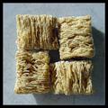
The Adult Sideby jimmythefishComment: I was torn between these and triscuits, then scrapped both ideas for something else. My only nit here is the lighting. I like the sidelighitng to bring out the texture in the mini-wheats, but don't like the hard shadow at R. Maybe a reflector to fill it a little would be better. Nice work. |
 Photographer found comment helpful. Photographer found comment helpful. |
| 01/27/2003 10:59:49 PM |
SkyLight ^ 2 by myqylComment: Maybe at another time of day, when the interior/exterior exposure could be better balanced? It's a shame to have all those lines leading to almost nothing. The walls do give a great dimensionality to the image, and I love the light on them. |
| Photographer found comment helpful. |
| 01/27/2003 10:57:01 PM |
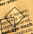
-e> n square;by kiwinessComment: Don't care for the composition, but maybe I just don't get it. Why cram everything into the LLHC like that? Actually, not wild about the squares there, either. Still, something appealing here. Nice work? |
| Photographer found comment helpful. |
| 01/24/2003 10:06:27 PM |
|
| Photographer found comment helpful. |
| 01/24/2003 09:59:44 PM |
|
| Photographer found comment helpful. |
| 01/24/2003 09:56:31 PM |
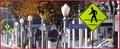
Slight Turn Aheadby xertionComment: Nice color and clarity. Possibly better with the diagonal of the hill not directly behind the sign. |
| Photographer found comment helpful. |
| 01/24/2003 09:33:25 PM |
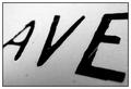
Avenueby mciComment: Tasty. This is the image that's sticking in my mind in this competition. Great approach to the challenge. One nit: since you don't have any pure white in the image, I'd avoid a white border. All black would look better. |
| Photographer found comment helpful. |
| 01/24/2003 09:22:35 PM |
Loading Onlyby GotchaComment: Wow. I'm not sure how you got this effect, but it's fantastic. Incredible tones, and I love all that yellow. My only nit is the upper right hand corner, where things fall apart a little. Very fine. |
| Photographer found comment helpful. |
| 01/24/2003 09:18:28 PM |
|
| Photographer found comment helpful. |
| 01/24/2003 09:15:48 PM |
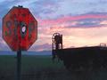
Drew's Stop Sign Revisited by autoolComment: Brilliant work. You've balanced the exposure between the sign and the sky perfectly, and the wheel on the flatcar is a nice counterpoint to the sign. I generally dislike square crops, but I think this would be even better with the R side cropped away. |
| Photographer found comment helpful. |
Home -
Challenges -
Community -
League -
Photos -
Cameras -
Lenses -
Learn -
Help -
Terms of Use -
Privacy -
Top ^
DPChallenge, and website content and design, Copyright © 2001-2025 Challenging Technologies, LLC.
All digital photo copyrights belong to the photographers and may not be used without permission.
Current Server Time: 07/31/2025 09:28:52 AM EDT.