| Image |
Comment |
| 01/30/2003 12:11:26 AM |
Las Vegas Checkersby keoneComment: One of the best photographic rules I've learned is that, every time you're tempted to use the camera's built-in flash, you have to pinch youself somewhere painful as hard as you can for as long as you can stand it. Pretty soon, you stop being tempted. Nothing screams 'snapshot' so shrilly as the combination of overexposed highlights and background falloff produced by these (damned) things. They're okay for taking a picture of the product of a fender-bender, but if you want to make a pleasing image you're much better off using a tripod (or even just bracing against something and taking a deep breath, releasing the shutter while exhaling) and natural light. |
 Photographer found comment helpful. Photographer found comment helpful. |
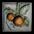
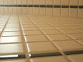
| 01/30/2003 12:05:15 AM |
Stone Orangesby zadoreComment: This is pretty good photography, although I personally would have opted for a more diffused light source rather than those hard shadows. My gripe here is that, unless you made this tile, the image falls into the dreaded category of OPA (other people's art). To make an image of OPA that's worthwhile, as opposed to holding up a photocopier to it, it's necessary to present it in such a way that the image adds something to the original work. A unique perspective, maybe, or a composition which shows the piece's relationship to its surroundings. |
| Photographer found comment helpful. |
| 01/30/2003 12:00:40 AM |
Let Your Fingers Do The Walking...by dougmc1Comment: so tiny... the diagonal composition and choice of B/W work here, but the dark tones could use some reinforcement and a more interesting light source than onboard flash is in order. |
| Photographer found comment helpful. |
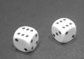
| 01/29/2003 11:58:33 PM |
luckythrowby desmckechnieComment: If I were you, I'd take that overexposure on the tops of the dice and run with it. If you've got software with the capability, adjust the left side of the levels slider to make the tabletop and the markings on the dice almost pure black. Otherwise, just jack up the contrast. It won't overcome the soft foucs or less-than-spectacular subject, but it will pull what pop there is out of the image you have. |
| Photographer found comment helpful. |
| 01/28/2003 12:39:00 PM |
|
| Photographer found comment helpful. |
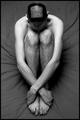
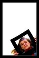
| 01/28/2003 12:30:06 PM |
Square competition gone to my head.by SharQComment: Bonus points for dedication. Great tones and light. I know getting the camera up higher would have been difficult, but it would have allowed you to put more compositional emphasis on the head. Very fine. |
| Photographer found comment helpful. |
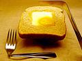
| 01/28/2003 12:16:38 PM |
Square Mealby BullwinkleComment: Interesting image. What strikes me immediately is the way the toast is levitating above the tablecloth, reinforced by the position of the knife. Is there a reason for this? It's attention getting, but a little unclear w/r/t intent. Some white balance and sharpness issues, but good work. |
| Photographer found comment helpful. |
| 01/27/2003 11:16:12 PM |
|
| Photographer found comment helpful. |
| 01/27/2003 11:14:50 PM |
|
| Photographer found comment helpful. |
| 01/27/2003 11:05:03 PM |
|
| Photographer found comment helpful. |
Home -
Challenges -
Community -
League -
Photos -
Cameras -
Lenses -
Learn -
Help -
Terms of Use -
Privacy -
Top ^
DPChallenge, and website content and design, Copyright © 2001-2025 Challenging Technologies, LLC.
All digital photo copyrights belong to the photographers and may not be used without permission.
Current Server Time: 07/31/2025 09:28:32 AM EDT.