| Image |
Comment |
| 03/20/2007 08:01:16 AM |
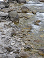
Rocks Day 3by emily212Comment: a quite nice shot. could do with one stop underexposure to bring out the tones some more. |
 Photographer found comment helpful. Photographer found comment helpful. |
| 03/20/2007 07:59:33 AM |
|
| Photographer found comment helpful. |
| 03/20/2007 07:59:00 AM |
|
| Photographer found comment helpful. |
| 03/19/2007 05:42:50 PM |
Rescripting Nightmaresby PedroComment: peter, wonderful, wonderful image, and thanks for directing me to ken lee's site. how super, a combination of film and digital. i've just uploaded his quadtones, and am looking forward to experimenting!
ETA
ooo, yeah, i like the quad thang a whole bunch. THANK YOU! Message edited by author 2007-03-20 20:04:11. |
| Photographer found comment helpful. |
| 03/19/2007 07:40:14 AM |
Day 1 edited: the stairsby ShmeeComment: greatly improved shot with this edit. well done. the stairs now add interest and lead us to the model. the negative space is now active, instead of the rather deadening effect it had in the origianl. nicely done! |
| Photographer found comment helpful. |
| 03/14/2007 10:06:23 PM |
DAY 1. edited. perspective .by rozComment: wonderful reworking. the distortion works very well indeed! something i just learned is that, if you find a curves layer is changing the saturation levels too much, set it to 'Luminosity' mode, and that should take out any execcive saturation. |
| Photographer found comment helpful. |
| 03/14/2007 03:04:55 PM |
Mother and Sonby Blue MoonComment: lovely shot leah. the leading lines of the sheet are just perfect, a subtle touch that brings you right into the boy, and then up to hismothers fab eyes. well done indeed. |
| Photographer found comment helpful. |
| 03/14/2007 03:01:17 PM |
|
| Photographer found comment helpful. |
| 03/14/2007 03:00:23 PM |
Minimal Edit PAD 4 "Fallen"by noranekoComment: a very nice shot indeed, catherine i think if you can pull the stamens in crispness, then it'll be worth it. well exposed and composed. good one! |
| Photographer found comment helpful. |
| 03/14/2007 02:58:00 PM |
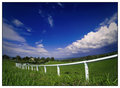
DAY 4. minimal edit. fence post .by rozComment: this is nice, but i think the composition would be stronger if the left edge of the image started in the middle of the fence post. all the stuff to left of the post seems an addendum. lovely colours and tones. |
| Photographer found comment helpful. |
Home -
Challenges -
Community -
League -
Photos -
Cameras -
Lenses -
Learn -
Help -
Terms of Use -
Privacy -
Top ^
DPChallenge, and website content and design, Copyright © 2001-2025 Challenging Technologies, LLC.
All digital photo copyrights belong to the photographers and may not be used without permission.
Current Server Time: 06/23/2025 08:02:55 PM EDT.