|
|
|
Showing 1691 - 1700 of ~1767 |
| Image |
Comment |
| 07/05/2004 03:57:33 AM | |  Photographer found comment helpful. Photographer found comment helpful. |
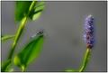
| 07/05/2004 03:55:23 AM | purple delightby slonkoComment: Marked this down a little because of dof - don't likr the main stalk being out of focus. This should be pin sharp to catch the eye. The top of the leaf should also be sharp in order to carry this photo | | Photographer found comment helpful. |
| 07/01/2004 04:11:29 PM | | | Photographer found comment helpful. |
| 06/29/2004 05:24:39 PM | | | Photographer found comment helpful. |
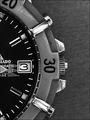
| 06/12/2004 04:05:15 PM | Tick, Tick, Tickby sleekrComment: Greetings from the Critique Club.
OK lets first review some of the comments given during the challenge marking. Most commentators have mentioned the 3 second exposure and the sweep of the second hand. I agree, I really liked this when I saw it, and marked it highly for just that reason. However, it is true also that this element is not obvious enough, and probably lost a few votes because of this.
Lets move onto the watch itself now. Because you are in close with a macro lens, you need to make sure the object is very clean, any dirt or inperfection shows up here. I think a good clean might have helped, just take a look at the outer bezel, just above the 30, Its not clean and contributes to the overall reduction in sharpness. On the chrome pieces I think I can see reflections of the room too, this can be avoided by using a light tent (see the link here for details of how to construct a very cheap light tent Light tent article). Of course it might be that the reflections are not the room, in which case I stand corrected.
Moving out the background has some grain, which people have commented on below. A good clean background together with the light tent would help massively here.
Finally the crop/composition. As remarked below the image relies on symmetry, and the crop has just managed to miss this. Its almost but not quite there, which is a shame.
Having said all that, I would like to say I am amazed that it ended up in 77th place, it deserved a much higher position than that, simply for the second hand sweep.
I hope some of the points I raised here will help when you come to some future challenge. If so then its been worthwile taking the time to have a deeper look into your entry.
Good luck with future challenges.
Keith Message edited by author 2004-06-12 16:13:20. | | Photographer found comment helpful. |
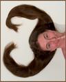
| 06/10/2004 06:49:58 PM | Ms. Threeby magnusComment:
Hi greetings from the CC !!
Its my job to try and give you some meaningful feedback on your image,. I'm new to this, so I'll do my best.
Lets start with the obvious, the humour. Most commentators have applauded your inventiveness and humour, and I think that worked really well. The thing about humour is that it has to connect, and not everyone is on the same wavelength. Using humour can be a slightly risky strategy for that reason. You will see from the forums that some people wouldn't recognise humour if it slapped them on the cheek ;-)
I have to say I did pick up on this and awarded it a 6.
So why did I not give it a 7, well I think its the lighting which really is the big element which lets this image down. The very obvious shadow line mentioned in other comments is the first giveaway. However I think its something to do with the lack of side lighting which gives the face a flat feel. Now I don't claim to be a portraite photographer, but I do feel theres something extra which could have been made of the lighting and the models face.
The skin tones also appear a little 'red' on mu monitor and maybe that too could be addressed either with the white balance setting on the 10D or in PS afterwards.
Having said all that I really did enjoy the image. I think it showed huge amountts of invention and really give me a laugh when I first saw it. I congratulate you.
Hope that helps a little.
Regards
Falc | | Photographer found comment helpful. |
| 06/10/2004 06:23:23 PM | eggsby oferashelComment:
Hi, I've been allocated this image from the list of images on the CC list requiring an in depth crit. I'll do my best.
In my voting I actually gave you a 7 for this image, I forgave the 'imperfections' which other commenters have already mentioned, but I think many of the voters will have marked you down severly for this lack of attention to detail. A few minuted cleaning and setup would have payed dividends.
I will try to examine whether there are other aspects of the image which resulted in such an unjustified low final score.
In order to do that I'm going to compare it to the other 'three egg' shot in the challenge, which might shed some llight on what people voted for.
The two images are in effect almost identical in concept, however yours is composed with a very rigid vertical rythm, thats usually a very pleasing tool. But what can sometimes work is a break in the rythm and that appears to be the case here.
The lighting of your image is from the front and laft of the eggs, this makes the eggs blend into the white background, losing a little definition. If you look closely at the other entry you will see that the eggs are lit from slightly behind. This makes the eggs just stand out a little more and defines the left hand edge of the eggs.
I hope you don't mind me using someone elses image as the vehicle for this critique, but I do think its sometimes useful to understand the differences, especially when the images are so similar and marked so differently.
Hope that helps a little.
Regards
Falc | | Photographer found comment helpful. |
| 06/08/2004 01:49:04 PM | Filtered light from aboveby DeepDiveComment:
Hi, well what can I say, the random allocation of photos for critique gave me a diving photo. I'm a PADI Advanced Open Water diver based in the UK so this is right up my street (as we say in Yorkshire).
OK the image: Its a classic diving shot using a silhouetted diver against the overhead sunlight. You have managed to get a very clear outline, nicely sharpe and well defined. The clean lines and style of shot prevent any other compositional elements, but it doesn't really need anything else. My only critisism would be that it does not really convey the feeling of a 35m dive, but I can only say that because I am a diver.
I find the pose intriguing, I would prefer to see some evidence of action, that may not be the case for a non-divier audience.
How might it be improved? - well these are just suggestions, because I find the image very pleasing as it ism but here goes:
A second diver silhouetted higher up, say 20m, mirroring the lower diver would give a sense of depth, a column of bubbles might also add something - just ideas.
Hope that helps. | | Photographer found comment helpful. |
| 05/27/2004 09:56:49 AM | | | Photographer found comment helpful. |
| 05/19/2004 05:21:13 PM | Cops Habitby hallswelComment: Bland lighting, the pose disturbs me a little, too artificial. I don't like models who look into the lens - makes it feel amateurish.
hope that helps - short but brutal - sorry | | Photographer found comment helpful. |
|
Showing 1691 - 1700 of ~1767 |
Home -
Challenges -
Community -
League -
Photos -
Cameras -
Lenses -
Learn -
Help -
Terms of Use -
Privacy -
Top ^
DPChallenge, and website content and design, Copyright © 2001-2025 Challenging Technologies, LLC.
All digital photo copyrights belong to the photographers and may not be used without permission.
Current Server Time: 06/15/2025 03:58:52 PM EDT.
|