| Image |
Comment |
| 05/20/2007 02:57:17 AM |
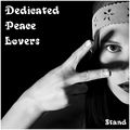
Dedicated Peace Loversby escapetoozComment: Oh fantastic. Placement of shadow looks very deliberate and effective, and font just is perfect. Great job. My sixth favorite in this challenge. 10! |
 Photographer found comment helpful. Photographer found comment helpful. |
| 05/20/2007 02:57:05 AM |
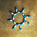
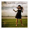
designing perfect livesby bdennyComment: One of a very small number that actually looks to me like a REAL album cover. I'm a bit distracted (only on second glance) by the rectangular dark spot in the right center but it's not a big deal. 10. My second favorite in this challenge. |
| Photographer found comment helpful. |
| 05/20/2007 02:56:57 AM |
DePhunk Limitedby rinacComment: My third favorite in this challenge. 10. I love everything about this, from the grain to the lighting and colors to the wire that the subject has that confuses and intrigues me. Great job with the text as well. |
| Photographer found comment helpful. |
| 05/20/2007 02:56:45 AM |
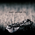
Death Painted Lifeby aznymComment: One of a very small number that actually looks to me like a REAL album cover. I would have prefered the title to have a dash between the first two words; just would have made a bit more sense to me. But, I can see it being the other way too. Love the colors, composition, and DOF. 10. (My top favorite in this challenge.) |
| Photographer found comment helpful. |
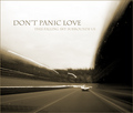
| 05/20/2007 02:56:23 AM |
Don't Panic Loveby JoshuaRaineyPhotographyComment: Fantastic composition of photo and placement of text! I love it! The colors are great, and the sense of motion makes me want to put this CD in my car as I go on a road trip. My fourth favorite in this challenge. 10! |
| Photographer found comment helpful. |
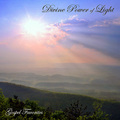
| 05/20/2007 02:56:15 AM |
Divine Power of Lightby SJCarterComment: My fifth favorite in this challenge. I like the composition of the photo and placement of text, and really think it fits with a gospel theme. 10. |
| Photographer found comment helpful. |
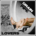
| 05/20/2007 02:56:04 AM |
Drain Pipe Loversby ColeyComment: Oh, I think you used the shadow as part of your text layout? That's awesome! |
| Photographer found comment helpful. |
| 05/20/2007 02:55:27 AM |
|
| Photographer found comment helpful. |
| 05/20/2007 02:54:57 AM |
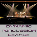
Dynamic Percussion Leagueby L1Comment: I feel like the overall layout of your entry is a bit too text-based and wouldn't do the best job, in a CD rack, of showcasing and promoting the band. Great title though. |
| Photographer found comment helpful. |
| 05/20/2007 02:53:51 AM |
Dark Planet Larksby BrianRComment: Very busy image - it really would not have been so bad if the color of the font did not conflict so much with the image itself. |
| Photographer found comment helpful. |
Home -
Challenges -
Community -
League -
Photos -
Cameras -
Lenses -
Learn -
Help -
Terms of Use -
Privacy -
Top ^
DPChallenge, and website content and design, Copyright © 2001-2025 Challenging Technologies, LLC.
All digital photo copyrights belong to the photographers and may not be used without permission.
Current Server Time: 08/27/2025 03:00:20 AM EDT.