| Image |
Comment |
| 05/08/2006 01:38:30 PM |
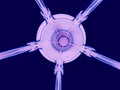
Five into Oneby kombizzComment: Greetings from the Critique Club!
First, let me say that I am not a professional or even a very good amature photographer, so you may want to take my comments with a grain of salt.
I think you did a great job with colors and composition. You could have benfited from more detail, as mentioned. A larger filesize and larger dimensions would have helped. You are able to have dimensions up to 640 pixels and a size of 150K - take advantage of that. If you use Photoshop, you can try "save for web" and optimize it to the particular file size you want.
I am glad to see you jumping into the challenges here! I look forward to more from you - it seems from your profile that you have a great appreciation of the world around you and when that comes out through a photo, it is truly amazing.
I hope this helps! Feel free to PM me if you have any questions. |
 Photographer found comment helpful. Photographer found comment helpful. |
| 05/03/2006 01:09:01 PM |
|
| Photographer found comment helpful. |
| 05/02/2006 10:59:52 PM |
|
| Photographer found comment helpful. |
| 05/01/2006 11:59:51 PM |
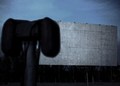
Serving You Since 1933by GivemeashotComment: Greetings from the Critique Club!
First, let me say that I am not a professional or even a very good amature photographer, so you may want to take my comments with a grain of salt.
I have mixed feelings about this. I would not have been able to recognize what this was had I not read your comments. I think it would have been much better if you had incorporated "Drive-In" into your title so that people would not have to struggle so hard with it.
Composition-wise I feel that this is decent but maybe could have benefited from a little context to show that the speakers are not the same size and location as the white screen. If I look at the pic from a bit of a distance that is what it seems like.
This being said, I really love the blurry/grainy/whatever effect that you have. It makes me feel like I am looking back in time - which of course adds to the old feeling.
I feel like this is a photo with a lot of potential. Like you had a great vision that you captured almost, but not exactly, perfectly, or you failed to include just the bit of context or focus that other viewers would need to see the scene as you saw it. I do love what you were trying to do here and I find your photo very pleasing to look at. |
| Photographer found comment helpful. |
| 04/18/2006 12:50:56 PM |
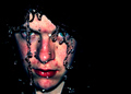
Inferno by kiwinessComment: I hope to get a chance to comment further later on, but for now I want to say: This is true, perfect beauty. |
| Photographer found comment helpful. |
| 04/18/2006 12:37:09 PM |
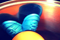
Rageby ZoomdakComment: Okay, this is really seriously freaking me out. Great job. |
| Photographer found comment helpful. |
| 04/18/2006 12:07:05 PM |
donuts for brunchby weiszComment: The couple of loose sprinkles on the middle donut feel out of place, and unfortunately the pattern of the countertop looks like noise. But besides that, this looks like it could be a great magazine ad for snacks! |
| Photographer found comment helpful. |
| 04/18/2006 12:04:30 PM |
Mr. Potato Head for Dinnerby weiszComment: Greetings from the Critique Club!
First, let me say that I am not a professional or even a very good amature photographer, so you may want to take my comments with a grain of salt.
Wow - a very interesting photo. What's making it go into my favorites?
The colors are to DIE for. They make my heart all melty. I really, really love them.
An interesting and unique concept. Makes you stop and think for a moment.
A new visual perspective on a familiar toy. It captures the plasticness while adding a feeling of true art.
A bold take on the challenge.
Here are things I'd suggest as improvements. I'd really like to see the entire curve of the plate (looser crop at the top). The highlights at the top right are a bit too strong. Also, the shadow of the feet is not a sharp V shape at the tip as it should be. I don't know what caused that but it is a bit distracting. Also the image should be bigger for a greater impact.
Unfortunately, with the way that DPC voters are, these improvements might not have increased your score significantly because of the true uniqueness of your photo. It's abstract in a way, and I think a lot of times that is not rewarded here.
Congrats for jumping into the challenges - I've found that a really great way to learn. Looking forward to seeing more photos from you. Much luck to you here at DPC!
I hope this helps! Feel free to PM me if you have any questions.Message edited by author 2006-04-18 12:10:53. |
| Photographer found comment helpful. |
| 04/18/2006 11:02:13 AM |
Police Carby reeveyComment: Greetings from the Critique Club!
First, let me say that I am not a professional or even a very good amature photographer, so you may want to take my comments with a grain of salt.
Meeting the Challenge: Definitely! It makes me feel like a kid again.
Composition: I agree that the crop seems a bit off. I don't feel like I need to see the whole toy - in fact, I think I like the feeling of energy that comes from the partial car. But I think that a looser crop on the top would bring it more into balance by showing more of the rear of the car. A solid color background may be less distracting but as there is not much background there, this is not as big of an issue as it would otherwise be.
Lighting: Pretty good. I think the right could be lit a bit more, and the left a bit less, as you lose a bit of details - especially to the left where the light merges with the car. It's not a huge problem as the merging of light and car does give a feel of movement, but that would have been enhanced by the beams of light being more consistant with each other.
Color: AWESOME. I love it. One of the best aspects to this photo, in my opinion.
Camera Work: Everything is clear and crisp. I am impressed with the attention to detail that this photo shows.
Post Processing: Details are sharp, the glow adds vibrance, highlights and shadows are very nice. You definitely accomplished what you wanted to with this.
Title: I would have prefered to see a less-obvious title, but this one is fine.
Image Dimensions and Filesize: Although not noticable, the filesize should be as close to 150kb as possible to minimize compression artifacts.
Misc / My subjective thoughts: It reminds me of something in a comic book or cartoon. I think it captures the feeling of children - colorful, vibrant, full of energy.
I hope this helps! Feel free to PM me if you have any questions. |
| Photographer found comment helpful. |
| 04/17/2006 02:23:17 PM |
|
| Photographer found comment helpful. |
Home -
Challenges -
Community -
League -
Photos -
Cameras -
Lenses -
Learn -
Help -
Terms of Use -
Privacy -
Top ^
DPChallenge, and website content and design, Copyright © 2001-2025 Challenging Technologies, LLC.
All digital photo copyrights belong to the photographers and may not be used without permission.
Current Server Time: 08/01/2025 05:08:49 PM EDT.