| Image |
Comment |
| 12/15/2006 07:01:55 PM |
|
 Photographer found comment helpful. Photographer found comment helpful. |
| 12/15/2006 06:24:01 PM |
I'm Still Flyby fotomann_foreverComment: Hiya! I like this shot because it's so fun looking. It brought a smile to my face. What would have made it stand out for me is if you were interacting more with the sky - maybe if there were a cloud in the foreground that you were using your hand to push away, or something like that. As is, it looks too much like you and the background are two seperate elements. I do like the feeling of motion that is created by the streaks in the clouds - that does bring a bit of unity to the shot. Good luck in the challenge! |
| Photographer found comment helpful. |
| 12/15/2006 06:23:16 PM |
|
| Photographer found comment helpful. |
| 12/15/2006 06:16:09 PM |
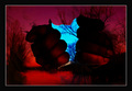
Torn Skyby kausikmpiComment: I could do without the border (maybe just the white one would be nice) and the hands could be a bit smaller (right now they seem to dominate the image) but otherwise this is great. |
| Photographer found comment helpful. |
| 12/15/2006 05:48:28 PM |
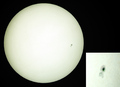
Large Sunspotby cloudsmeComment: While a very interesting image, it just doesn't say "sky" to me. Something in the sky is not the same as the sky. |
| Photographer found comment helpful. |
| 12/15/2006 05:48:25 PM |
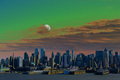
My Worldby timfythetooComment: I don't see the sky here as a key element. Instead it just seems to be negative space. Perhaps if there were more variation in the sky (clouds in different places) it would be a different story. Overall I do like this shot - I saw a thread a while back linking to examples of this, and I have to say yours ranks right up there with what I've seen.
edit: I was thinking about it a bit more... I think the main problem is not the negative space thing. A "key element" does not have to be a subject - I felt that way when I first wrote the comment but I have changed my mind on that. I do still think though that this image does not say "sky" to me. That is really probably a combination of two things: one, I am not used to seeing a sky presented in this way (surrounding the earth like that) and two, there are no clouds really, nothing to say sky except the colors of blue and white presented in what looks to be a vague "gradient" fashion. The first thing I cannot penalize you for, but the second I can. I think if you had chosen to shoot on a day where the clouds were throughout the sky instead of just low to the ground it would have helped a lot.
The main thing is, I am bumping your score a bit because of my revised thinking, but at the same time it is not the score I would give to this same image in a free study. |
| Photographer found comment helpful. |
| 12/15/2006 05:35:47 PM |
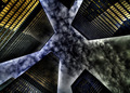
Spokesby StrikeslipComment: Nice image, and one that certainly struck my eye on a first glance over the entries, but I would have prefered it without the whiteness around each of the buildings. |
| Photographer found comment helpful. |
| 12/15/2006 05:25:01 PM |
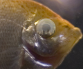
Sky High Fish Eye Lensby justamistereComment: I think this is a super concept, just maybe could have been better executed. I'd prefer the fish in focus as well as the eye. Although with the fish not in focus, it does help bring more emphasis to the eye/skyline. Maybe you could have made the eye larger in the frame with a different crop? |
| Photographer found comment helpful. |
| 12/15/2006 05:19:29 PM |
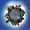
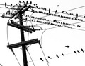
crowdedby aplomb76Comment: I see what you are going for, and I like this image as a whole, but when I look at it I don't see sky. I wish maybe there were some details in the background to tell me what I was looking at (although then of course the image would probably look too busy). |
| Photographer found comment helpful. |
| 12/14/2006 04:20:31 PM |
Blood and goreby BoltiComment: One of my absolute favorites in this challenge. Make the crop a bit looser and you'd have a perfect horror movie poster. 10! |
| Photographer found comment helpful. |
Home -
Challenges -
Community -
League -
Photos -
Cameras -
Lenses -
Learn -
Help -
Terms of Use -
Privacy -
Top ^
DPChallenge, and website content and design, Copyright © 2001-2025 Challenging Technologies, LLC.
All digital photo copyrights belong to the photographers and may not be used without permission.
Current Server Time: 08/20/2025 06:22:09 PM EDT.