| Image |
Comment |
| 02/08/2007 12:24:33 AM |
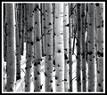
Winter Aspensby rasdubComment: Oh congratulations! I am so pleased that this lovely abstract is in the top 10. |
 Photographer found comment helpful. Photographer found comment helpful. |
| 02/08/2007 12:22:46 AM |
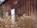
Brush Barnby dsternerComment: Regarding your photographer's comments - one thing that a lot of people will recommend is to not use the automatic feature on your camera. I had difficulty with this first but playing around with the manual settings gave me a feel for what types of changes had what effect. You can also try this tutorial for a beginning.
In the image I really love the red and gold tone - especially how the gold color spots on the barn are matched by the vegetation. It is a very lovely effect. |
| Photographer found comment helpful. |
| 02/08/2007 12:15:39 AM |
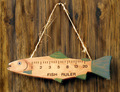
MEN - Just another lie!by dsternerComment: Background as mentioned is rather distracting. One thing would be to take it on a plain background - another, if that is not possible, would be to take advantage of advanced editing to selectively desaturate just the background. Sometimes people use this technique to leave the subject alone colored for emphasis. What I would do is in Photoshop, use an adjustment layer (layer --> new adjustment layer) to desaturate the shot. There are multiple ways of desaturation - see this tutorial by Leroy. Then you could use a mask (one of the little symbols at the bottom of the "layer" window) and paint black (or white, I could be mistaken) on it in the areas that you don't want that layer (the desatuation) to be (so you'd paint over the fish, leaving the fish colored.
Also in your shot, it appears that the fish is not in as much focus as would be desirable. Sharpening (I like smart sharpen in Photoshop CS or Neat Image, which is a stand-alone program that also works as a photoshop plug-in, and removes noise as well as sharpening) would be good or you could watch the focus when taking the shot. I can also see some haloing around the string - this type of effect is usually an indication of post-processing and draws attention to the processing as well as simply being distracting.
Colors are nice and composition is great. I like that you got the fish level and it's not hanging to one side or the other. In some shots, the composition being balanced is more important than others (like archetecture shots, where leaning buildings look really strange) and this is one of them (it would be just so obvious with the string if it weren't level), so I think you did a great job here.
edit: Here is a tutorial on layer masks and here is a tutorial on how to do selective desaturation under the basic editing rules (the thing I explained above, or layer masks in general, are not legal in basic). Message edited by author 2007-02-08 00:19:54. |
| Photographer found comment helpful. |
| 02/08/2007 12:07:06 AM |
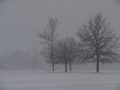
Buffalo, NY Finally Sees Winter's Entrance (after unseasonably long high temps.)by dsternerComment: Composition is pretty nice although cropping the bottom might help a bit as mentioned. Also maybe a bit looser crop on the right, to include all of the branches on the rightmost tree. Definitely adjusting the contrast would help a ton. First it is normally not so great to see so much gray in a picture, and secondly you want to get brighter tones to emphasize the white "snow-ness" of the image. |
| Photographer found comment helpful. |
| 02/08/2007 12:03:34 AM |
Study Tableauby dsternerComment: The main thing I notice about this that you could improve is that there seems to be a reddish tint over the entire image and the paper just doesn't seem right. There are multiple ways that you could address something like this - in Photoshop, using levels, curves, hue/saturation, and brightness/contrast will all make some sort of effect. What I would do first, if this were my image, would be to use levels or curves. That gives you a bit more control, I have found, in brightening up the whites - if you look at the shot the white paper doesn't really seem all that white. You could adjust levels as a whole or adjust the red levels separately.
I'd recommend playing around with all the different options and seeing what you like. You could even use adjustment layers (legal in basic if they're in "normal" blending mode and there are no masks), making changes one at a time (hiding each after you do it so that you can make your next change to the original image) and that would allow you to see very easily the differences between the methods (while keeping a copy of the original background layer, which is helpful). |
| Photographer found comment helpful. |
| 02/07/2007 04:34:28 PM |
Post Mortem Examinationby samhallComment: I think that the composition is really nice and the lighting is also great. Not a fan of the motion blur in the left but everything else technique-wise I think is pretty good. |
| Photographer found comment helpful. |
| 02/07/2007 04:00:34 PM |
|
| Photographer found comment helpful. |
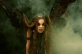
| 02/07/2007 03:56:40 PM |
Dark Angelby JudiComment: Really nice except the white spots, which I find very distracting. Great colors and I love the smoke. |
| Photographer found comment helpful. |
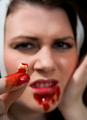
| 02/07/2007 03:55:50 PM |
Bad wisdom toothacheby tomzComment: I've been staring at this for a while trying to decide if I think the blood is real. If it isn't, then I think you've fooled me! I'm not too big of a fan of the way it doesn't look like it's on the lip so much, especially the left side (of the photo). However I think this was definitely pulled off nicely. |
| Photographer found comment helpful. |
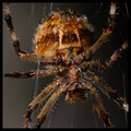
| 02/07/2007 12:25:25 AM |
VENOM: BAD HAIR DAYby hotpastaComment: Ummmmm.. ewwwww ewwww ICK ICK ICK.
*ahem*
Very very excellent and wonderfully detailed photo. Congrats. |
| Photographer found comment helpful. |
Home -
Challenges -
Community -
League -
Photos -
Cameras -
Lenses -
Learn -
Help -
Terms of Use -
Privacy -
Top ^
DPChallenge, and website content and design, Copyright © 2001-2025 Challenging Technologies, LLC.
All digital photo copyrights belong to the photographers and may not be used without permission.
Current Server Time: 08/22/2025 03:39:29 PM EDT.