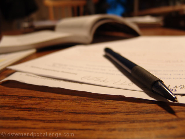
The main thing I notice about this that you could improve is that there seems to be a reddish tint over the entire image and the paper just doesn't seem right. There are multiple ways that you could address something like this - in Photoshop, using levels, curves, hue/saturation, and brightness/contrast will all make some sort of effect. What I would do first, if this were my image, would be to use levels or curves. That gives you a bit more control, I have found, in brightening up the whites - if you look at the shot the white paper doesn't really seem all that white. You could adjust levels as a whole or adjust the red levels separately.
I'd recommend playing around with all the different options and seeing what you like. You could even use adjustment layers (legal in basic if they're in "normal" blending mode and there are no masks), making changes one at a time (hiding each after you do it so that you can make your next change to the original image) and that would allow you to see very easily the differences between the methods (while keeping a copy of the original background layer, which is helpful). |