| Image |
Comment |
| 05/07/2005 01:05:47 AM |
|
 Photographer found comment helpful. Photographer found comment helpful. |
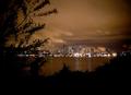
| 05/07/2005 01:04:58 AM |
Lake Cityby fluxnComment: Very nice picture. I think cropping out some of the dark space at the bottom will draw attention more quicky to the happening lit city. The framing is very nice though, it brings a closedness to what would otherwise be just like any other waterfront picture. I really like the colors in the night sky too! |
| Photographer found comment helpful. |
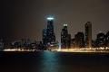
| 05/07/2005 01:02:38 AM |
Dark Cityby Keith ManiacComment: The detail and sharpness in this picture are just amazing. And the darkness and colors make it one of the most 'late' night pictures in this challenge... I hope you do really well with this. 10. |
| Photographer found comment helpful. |
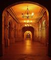
| 05/04/2005 02:25:39 PM |
Golden Archesby boomerComment: This is a beautiful picture; also technically very well done. I like the sense of converging in to some deep corridor... the slight off-centering also helps the composition. Incidentally this would also fit wonderfully into outside looking in :) 10.
|
| Photographer found comment helpful. |
| 05/04/2005 02:22:04 PM |
|
| Photographer found comment helpful. |
| 05/04/2005 01:19:14 AM |
Wide Worldby ImagineerComment: What JPR said. I always end up liking your pictures without even knowing they are yours. I guess that's when you add someone to your favorites :).
Excellent photograph, and I really like the processing for the clean white look. To me it seems like the processing has made the picture effective as a minimalism picture, since it really makes the subject stand out and the background blend into one large space. Excellent work again!! |
| Photographer found comment helpful. |
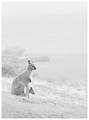
| 05/02/2005 01:52:05 PM |
OUTBACKby DrJOnesComment: Congratulations on the 5th, though I was hoping this would ribbon!
Pretty neat that you did this with yourself and a timer, and still got such an excellent posed-model like look to it. I really like the mood in this shot... more than just the object, it also suggests the kind of person who ought to wear it... great work! |
| Photographer found comment helpful. |
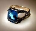
| 04/29/2005 08:00:10 PM |
Topazby aerogurlComment: Border and a tighter crop from the bottom would have helped even more this already good image.
|
| Photographer found comment helpful. |
| 04/29/2005 07:59:12 PM |
OUTBACKby DrJOnesComment: Very very professional looking . Excellent concept and very well executed! |
| Photographer found comment helpful. |
| 04/29/2005 07:58:28 PM |
Be the light...by ShamanComment: Technically very nice. Only here I think the text does not really add to the image... in a different smaller font, without the price, at the top corner might have gone better with the image. But the photograph in itself is excellent. |
| Photographer found comment helpful. |
Home -
Challenges -
Community -
League -
Photos -
Cameras -
Lenses -
Learn -
Help -
Terms of Use -
Privacy -
Top ^
DPChallenge, and website content and design, Copyright © 2001-2025 Challenging Technologies, LLC.
All digital photo copyrights belong to the photographers and may not be used without permission.
Current Server Time: 08/01/2025 09:35:10 PM EDT.