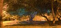
DPChallenge: A Digital Photography Contest You are not logged in. (log in or register
 
Browse Settings
Currently viewing:
Registered Usermoniepenny

Show comments:

Per page:

Order:

Comments:


Comments Made by moniepenny
Pages:   ... ...
Showing 101 - 110 of ~337
Image Comment
enchanted
07/04/2006 01:55:11 PM
enchanted
by magnumruss

Comment:
Greetings from the Critique Club!

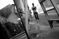
First Impression: This image is certainly one to make viewers take a second look, because it is not apparent immediately what exactly is going on in the photo.

Technicals:

Composition - The photo seems a little bit cluttered to me, with so many trees, it takes a bit to notice the enchanted one that is apparently the main subject.

Lighting - The lighting here provides an atmostphere that goes well with the enchanted feeling. You've obviously created this effect on purpose from reading your comments.

Focus - The focus seems to be reasonably clear, but it's hard to tell since the details are so small because of the many objects in your shot.

Colors & Contrast - Interesting colors, and good contrast.

Presentation:

Meets the challenge? - You had a shutter speed of more than 30 seconds, so you've met the challenge, but this image doesn't visually express it to me, there's no reason why this couldn't have been taken at 5 seconds to me. I believe this is where your average score comes from - voters wanted to see something that looks like a long exposure.

Subject Choice - I think that choosing a closer crop to one tree, and using just that single subject would've improved this shot a lot. The background building distracts.

Title - Well you've certainly gotten an eerie feeling with this one, and the blue light certainly doesn't appear natural, so your title fits.

Photographer's comments - This was an obvious effect judging by your comments, so congratulations if you've achieved what you were aiming for. Don't let the score get you down, what's considered great on DPC isn't the only type of art out there. Keep doing your thing if it makes you happy.

My Suggestions: I'd like to see a tighter crop, and a less distracting background here. I think that would improve your score quite a bit.

If you have any questions, comments or concerns regarding this critique, feel free to PM me.

Keep Shooting!

-Monica

Photographer found comment helpful.
Trick-or-Treat ( Inspired by Artoole)
07/02/2006 03:28:01 PM
Trick-or-Treat ( Inspired by Artoole)
by Jaded_Housewife

Comment:
This image has single-handedly made me paranoid for the sakes of my future children. I like that it's so bright and colorful considering what the image is about. It's a nice contrast.
Photographer found comment helpful.
Fire Jumping (Solstitial celebrations - St. John)
07/02/2006 03:26:55 PM
Fire Jumping (Solstitial celebrations - St. John)
by Milacroft

Comment:
I really like the color here, and the swooping lines above the flame.

St. John where?
Photographer found comment helpful.
Fortune Cookies
07/02/2006 03:23:57 PM
Fortune Cookies
by sfarrell23

Comment:
There seems to be a red color cast on this, but it seems to warm up the image a bit so I'm not sure if it's a good or bad thing. I like the texture, lighting and colors here. Good work.
Photographer found comment helpful.
If you delete this email...
07/02/2006 03:22:04 PM
If you delete this email...
by lauraodom

Comment:
I always hate when I get them, I think they're silly but in the back of my mind I'm thinking..."what if?" Very good use of controlled DOF, having the delete and backspace buttons in good focus is clever and unexpected.
Photographer found comment helpful.
Tasseography: The Psychic Art of Reading Tea Leaves
07/02/2006 03:19:11 PM
Tasseography: The Psychic Art of Reading Tea Leaves
by IndigoButterfly

Comment:
They kind of look like bacon bits. Good use of DOF, the eye is immediately drawn into the cup. Some might have complained about the china pattern being too busy or distracting, but here I find it adds some interest and color to the shot. Good concept.
Photographer found comment helpful.
Honey, Where's The Dog?
07/02/2006 03:17:29 PM
Honey, Where's The Dog?
by idnic

Comment:
Very clever and well done. This is an interesting, thoughtful photograph, that also uses humor to great effect. Good work!
Photographer found comment helpful.
So you can hear the ocean?
07/02/2006 03:15:57 PM
So you can hear the ocean?
by TrollMan

Comment:
I like the blue tone on this, reminds me of the ocean. I also like the DOF you've used. The lighing is a bit bright in some areas, so watch out for that. All in all, I think this is a good image that stands out in the challenge. Good work.
Photographer found comment helpful.
... A little over the shoulder!
07/02/2006 03:12:18 PM
... A little over the shoulder!
by jah_luv

Comment:
The size of your image is way below the allowed 640 pixel and 150 MB limits. You should take advantage of the size allowed. The compression here has ruined an otherwise decent shot. There are tutorials for resizing your image in the "Learn" section of the top navigation bar. Good luck with your future challenges, keep shooting!
Photographer found comment helpful.
Oblivious
07/02/2006 03:08:56 PM
Oblivious
by dizneewench

Comment:
I like this tilted composition, it adds tension to the scene. I also like that you've encorporated too superstitions into this at once. I do think though that this is not nearly as sharp as it should be, so that could be something you work on. Since you clearly have good ideas, paying a little more attention to the technical aspect will make your work stand out from the rest.
Photographer found comment helpful.
Pages:   ... ...
Showing 101 - 110 of ~337


Home - Challenges - Community - League - Photos - Cameras - Lenses - Learn - Help - Terms of Use - Privacy - Top ^
DPChallenge, and website content and design, Copyright © 2001-2025 Challenging Technologies, LLC.
All digital photo copyrights belong to the photographers and may not be used without permission.
Current Server Time: 06/16/2025 05:39:20 AM EDT.