|
|
|
Showing 271 - 280 of ~494 |
| Image |
Comment |
| 01/31/2003 02:15:13 PM | Inspiredby PtmanComment: Great angle and cropping. I might have like the sky a little desaturated if I would change anything, 9 |  Photographer found comment helpful. Photographer found comment helpful. |
| 01/31/2003 02:11:47 PM | | | Photographer found comment helpful. |
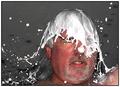
| 01/31/2003 01:34:48 PM | Refreshingby spidermanComment: Critique Club:
Meeting the challenge: Excellent! This is definitely identifiable as milk or cream and you certainly "got" it!!
Composition: Good use of thirds, use of dark background to contrast against the milk (although it would have been nice to have been a little more solid) The chain is a little bit distracting but not a major problem. It would have been nice to see one eye to enhance the expression, but I certainly understand pouring milk over oneself in the middle of winter might not justify 100 shots of the moment ;)
Technical Quality: Again, I would like to have seen the background more solid. The capture of the moment is excellent, the skin tones good and the focus is very good. It appears you used a perfect shutter speed to stop the movement of the milk, and I love the splat on the nose! I would also like the background to have been a less speckled in addition to being a solid color. You might have been able to improve on this with a levels adjustment. Good focus and depth of field, also.
Creativity: Excellent, I think I might have called this "human sacrifice ritual for DPC", but the the satirical title fits well, too. Unlike some other comments, I think there is enough of your face showing to communicate a feeling of "arggh" during this shot.
Overall: Nice shot, fits well with the challenge, with background change, would have been at least an 8 for me. | | Photographer found comment helpful. |
| 01/29/2003 08:58:53 PM | Slight Turn Aheadby xertionComment: Critique Club:
As noted below, the main flaw in this picture is composition. The centrally located sign seems to lead to nothing interesting. The road being included, or the sign against the sky pointing to the ridge would have added to the quality of the photo.
Technical quality: Good clear capture, clear bright colors, beautiful shot of the sky. I personally don't mind the dings in the sign, makes it very realistic. no post-processing problems noted.
Meeting the challenge: Well done, the sign is the focal point.
Creativity: Well, this is not one of the most creative shots I have seen. I cannot really see any meaning of the sign in relation to the background although maybe the curve goes around that ridge and that is something we need to imagine when viewing the photo. Not really any kind of impact statement made with the shot that I like to see in a photo.
HOpe this helps.
| | Photographer found comment helpful. |
| 01/29/2003 08:50:21 PM | No Road? ... No Problem!by LustreComment: Critique Club:
Composition: Would have changed the antenna running into sign. Liked the dirt and gravel helping to tell a story about this photo. Might have done a slight rotation to the right to help it look a bit more level. Nice use of off-center focal point and bright colors to also accentuate your focal point. the lettering on the car is a bit distracting to me, so if it had been turned around, that would have been eliiminated.
Technical Quality: Bright lighting works well to bring out the colors in the photo, maybe a little less shadow on the sign would have been a minor improvement. No post-processing problems apparent. Nice focus and dof.
Meeting the Challenge: Well done in this area, a boring road sign with an interesting setting, very good!!
Creativity: Although this picture does not "move" me as I like photos to do, it was a good idea for a tough challenge.
Overall: An interesting photo, except for the composition problems, and lack of "wow" factor, and as said before, getting an exciting photo for this challenge was tough.
Hope this helps. | | Photographer found comment helpful. |
| 01/28/2003 11:24:03 PM | maximum thirty studentsby ParentxComment: Critique Club:
Lili, thought at first this photo was playing with the flying plane in the upper left section, then I read the title and got your point!
Composition: Good use of negative space, a nice simple clean composition, with contrasting colors. I, like some of the other commenters like the plane in the sky and it helps make fun of the speed sign and balances out the picture a bit.
Technical Quality: Some jpg artifacts in the solid areas might have been removed with despeckling, salt/pepper filter or an edge preserving smoothing filter such as neatimage. Wish those sticker looking white things weren't on the sign, but hey, it's a children's crossing and they tend to put stickers on anything they can find, if that's what they are. They are a bit distracting to me. I like the interesting angle of the shot. Except for the artifacts, the shot is crisp, well-saturated and well-lit.
Overall: An interesting photograph, likely not something I would hang on my wall, but the challenge this week was difficult to meet with "pretty" photos!!
HOpe this has been helpful to you. (;*)
Creativity: Nice use of an otherwise boring sign, especially with your interpretation, the plane included and the humourous title.
| | Photographer found comment helpful. |
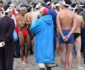
| 01/28/2003 10:39:08 PM | Alright, Who's Got the Hot Milk?!!by AntithesisComment: Critique:
Meeting the challenge: I would have never known that this photo was related to milk products without the title, and even then it's a stretch for me.
Composition:
I like the way the person that is the focal point is located in the left third of the photo and that several other persons in the photo lead your eye to him, which makes him stand out in this picture of a group. There is not only color contrast, but contrast through subject matter that tells a lot about the picture. I agree that cropping this photo vertically and including heads and feet may have improved the composition. The flip side of this issue is that the other people in the photo help to explain what is going on with this nearly naked subject, as those around him do not reflect the swimming event well.
Creativity:
I love the way you used the contrasted figures and the expression you caught on what looks to be a very candid photo. And the way you tried to link the picture to the challenge subject was really a stretch of your imagination imagination(;')
Technical Quality:
The image is clear and dof good. No visible post-processing problems. Maybe a slight increase in mid-levels or brightness may have made the contrast a little improved, and a bit less drab in color.
Overall Opinion:
Interesting image, but lack of connection to challenge theme likely hurt your score this week. Hope the guy finally got warmed up!!
| | Photographer found comment helpful. |
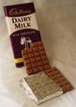
| 01/27/2003 11:54:59 PM | Milk's Perfect Formby myqylComment: Critique Club comments:
As noted below, I liked this shot when I first saw it.
Composition: Good, I like the way the eye flows downward with the milk into the chocolate. Yes, the middle candy could have been scooted over a bit to the right or left to avoid lining up with the wrapped bar, although you would have needed to take another bite, ha! If the bottom piece was a bit more angled, it might have made the composition a little more interesting.
Creativity: The best feature of this shot. Loved the milk flowing into the candy and is a great idea for this challenge!
Technical quality: fair The wrinkles are a bit distracting, but I really liked the way the color of the backdrop worked with the colors in the wrapper and the very soft lighting. The chocolate crumb could have been removed for a cleaner look. Would have liked a little less lighting on the foil, and a tad more on the words on the wrapper. As noted above, the background colors work well with the shot and help bring the focus to the candy, as well as the contrast in the shot.
Overall: This is a fairly nice shot, shows that maybe you rushed a bit to get it done and from your comments I can see why and understand the technical flaws.
Hope this helps!
| | Photographer found comment helpful. |
| 01/27/2003 12:15:34 AM | | | Photographer found comment helpful. |
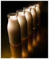
| 01/27/2003 12:14:28 AM | Who`s Got Bottle by redfigComment: Congrats, good to see a photo with nothing under 4! A well-deserved win, beautiful shot!! | | Photographer found comment helpful. |
|
Showing 271 - 280 of ~494 |
Home -
Challenges -
Community -
League -
Photos -
Cameras -
Lenses -
Learn -
Help -
Terms of Use -
Privacy -
Top ^
DPChallenge, and website content and design, Copyright © 2001-2025 Challenging Technologies, LLC.
All digital photo copyrights belong to the photographers and may not be used without permission.
Current Server Time: 08/06/2025 02:02:12 AM EDT.
|