|
|
| Image |
Comment |
| 01/19/2004 02:21:26 AM | |  Photographer found comment helpful. Photographer found comment helpful. |
| 01/18/2004 06:24:44 AM | Flash Photographer At Workby GeneralEComment: Greetings from the Critique Club
Initial thoughts/My opinion
While the ceiling was shown when it loaded the first time I thought: that's an interesting place of great leading lines and structure and I looked forward what would be at the end of the ceiling. Was disappointed when I finally looked at the harsh, blue flash and the peoples and chairs.
Content/Composition
Of course there is action in this image due to the flash. However, this action and the place don't fit well in my eyes: the exhibit is a place of silence and contemplation, whereas the flash is an element of disturbance, harshness. Such a contrast might of course be an interesting compositional elements, but to me it did not work well in this case. That is probably due to the fact that the two elements are not well balanced and especially that the exhibition hall isn't too quiet due to the people. It's at that moment already very busy even without the flash photographer.
Something that might have worked better here is to focus on the movement of the people rushing through the hall: that's an often seen action in museums that is simply contradictionary to the intention of places like that.
Camera work -technically
The image looks not sharp were it should be: only the upper portion of the ceiling is fine, the rest is a little too blurred. Was it a handheld shot? Exposure seem OK, maybe a tad too dark.
Digital Processing - Technical
I'm honestly not a big fan of the blue hue of the flash: a flash is by itself already cold enough and the blue colour makes it even colder and also look too unnatural. I would thus have changed the colour digitally. Cropping works well, you might have considered rotating the image a bit clock-wise.
Fits the challenge
Somehow yes, but to me it's more "disturbance" then action itself.
Good luck for your further submissions
| | Photographer found comment helpful. |
| 01/18/2004 05:32:44 AM | Mr. Lebowski's Swim Lessonby SirBiggsALotComment: Greetings from the Critique Club
Initial thoughts/My opinion
Great idea: very different to other water images, has some technical and compositional shortcomings, leading to a lag of WOOW-factor.
Content/Composition
The content is just great: The water surface you show us is full of vibration, texture and live: very dynamic, full of action and life.
In Germany there is a saying "Storm in the water glass" and in means "making a big fuzz about something very unimportant". Your image shows this very well.
The composition comes somehow short at several points. The water glass you choose isn't very attractive: a simpler one with thinner glass and without any structure (by that I do mean the shape at the bottom) would be better. The angle of view and the cropping might be improvable too, however, I can't tell in which direction to go, one simply has to try it. The droplets flying around are also a problem: in the image they are not strong enough to make an important compositional element, so it would be better to either not showing them or increase them much more to give them an importance equivalent to the water surface.
One main point is the colour and light: there is some colour shown and that is important. Without it, i.e. B&W, the image would be very flat. I would have strengthened colour by using light reflected from coloured paper or so and also by a coloured background (the later might not work though). That would have increased the dynamic of the image considerably. Of course the glass rim would show this colouration too, but with a better glass this would have made up just a probably nicely coloured line. Right now the red at the left rim just does not look nice, looks more like dirt.
Camera work -technically
Exposure seems fine, but it's hard to tell here, because the exposure is the main control to get the texture on the busy water right. Focus seems fine too, although not of great importance here.
Digital Processing - Technical
The image looks a little over-sharpened to me, otherwise fine. As mentioned: I would have used a different cropping. Negative space is not of importance here IMO.
Fits the challenge
Yes, for sure.
Good luck for your further submissions
| | Photographer found comment helpful. |
| 01/15/2004 03:36:35 PM | | | Photographer found comment helpful. |
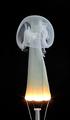
| 01/15/2004 05:08:28 AM | Fingering Ghostby kiwinessComment: Great creativity Gary. hope you didn't cut yourself when taking the bulbs apart. Did you use full voltage, i.e. 220V, or did you use a dimmer? How long does it take between switching on the lamp and before is burned out?.
Jörg | | Photographer found comment helpful. |
| 01/15/2004 02:21:46 AM | Chairman of the Board by crabappl3Comment: Congrats for the blue ribbon!
And as stated below a good example how the new member rules enhance an image and not make it digitally looking at all.
Jörg | | Photographer found comment helpful. |
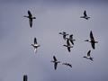
| 01/14/2004 06:12:49 PM | Ready, Aim....by vtruanComment: Greetings from the Critique Club
Initial thoughts/My opinion
To be honest, I do not like hunting, especially on birds, but that's my personal taste. The image is somewhat nervous and grainy and dark.
Content/Composition
I (as probably many) didn't get that there was a shotgun barrel at the lower left. Only by reading your comment I noticed it. Had the exactly same experience once with my "four" submission :(.
As mentioned above the image is somewhat nervous for the following reason: there are too many ducks to get them with a single view, but on the other hand the individual ducks are to large and detailed to see them just as a swarm of ducks. Hence the viewers eye walks around the image searching for something special, which can actually not be found.
Getting less close might have been better. Cropping out most of them and showing only the two left once would have given probably too many difficulties with the graininess (unless digitally taken away)
Camera work -technically
Focus seems a bit off, but I'm not really sure. Exposure is too much on the dark side, but you had probably problems getting enough light anyway as I can see from the camera settings.
Digital Processing - Technical
You could have made the image brighter digitally and of course the barrel more pronounced (though I'm actually not sure if the way you made is allowed, probably yes).
You could have sharpened the ducks more using "smart sharpening" and also blurred using the same inverted selection the noise away. I tried it on the image, works well.
Also some more colour saturation would have brought some more structure to the ducks.
Fits the challenge
Needs the title, but then it fits.
Good luck for your further submissions
| | Photographer found comment helpful. |
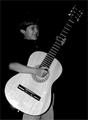
| 01/14/2004 05:09:57 PM | I Will Get Him Lessons!by OneSweetSinComment: Greetings from the Critique Club
Initial thoughts/My opinion
I like the play with size: what a huge guitar for the boy. Also like his expression, made me smile and think of our kids. It's way too dark for me and the title is less inspiring then the image itself.
Content/Composition
For this challenge image and title have to go more hand in hand then for other challenges, because a resolution can be a whole story. While getting your son some guitar lessons, a title like "This year I will become a star" would probably worked better. Such a title would draw the viewer into the image and think about the dreams of the boy and maybe the own dreams as a youngster. Your title made me and probably others "step" outside the image and thing about a parent who has duties and work to do. Often not so pleasant.
The composition itself is well made: placing the guitar along the diagonal is a good choice and the boy's placement follows the rule of third. Also that he wears a black shirt is fine: makes the hand and face stand out more. Black trousers might have been great.
The way you set the light is my main problem I do have with the image: it looks like it is an image taken with flash, judged by the strong reflection at the lower portion of the guitar. Thus the strongly reflecting guitar body is overexposed were as the rest is way to dark, even the face. Some softer light, probably from the side would have been much better.
I like the black background though and B&W was probably a good choice (depends a little on the colour of the guitar).
Camera work -technically
The focus seems to be a little soft, but not too much. Exposure: see above.
Digital Processing - Technical
Could need some more sharpening. Regarding a better balancing between the dark and bright parts there is actually not too much that can be done digitally without breaking the rules.
A border might have been nice.
Fits the challenge
Yes it does.
Good luck for your further submissions
| | Photographer found comment helpful. |
| 01/13/2004 06:16:45 AM | Cellphones anyone?by oksamitComment: Greetings from the Critique Club
Initial thoughts/My opinion
That's tacky! Composition is a little flat with too much to see that is not necessary.
Content/Composition
I think that the content itself is well chosen: Santa with plenty of cellphones is tacky, already on the edge of tasteless. And I think the voters saw this too.
All the stuff on the desk and in the back do of course disturb a lot. Assuming that it wasn't your store where you took the picture and you were not allowed to rearrange things, the only thing that might have helped would have been a different angle of view. Probably more from below would have been better. But kneeing down in a store is not what everybody likes to do.
Composition with light was probably also not possible to get the back darker, am I right.
So I thing you did it as good as possible.
Camera work -technically
Focus is just right and using 2.2 as aperture was a wise choice to get the back as blurry as possible. Exposure is fine, maybe a little bright. A very gentle fill flash might have been interesting, but I do not believe that in this way you would have gotten the Santa well exposed in front of a darker background.
Digital Processing - Technical
Santa appears a little soft and cropping could have been improved: either a way stronger crop to focus more on his face and the phones, or a bit wider at the top and bottom to see the whole figure. A nice frame might have been great too.
Fits the challenge
Yes, for sure
Good luck for your further submissions
| | Photographer found comment helpful. |
| 01/12/2004 04:35:30 PM | time to get some reading doneby camelotnorthComment: Like the play of light and shadows and pose of this one. Also fits very well to the challenge.
It's just too bright and also could have been improved considerablly by moving the phone and other items away and place a cup of tea or glass of wine/whisky there. | | Photographer found comment helpful. |
Home -
Challenges -
Community -
League -
Photos -
Cameras -
Lenses -
Learn -
Help -
Terms of Use -
Privacy -
Top ^
DPChallenge, and website content and design, Copyright © 2001-2025 Challenging Technologies, LLC.
All digital photo copyrights belong to the photographers and may not be used without permission.
Current Server Time: 06/18/2025 04:15:06 PM EDT.
|