| Image |
Comment |
| 01/15/2003 06:13:32 PM |
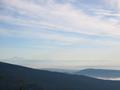
Mount Bakerby lamentComment: the picture has some very interesting parts: the mountain range in the back, the mountain at the right with the low clouds and the nicely structured clouds of the sky. However the woods in the front (also the treetop to the left) attract the viewers eyes first and because they are not so interesting, the viewer has to search for what he should look at. Also it could be darker. Then some nice orange colors of the sky would get visible (I have a laptop on which I simply tilt the screen to see how brightness variation alter the apperence of an image). |
 Photographer found comment helpful. Photographer found comment helpful. |
| 01/15/2003 06:05:16 PM |
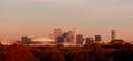
On a clear day...by decoteauComment: Now that's what I call cityscape: the view is awesome. The buildings are arranged like the trees of a small forest or it looks like a small hill. Cropping is a little tight, but I guess that the effect mentioned above would otherwise be disturbed by bulidings on the left or right. I have a little problem with the color though. Too brown/orange to me. This is probably the result of the sunset, but because it's not obvious to the viewer, it feels somewhat un-natural. Still a great cityscape and the best example that cityscapes fit the challenge. |
| Photographer found comment helpful. |
| 01/13/2003 12:01:41 PM |
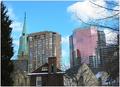
Lanscape became Cityscapeby jgillardComment: I like the variety of buildings in your cityscape, it's almost like a historical review with the old church and the brig house, the older and the new office building. Also the trees frame the picture well. They are of course needed to make it fit to the title of your submission. Sky fits well too.
My major concern with this image is that it is very tight, i.e. all elements are so close together and fill the whole picture that there is no space. IMO space is an important element in landscape pictures. A wide-angle shot or a shot from the distance would have probably reduced this issue. Colors could be stronger too (or maybe B&W?!).
|
| Photographer found comment helpful. |
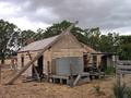
| 01/13/2003 05:26:19 AM |
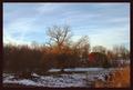
Down On The Farmby GekkerComment: The scenery, especially the center tree is great. Like the cow too. Could be brighter though |
| Photographer found comment helpful. |
| 01/09/2003 05:21:13 AM |
|
| Photographer found comment helpful. |
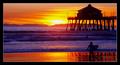
| 01/09/2003 05:20:10 AM |
Beach Boys - Surfin' USA by byetkoComment: Woow, unbelievable colors. While it's still "just another sunset" it's awesome, fits to the title and challenge and will end up high. Thumb up and good luck. |
| Photographer found comment helpful. |
| 01/09/2003 05:15:08 AM |
|
| Photographer found comment helpful. |
| 01/09/2003 05:12:01 AM |
This ol' House (Shakin Stevens)by PtmanComment: Fits wonderfull to the title: it's probably impossible to find a better house for this song. A little cropping and a frame would have probably improved the image, but still: thumb up.
|
| Photographer found comment helpful. |
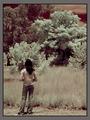
| 12/29/2002 08:08:12 AM |
4by ndsComment: I very much like the way you set the light! Also a great idea. Only that the interior in the romm can slightly be seen disturbes a bit. Still one of my favorits. |
| Photographer found comment helpful. |
| 12/29/2002 08:05:31 AM |
He's Got Legsby albright1Comment: A great piece of photographical art! The composition, light, topic are all well chosen. If I were you, I would make a series of these kind of pictures and put them as big as possible onto the wall! |
| Photographer found comment helpful. |
Home -
Challenges -
Community -
League -
Photos -
Cameras -
Lenses -
Learn -
Help -
Terms of Use -
Privacy -
Top ^
DPChallenge, and website content and design, Copyright © 2001-2025 Challenging Technologies, LLC.
All digital photo copyrights belong to the photographers and may not be used without permission.
Current Server Time: 06/18/2025 09:00:57 PM EDT.