| Image |
Comment |
| 02/06/2003 05:41:04 AM |
Plain and Simpleby agwrightComment: The flower is wonderfull: it's variation of "whites" and its texture are great. The background is a little to bright in my opinion, but I have to honest that I do not know is a darker background or even a colored one would do better.
Still a very good picture, like the frame too. Good luck to you. |
 Photographer found comment helpful. Photographer found comment helpful. |
| 02/06/2003 05:38:10 AM |
La Primevère (Primrose)by joannsComment: Great still life shot. I especially like the soft light, the reflections from the surface and it's stillness. I think the vase is a little too big compared to the flowers: I was looking back and forth between the flowers and the vase to see what is more important to the picture. Still, a great image and it will probably do well. good luck. |
| Photographer found comment helpful. |
| 02/06/2003 03:46:58 AM |
Camelliaby Geo_GriffinComment: I like many things of this photo: the arrangement is clear with the flower on a green background made from the leafs; the composition with the flower in the center is also very got here (rule of third is not always the way to go); the frame is good too; the colors and light are very good too. What I do not like is the sharppness or focus: I realy don't get what happend to the image. Can't say that it is out of focus but somehow it looks like blurring, double exposure or so. Is it from the digital sharpening? |
| Photographer found comment helpful. |
| 02/06/2003 03:40:53 AM |
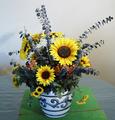
Floral Arrangementby jgillardComment: The flowers and the pot look very nice: the arrangment of the flowers, the color (although they could be more vivid) and sharpness. It's a little bright in some parts of the flower and the ligth is set a little flat (probably due to using a flash!?).
What really makes the picture look not too great is the table, the backgound and most important the two green boards. Taking them away and using a lower angle so the table would not be seen too much would have made the picture a lot better. |
| Photographer found comment helpful. |
| 01/30/2003 07:24:58 AM |
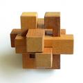
Puzzleby JamieWillmottComment: Great picture regarding light, color, texture of the wood and the focus.
What I like most is the gradual decrease of brighntess of the puzzle from the right to the left. Also the soft shadow of the puzzle on the background is great.
It is not too "square", it's more "geometry". However, it still fits the challenge IMO. |
| Photographer found comment helpful. |
| 01/30/2003 04:49:44 AM |
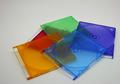
Plastic Rainbowby jgillardComment: Good choice of color in your submission. Somehow you had bad luck that the topic is choosen by other submitters. This usually leads to lower votes. The colors could be more vivid and the image itself a little brighter though. I like the arrangement of the disk covers and the simplicity of the picture: its a one-view-fully-captured-image. |
| Photographer found comment helpful. |
| 01/24/2003 05:10:26 AM |
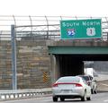
Only in Boston can you be heading North AND South at the same time!by svitalComment: The topic of you submission is great. However, it looks a little too snapshoty. I assume it is actually a snapshot taken out of the car and you could not do much about the composition while taking it. So improvements could have been done only later on the computer. Rotating it to aling the sign horizontally or maybe almost diagonal, taking away as many colors as possible so only the green, blue and red is visible, change of the cropping, all this might have added something to the picture to make it more atractive to the viewers eyes. Still, because of the topic a good submission in my view. |
| Photographer found comment helpful. |
| 01/24/2003 04:41:41 AM |
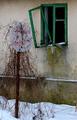
Abandonedby miracComment: The topic of your picture is awesome and your composition with the green windows too. I thing it could have been improved by lowering the saturation of the colors yellow, blue and even red and strenghten the green. I tried it and in my opinion it looks better: the dirt below the the window will look not as dirty but rather like a patina. A frame might have been nice too.
Still a wonderfull picture. good luck to you. |
| Photographer found comment helpful. |
| 01/23/2003 06:41:06 AM |
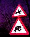
Beware of the Giant Toadby KonadorComment: LOL, a wonderful combination of the two road signs. Even without reading the size mismatch is the first thing I noticed. I like the color and darkness of the background: it's more like a surface on which the main-objects rest. Like in a studio-shot with colored and textured background.
Because you probably used the flash, the sign appear a little flat, more like a graphic rather then a real life object. I can't say if this is good or bad.
Good luck to you.
|
| Photographer found comment helpful. |
| 01/23/2003 06:33:57 AM |
Artificial Heartby ndsComment: You were realy lucky in finding one of the very few interesting signs of the challenge. Not only is it old, scratched and the tree is grown over it, its heard shape is wonderfull and you have a grat ese in seeing this. Most people would have passed by (including me).
However, somehow the cropping or size does not work well: on the thumbnail the "heart" is more obvious then on the enlarged picture. It's so big that the viewers eyes do not get the shape with one single view, his eyes have to move.
A square shaped cropping with a smaller sign might have been better.
Still, a very good picture with a wonderful idea. Good luck to you |
| Photographer found comment helpful. |
Home -
Challenges -
Community -
League -
Photos -
Cameras -
Lenses -
Learn -
Help -
Terms of Use -
Privacy -
Top ^
DPChallenge, and website content and design, Copyright © 2001-2025 Challenging Technologies, LLC.
All digital photo copyrights belong to the photographers and may not be used without permission.
Current Server Time: 12/20/2025 08:53:26 PM EST.