| Author | Thread |
|
|
02/12/2003 01:05:29 AM |
Critique Club:
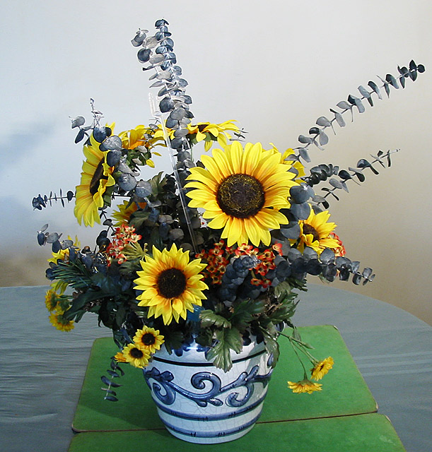
Meeting the Challenge: Does this well being a flower arrangement.
Composition: As noted below the main flaw of this photograph is what the vase is sitting on. A nice beige table cloth that may have blended in with the background or the pot resting on a little plain stool with the sky in the background might have done a lot for this photo. Yes, and taking out the card holder would have helped too. Looks like this was a bit of a rushed photo (something I'm guilty of every week!). Also, I think I would have left a bit more space in front of the vase to give it an "anchor" in the photo. Having the focal point in the center is a bit boring and photographing the arrangement with another item and taking it to one side or another might have improved composition.
Technical Quality: The colors are nice and clear. A more dramatic lighting situation might have made this photo more interesting and brought out more textures in the flowers. No major post-processing issues noticed. All the flowers and vase seem to be in focus.
Creativity: Well, not much of a wow factor here, even though the challenge was cliches, I expected some creativity to get the "best shot" of familiar subjects, which this photo lacks somewhat.
Overal Conclusion: A fair photograph that could have been greatly improved with a little more patience, better background and composition, creativity and lighting changes.
Good luck in future challenges, if you have questions about this critique, feel free to email me.
|
|
Comments Made During the Challenge  |
|
|
02/09/2003 08:40:13 PM |
|
 Photographer found comment helpful. Photographer found comment helpful. |
|
|
02/09/2003 10:36:14 AM |
|
The lighting is too bright and makes the photo very flat. Looks like an ad from the FTD catalog. The color is ok. I don't like the tables or panels that the vase rests on. They are not a healthy addition to the pic. |
|
| Photographer found comment helpful. |
|
|
02/08/2003 05:30:51 PM |
|
I don't particularly like the green mats under the pot. The colour of the table goes really well with the arrangement - it seems a pity to have something dividing them. |
|
| Photographer found comment helpful. |
|
|
02/07/2003 07:34:20 PM |
|
Its fake looking , dull .... and i just dont like it ... but good try |
|
| Photographer found comment helpful. |
|
|
02/07/2003 03:50:09 PM |
Composition: Might have tried lowering the camera so the pic did not contain any table/mats. I like the inclusion of the pot though, rather than just the flowers themselves.
Technical: The flowers look nice and vibrant but some of the leaves near the bottom are qutie dark meaning they don't have a lot of clarity.
Overall impression: Very nearly a good pic, but lacking slightly on the above. 6 |
|
| Photographer found comment helpful. |
|
|
02/07/2003 09:11:52 AM |
|
Nice floral still life. Nice piece of art work. Not real happy with the place mats it's sitting on. Wold have looked nice on the table cloth, especially since it goes so well with the top let corner. Beautiful arrangement. My sinuses can't take the ecucolyptis. The background is different, but I like it. Nice one. |
|
| Photographer found comment helpful. |
|
|
02/06/2003 05:25:49 PM |
|
I like all but the distracting green under the vase. |
|
|
|
02/06/2003 03:18:34 PM |
|
|
|
02/06/2003 03:40:53 AM |
The flowers and the pot look very nice: the arrangment of the flowers, the color (although they could be more vivid) and sharpness. It's a little bright in some parts of the flower and the ligth is set a little flat (probably due to using a flash!?).
What really makes the picture look not too great is the table, the backgound and most important the two green boards. Taking them away and using a lower angle so the table would not be seen too much would have made the picture a lot better. |
|
| Photographer found comment helpful. |
|
|
02/05/2003 07:09:50 PM |
|
OK - Jeremy!! Not only do the green things suck, the flowers are ugly!! LOL!!! And you could have taken the clear plastic stick that holds the gift card out, too. |
|
| Photographer found comment helpful. |
|
|
02/05/2003 03:42:39 PM |
Lovely arrangement, nice blurring in the background ...
Rating an 8 |
|
|
|
02/05/2003 12:07:56 PM |
|
A nice flower arrangement. The green cardboard detracts from the image. Try using a cloth to drape the table, and flower pot for that matter, and see if you think the image is improved. |
|
| Photographer found comment helpful. |
|
|
02/05/2003 02:49:36 AM |
|
Nice sharp photo but the base and background are distracting to the photo. (Nice arrangement, too!) |
|
| Photographer found comment helpful. |
|
|
02/04/2003 07:35:53 PM |
|
Beautiful bright, crisp, clear shot. Decent composition, but I find the green boards (or whatever) distracting. |
|
|
|
02/04/2003 02:14:43 PM |
|
|
|
02/04/2003 12:27:36 AM |
|
kind of blurry and the green placemats are kind of distracting, ditto for the shadow to the left and the card holder. maybe it could have been centered or photographed from a diferent angle. otherwise, not bad for plastic plants. |
|
| Photographer found comment helpful. |
|
|
02/03/2003 11:30:37 PM |
|
Nicely done. Sharp focus on most of the flowers and the vase. The background is nicely done so that it is not distracting from the flowers. The colors are bright and stand out nicely. I wish the smaller pink flowers were more in focus, but what the heck. . . Did you have to use two mats, could you not have used just one instead of having the two joined together like this? Or perhaps crop the bottom of the vase a little to cut off the 2nd mat? Nice floral arrangement. |
|
| Photographer found comment helpful. |
|
|
02/03/2003 09:18:53 PM |
|
Beautifull colors and composition, but in my opinion get rid of the green things the pot is setting on. |
|
|
|
02/03/2003 05:02:31 PM |
|
looks like an ad for FTD. |
|
|
|
02/03/2003 01:59:03 PM |
|
All these flowers look so pretty. I really like the colors in this photo. They turned out very bright and clear. And the backgound was a good choice as well. Good job. |
|
| Photographer found comment helpful. |
|
|
02/03/2003 12:35:20 PM |
|
overall a nice pic but the mats look a bit grubby.6 |
|
Home -
Challenges -
Community -
League -
Photos -
Cameras -
Lenses -
Learn -
Help -
Terms of Use -
Privacy -
Top ^
DPChallenge, and website content and design, Copyright © 2001-2026 Challenging Technologies, LLC.
All digital photo copyrights belong to the photographers and may not be used without permission.
Current Server Time: 06/27/2026 04:24:55 PM EDT.