| Image |
Comment |
| 12/13/2003 05:09:32 AM |
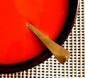
Soupby TommyMoe21Comment: What a RED! Very strong!
I like the color and the composition very much! What I do not like so much is the background: having it structured in a grid is great, but what I do not like is that you used these rubber-coated stuff. It has a sub-structure (the shadows, variing thicknesses) that attract the attention and leads it away from the main subject. Good luck to you. |
 Photographer found comment helpful. Photographer found comment helpful. |
| 12/13/2003 05:04:47 AM |
Diaryby KociComment: Fantastic play with light an shadow! Also the compostion is great, especially that it is not fully symmetrical but the distance between the shadows vary. Technically I like very much that the full dynamic range from black to white has been used here and of course it fits the challenge very well. A 9 from me. |
| Photographer found comment helpful. |
| 12/13/2003 04:31:06 AM |
Primariesby FactoryXComment: Taht's a great concept! Acctually I had something simillar in mid but didn't do so. I like the structure of the bodies and how the light and shadow play on them (for instance the shadow of the cube on the sphere. What I do not like so much is the shadow of the cone in the back: it's not well defined, not sharp and hence should have been avoided. Also the open space on the right is not necessary IMO: a quadratic cropping might have been OK too.
Anyway, your submission fits very well to the challenge and for me it's an 8 |
| Photographer found comment helpful. |
| 12/11/2003 06:58:54 AM |
Bare Symmetryby GPComment: This image for sure fits the challenge very well, however, due to the the very bright background it looks more like a drawing and thus a little flat. A little bit of structure from the wall or a different angel so one can see the 3-dinmensionality might have been better. Still, a 7 from me. |
| Photographer found comment helpful. |
| 12/11/2003 06:55:24 AM |
attitude.by jackditchComment: It might not be the image that fits to simplicity best, but to me it's for sure one of the strongest images: great composition and strong expression. And I always honour pictures showing people, because those pictures are the hardest to take IMO. Color focus etc. are great too. Good luck. |
| Photographer found comment helpful. |
| 12/08/2003 04:11:11 PM |
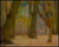
Waiting for the Elves by dsidwellComment: Absolutely fabulous! Have'nt seen such an image as a photography before. Like a painting and very inspiring. I like the enourmous variation of color very much. |
| Photographer found comment helpful. |
| 12/06/2003 11:31:48 AM |
Promises! promises!by sulamkComment: Where in the world did you get this pick!? It\'s wonderfull and the best pick of all I have seen. A less dark background might have worked better IMO: it looks like the pick is flying, making the image a little artificial. Otherwise great (like the frame too). Good luck. |
| Photographer found comment helpful. |
| 12/06/2003 11:27:21 AM |
pennilessby peeceeComment: Great idea, fitting the challenge much better then many other submissions, if not even best: the link too money is perfect. However, the image is a little too "snap-shooty" IMO. The background disturbs and due to the flash the light is too harsh. |
| Photographer found comment helpful. |
| 12/06/2003 11:24:34 AM |
Blackjack pays 3 to 2by ZalComment: Good idea and well composed. Light is also set well. Only the DOF could be a little larger and the image more crisp. |
| Photographer found comment helpful. |
| 12/06/2003 11:20:29 AM |
"Money can't buy me love" (Beatles - 1964)by NatatorComment: A strong entry! While money would not be the first thing that if it were not in this challenge, I think it fits very well. Also showing a realistic scene rather then a technically brilliant work is well suited: adds a lot to the mood of the image. For me a 8. |
| Photographer found comment helpful. |
Home -
Challenges -
Community -
League -
Photos -
Cameras -
Lenses -
Learn -
Help -
Terms of Use -
Privacy -
Top ^
DPChallenge, and website content and design, Copyright © 2001-2025 Challenging Technologies, LLC.
All digital photo copyrights belong to the photographers and may not be used without permission.
Current Server Time: 06/19/2025 01:36:10 AM EDT.