| Image |
Comment |
| 09/20/2004 12:14:57 AM |
Strike Twoby alanfreedComment: Fitting portrayal of the Pirates = )
The bokeh looks a little strange to my eye. Some selective blurring might have given a smoother look in that respect. |
 Photographer found comment helpful. Photographer found comment helpful. |
| 08/05/2004 05:27:32 PM |
It's In The Eyesby K-RobComment: Very nice portrait. I had a minature dachshound, but she passed away this past winter. This shot reminds me of her = ) |
| Photographer found comment helpful. |
| 08/02/2004 05:41:24 PM |
The Zipby KiwiChrisComment: I like the angle created by the zipper and the mood set here. I think this would look better as a black and white shot though, rather than the blue/black/white. Reason being, the colors don't contribute to the intimate nature of this shot. A great idea though. |
| Photographer found comment helpful. |
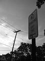
| 08/02/2004 05:39:40 PM |
Sign Post. Phone Post.by Delphi00Comment: Photographically, this shot doesn't hold very much interest. Black and white is probably the best treatment for this, but I would suggest a different composition. If the house in the bottom left is to be included, it might be better if it was completely visible. Also, the angles created by the house and telephone pole do not work well with the vertical post, and are a bit blurry as well. I'd suggest shooting this from an angle a little further left to crop out the house and pole, and the use of fill flash or positive exposure compensation to brighten up the sign a bit. |
| Photographer found comment helpful. |
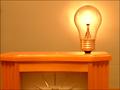
| 08/02/2004 05:26:56 PM |
What we do without it?by Prime_TimeComment: While a lightbulb would be a great subject in this challenge, I don't think it is presented as well as it could be here. The clock really doesn't belong in this composition imho - it detracts from the light bulb and with its coloring (vs the colors elsewhere in the shot), doesn't show a lot of contrast. |
| Photographer found comment helpful. |
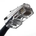
| 08/02/2004 05:25:12 PM |
RJ45by BooZonComment: The focus is spot on, showing a lot of detail in this shot. Interesting shot. |
| Photographer found comment helpful. |
| 08/02/2004 05:24:24 PM |
PHoto PHorkby scab-labComment: Lighting is well done, as is the composition. Should do well = ) |
| Photographer found comment helpful. |
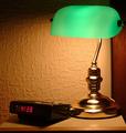
| 08/02/2004 05:23:29 PM |
Good Morningby peeceeComment: Nice low-key shot. I like the framing, but would prefer to see more detail in the alarm clock. An analogue clock (preferably with some green in it to parallel the lamp) might be a better choice. Definitely "every day" objects. |
| Photographer found comment helpful. |
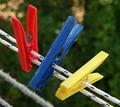
| 08/02/2004 05:21:50 PM |
Clothes Pegsby TartugaComment: Interesting subject, but might work better without the bottom two lines showing, and maybe with the green channel desaturated to just show the red, blue and yellow channels. |
| Photographer found comment helpful. |
| 07/30/2004 05:33:36 PM |
|
| Photographer found comment helpful. |
Home -
Challenges -
Community -
League -
Photos -
Cameras -
Lenses -
Learn -
Help -
Terms of Use -
Privacy -
Top ^
DPChallenge, and website content and design, Copyright © 2001-2025 Challenging Technologies, LLC.
All digital photo copyrights belong to the photographers and may not be used without permission.
Current Server Time: 07/23/2025 10:12:14 AM EDT.