| Image |
Comment |
| 05/23/2005 06:01:19 PM |
Natures Lightby BrianRComment: Always a good subject for light, but the composition here could be improved imho. My eyes are drawn to the roof of the house for its sharp edges and bright red. It competes with the rainbow for attention. Also, the post processing looks a little rushed. There is a clear and noticeable line separating the trees from the sky. To me it looks like either a little too much use of the clone tool or a composite image. The rainbow in itself is good, but I think the rest of the image really needs work. A softer background/foreground would better compliment the rainbow in my opinion. |
 Photographer found comment helpful. Photographer found comment helpful. |
| 05/23/2005 05:56:21 PM |
Sun Rise on the Marshby JeileenComment: Appears a little soft to me. The lighting and composition is good, but the post processing doesn't add to this imho. |
| Photographer found comment helpful. |
| 05/22/2005 07:27:17 PM |
jmlelii, Maverick and Phreakonby banmornComment: (just for clarification, I'm the Maverick with an 'e' and a 'c', there's another photographer who goes by Mavrik, but that's not me = )
Apologies for the unintentional rhyme.. |
| Photographer found comment helpful. |
| 04/26/2005 11:38:27 AM |
Different Outlooksby MarjoComment: Nice capture - I like that the horse's leg is blurred, suggesting movement. I'd like to see a closer crop on the two subjects (to better emphasize the 'people' aspect of the challenge), but I also like having the horse and buggy fully in the shot. A tighter crop on the buggy/horse as a whole might accomplish this as well IMHO. The child's expression is great = ) |
| Photographer found comment helpful. |
| 04/26/2005 11:32:08 AM |
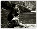
Childhood Memoriesby BradComment: Definitely sticks out as a memorable shot. I like the candid-esque look as well. The only suggestion I would have is to maybe clone out the highlighted area on the top right of the scene. IMHO it competes with the two people. |
| Photographer found comment helpful. |
| 04/26/2005 11:28:48 AM |
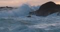
Angry Seaby mpembertonComment: Nice capture and framing. This might benefit from a little dodging and/or burning to further distinguish the water from the sky and the water highlights. |
| Photographer found comment helpful. |
| 04/16/2005 09:53:21 AM |
|
| Photographer found comment helpful. |
| 04/16/2005 09:51:50 AM |
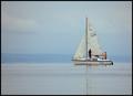
Tacks to find the breeze.by banditComment: Nice use of the challenge topic, hopefully most people will get it. Too bad about the hazy background, but you can't control the weather. |
| Photographer found comment helpful. |
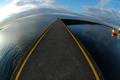
| 02/16/2005 08:20:14 PM |
The Ocean is Our Bridgeby ccraftComment: Great wide angle effect = )
I like how the image is divided between light (left side) and shadow (right side). The bridge serves a dual purpose of separating this lighting and adds to the scene. |
| Photographer found comment helpful. |
| 02/16/2005 08:18:28 PM |
February Thawby rileyComment: Not really fond of the use of selective desaturation here. It doesn't really add to the photo other than to prevent the guardrail from blending in too much with the trees - adding some contrast might have accomplished that in a better way imho. Also, the bridge is not perfectly horizontal - in this framing, it is somewhat awkward. Might be better to include part of the bridge that is connected to the ground. |
| Photographer found comment helpful. |
Home -
Challenges -
Community -
League -
Photos -
Cameras -
Lenses -
Learn -
Help -
Terms of Use -
Privacy -
Top ^
DPChallenge, and website content and design, Copyright © 2001-2025 Challenging Technologies, LLC.
All digital photo copyrights belong to the photographers and may not be used without permission.
Current Server Time: 07/22/2025 02:10:14 AM EDT.