| Image |
Comment |
| 06/18/2006 07:48:25 AM |
Window to Lifeby JibComment: good frame you have chosen, but the focus seems a bit off |
 Photographer found comment helpful. Photographer found comment helpful. |
| 06/18/2006 07:36:38 AM |
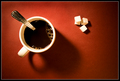
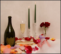
Morning Wake-Up Juice!by FotoMunkiComment: Fantastic red&white. Those sugarcubes are so perfectly placed, and the teaspoon just a little bit a way there. We are all so used so see cups placed for right-handed persons, this is a novelty. I really really do hope your shot does well, it sure deserves it. Framing is fine too. |
| Photographer found comment helpful. |
| 06/18/2006 07:29:33 AM |
|
| Photographer found comment helpful. |
| 06/18/2006 07:27:54 AM |
|
| Photographer found comment helpful. |
| 06/18/2006 07:27:27 AM |
|
| Photographer found comment helpful. |
| 06/18/2006 07:15:44 AM |
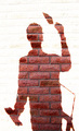
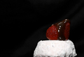
Caught Redhandedby mpetersComment: In a hurry to get my voting done, last day today. Finding myself wondering how this was done. Maybe a cardboard that has been cut out and painted. I have to remember to come back and hopefully find info :)
I really do like it. The lights are good, on the floor and then the wall, the painter has maybe got a tad too much, maybe not. The colours are good, not too strong, I like that. The blue frame is a really good idea. Frames are hard to place in my opinion and I do like them so ... when well placed, they can ruin a shot sometimes, this one does exactly what it is meant to do.
Hope it does well. |
| Photographer found comment helpful. |
| 06/18/2006 07:11:18 AM |
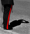
Parade Groundby e301Comment: Simple, elegant, strong, humorous, colourful (even if it is b&w+red), good ppwork. Well done, hope it does well. |
| Photographer found comment helpful. |
| 06/18/2006 07:07:58 AM |
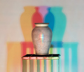
Raku RGBby rioloboComment: Wonderful idea and well executed, hope it does well. |
| Photographer found comment helpful. |
| 06/18/2006 07:06:40 AM |
|
| Photographer found comment helpful. |
| 06/18/2006 07:05:38 AM |
Her Indulgenceby scarbrdComment: Took a long time till I saw those toes, this is actually the second time I come for a look-see and to comment. I like the shot, but would like to make two suggestions. I think it would render the atmosphere better if there was less light, it would be more sensual that way. And then there are almost too many things on display and they are spread out. But as I said, I like it. |
| Photographer found comment helpful. |
Home -
Challenges -
Community -
League -
Photos -
Cameras -
Lenses -
Learn -
Help -
Terms of Use -
Privacy -
Top ^
DPChallenge, and website content and design, Copyright © 2001-2025 Challenging Technologies, LLC.
All digital photo copyrights belong to the photographers and may not be used without permission.
Current Server Time: 08/26/2025 02:38:15 AM EDT.