| Image |
Comment |
| 05/28/2003 05:51:56 PM |
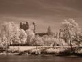
The Castleby inspzilComment: There seems to be barely any contrast here... it all kind of fades into one. I also think you should have thought more about the rule of thirds when cropping, there seems to me to be a lot of extraneous sky. I would have cropped down to just slightly above the highest tree on the right side. I also don't care for the power lines (?) running through the photo. Looks like an interesting subject though... I would suggest trying again with different angles and views of "the castle" |
 Photographer found comment helpful. Photographer found comment helpful. |
| 05/28/2003 05:46:10 PM |
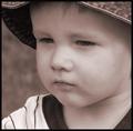
Deep Thinkerby karmatComment: This is cute... I like it in sepia. Good use of contrast and DOF. Even though it is adorable, it lacks WOW IMHO. Still a nice photo. -8- |
| Photographer found comment helpful. |
| 05/28/2003 05:28:37 PM |
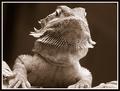
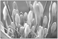
I'm Ready For My Close Upby CreativeFlyPhotoComment: GREAT macro... this was through a screen correct? it looks like it was, but I could be wrong. Wow... the details are incredible on this little guy... I really like the sepia tone as well. There's a tad bit too much light on the tip of his nose, and on the shoulder that is on the right side of the photo, but otherwise this was done really well. -9- |
| Photographer found comment helpful. |
| 05/26/2003 11:58:08 AM |
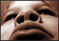
A Very Unusual Portraitby smellyfish1002Comment: Very unusual and very interesting. I don't usually care for up the nostril shots, but I kind of like this one. Lots of texture in the lips, I think this photo is very well done. I like the sepia, although you could have made it just slightly less brown. Nicely done photo, with a different angle on what could have been a very plain subject. -8- |
| Photographer found comment helpful. |
| 05/26/2003 11:56:28 AM |
The Guitaristby arnitComment: This is kind of cool... I like the DOF you used here, makes for a very interesting photo that could have been quite plain. Nice job getting down and really trying different angles on the subject. The sepia gives it an old time look. |
| Photographer found comment helpful. |
| 05/26/2003 11:54:37 AM |
untitledby DigitalGravyComment: Too busy with very little contrast. Not extremely interesting, this may have been a better color photo. |
| Photographer found comment helpful. |
| 05/26/2003 11:23:45 AM |
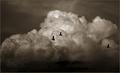
Three Ducksby DennisFComment: Very, Very Cool! Superbly done, beautiful yet simple, would not have been the same without the birds in the photo.... great use of sepia, overall just a fantastic photo! I hope this does really well! Good luck! -10- |
| Photographer found comment helpful. |
| 05/26/2003 11:22:22 AM |
Hello thereby MusicmanComment: This photo seems fuzzy to me. I think it actually would have been more effectual in color, with the green grass behind the animal. Personally I don't care for it. Also the cow somehow looks a little tilted. Sorry but I don't think that you attained what you were going for. |
| Photographer found comment helpful. |
| 05/26/2003 11:19:54 AM |
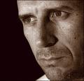
Introspectiveby ToddhComment: Wow! In the thumbnail I thought this was going to be a very plain portrait, but now, big, it's incredible. This guy's face is AWESOME! Really cool textures here, and his eyes are superb! Nicely lit, and the photo tells a story. I love the sepia, just a very well done photo, that hits you and keeps your attention. Solid 10! |
| Photographer found comment helpful. |
| 05/26/2003 11:14:27 AM |
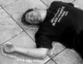
Crime sceneby hawkidaComment: LOL.... the shirt just pulls it all together. Very interesting... I really like it! Well done, creative, little extreme shadow, pure, simple, to the point, and it makes a statement. |
| Photographer found comment helpful. |
Home -
Challenges -
Community -
League -
Photos -
Cameras -
Lenses -
Learn -
Help -
Terms of Use -
Privacy -
Top ^
DPChallenge, and website content and design, Copyright © 2001-2025 Challenging Technologies, LLC.
All digital photo copyrights belong to the photographers and may not be used without permission.
Current Server Time: 08/21/2025 05:31:14 AM EDT.