| Image |
Comment |
| 01/16/2012 05:08:53 PM |
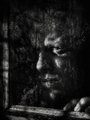
Man in the Mirrorby gyabanComment: Great take on surrealism (or the invisible man :).
I don't find the, uhh, inside gray colour too convincing and tridimensional, if this makes sense. Not sure if a different hue on it or on the background would have made a difference under that respect. Good work. |
 Photographer found comment helpful. Photographer found comment helpful. |
| 01/16/2012 05:04:04 PM |
|
| Photographer found comment helpful. |
| 01/16/2012 05:03:10 PM |
|
| Photographer found comment helpful. |
| 01/16/2012 04:58:17 PM |
|
| Photographer found comment helpful. |
| 01/16/2012 04:56:48 PM |
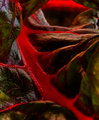
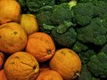
Eat More Leafy Greensby sfaliceComment: Almost SF, interesting and admittedly not the most attractive reppresentation of the leafy greens :) |
| Photographer found comment helpful. |
| 01/16/2012 04:55:32 PM |
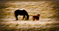
Don't Stop! by TiberiusComment: Kung - Fu? I like the DOF and the general tones to the image, quite harmonious. |
| Photographer found comment helpful. |
| 01/16/2012 04:54:28 PM |
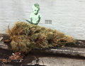
More Ruffageby banmornComment: I like the two ranges of tones and the detail. I find that brighter and more vibrant colours would have made for a more attractive image, if that was the intention. |
| Photographer found comment helpful. |
| 01/16/2012 04:51:47 PM |
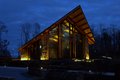
Grow Closer with God..by bargleComment: I like the contrasting hue of the outside VS church, and the framing. There are a few things that, in my opinion, could have made the image more effective and self descriptive, even without any title.
The hue of the church shows a bit yellowish, at least on my monitor, a slightly warmer cast would have made for a more inviting focal point to the image. Detail on the church could be better, perhaps a case for using a tripod. A framing or some element suggesting inquivocably that this is a church would have gone a long way makign the concept clear without any title. I am unsure about the inclusion of the house on the left, a crop exclusing it might simplify the image leaving only looming woods and church. Just my opinion, no offence taken I hope. |
| Photographer found comment helpful. |
| 01/16/2012 04:41:03 PM |
|
| Photographer found comment helpful. |
| 01/16/2012 04:38:16 PM |
|
| Photographer found comment helpful. |
Home -
Challenges -
Community -
League -
Photos -
Cameras -
Lenses -
Learn -
Help -
Terms of Use -
Privacy -
Top ^
DPChallenge, and website content and design, Copyright © 2001-2025 Challenging Technologies, LLC.
All digital photo copyrights belong to the photographers and may not be used without permission.
Current Server Time: 08/22/2025 08:29:12 AM EDT.