| Image |
Comment |
| 01/31/2006 02:07:58 PM |
|
 Photographer found comment helpful. Photographer found comment helpful. |
| 01/31/2006 02:07:06 PM |
|
| Photographer found comment helpful. |
| 01/31/2006 02:01:12 PM |
|
| Photographer found comment helpful. |
| 01/31/2006 01:53:57 PM |
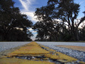
The Old Wayby dahvedComment: **** Greeting from the Critique Club ****
Challenge
- Relevant to the Challenge? Yes
- Is subject unique (vs. unoriginal or rehashed)? Yes. There were a few images composed with this point of view, but I think it's still unique.
Compostion
- Good or Bad? How can it be fixed? There are two minor things about the composition. The large crack up front dominates the image. Six inches forward or back might have made a difference. The road is your subject, but it is barely present. The point of view is too low, in my opinion. Bring the camera up by six inches to bring the road out, while still having the unique low view. The sky is great, but the trees are really bland.
- Good use of Depth of Field? Yes
- Good focus? I can't really tell where the focus is. It seems to be one of the trees on he right side of the road.
Lighting
- Good use of light? As someone mentioned below, your trees are overly dark.
Aesthetics/Artistic Appeal:
- What is my reaction or feelings? The subject just isn't that interesting to me. You have a light competing with dark thing going on. The Road and the Sky vs. the Trees and the Crack. The image is very busy. |
| Photographer found comment helpful. |
| 01/30/2006 10:40:57 PM |
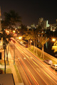
The Boulevardby gliphixComment: **** Greeting from the Critique Club ****
Challenge
- Relevant to the Challenge? Yes
- Is subject unique (vs. unoriginal or rehashed)? Yes and No. The viewpoint is unique, but the long exposure capturing the head/taillights was common in this challenge.
Compostion
- Good or Bad? How can it be fixed? Nice leading lines and unique view. The left side of the image ruins it for me though. The one palm extends into the image too far. Give me a clear view down the road. Let me follow the string of lights.
- Good focus? The focus is a bit soft, probably due to the 10 sec exposure and camera shake.
Lighting
- Good use of light? Yes, the lighting is good, but the image is overexposed. You used a very narrow aperature , but a high ISO. I'd try using an 800 ISO instead. The street lights and the reflections on the cars are the places that you notice the blown highlights.
- Good use of shadows? Yes No
Aesthetics/Artistic Appeal:
- Colors and Contrast. The colors are a little dull, but the contrast of the lit road and the dark water is a nice touch.
- What is my reaction or feelings? Long exposures make me go, "Ho hum." Just a personal opinion. |
| Photographer found comment helpful. |
| 01/26/2006 12:35:03 AM |
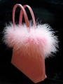
Frivolousby joycobbComment: Challenge
- Relevant to the Challenge? Yes.
Compostion
- Good or Bad? How can it be fixed? First the background. I think there should be more velvety folds, not less. The image is nicely composed. Not quite centered, which is my style.
- Good use of Depth of Field? I can't tell if the sfotness is due to the narrow DOF or if you went crazy with NeatImage. There are parts of the image that are soft right next to parts that are details. It doesn't quite look natural. Maybe you should have gone for a wider DOF?
Lighting
- Good use of light? You have good light, but you also have some blown highlights on the handle. Soft the light or under-expose it to give us more details in the feathers in the center.
- Good use of shadows? Yes. The shadows are good on the front of the handles and the front of the bag has a nice gradual shading.
Aesthetics/Artistic Appeal:
- Colors and Contrast. Good job on the contrast between the light pink and the black.
- What is my reaction or feelings? Well, I gave it a 6 and you had heavy competition in backlighting. I keep leaning in to look at the feathers on the right edge. I love the details over there. |
| Photographer found comment helpful. |
| 01/25/2006 11:36:17 PM |
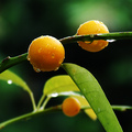
fresh lime juiceby crayonComment: Challenge
- Relevant to the Challenge? Oddly and compelingly I'd have to say, "Yes."
- Is subject unique (vs. unoriginal or rehashed)? Yes
Compostion
- Good or Bad? How can it be fixed? Okay the thing that bugs me about the composition is that the other limb is directly behind the focal point. It... It... I'm at a loss to describe what feels wrong about it. The background is awsomely done though.
- Good use of Depth of Field? Yes You did a good job of making the background go out-of-focus.
- Good focus? Yes
Lighting
- Good use of light? Yes
Aesthetics/Artistic Appeal:
- Colors and Contrast The colors are nice, vibrant even, and the contrasting of the light green leaves and the dark green background is perfect. THAT'S IT. That's the compositional issue. The contrast pulls the eye from the focus of the lime buds.
- What is my reaction or feelings? It's a well done photo, but is a little busy, in my opinion. It's outside the box, which I like, but others didn't seem to appreciate it inside the challenge.
Good job on the 6.1. |
| Photographer found comment helpful. |
| 01/25/2006 01:24:39 PM |
Candles in morning sunby MelethiaComment: Challenge
- Relevant to the Challenge? Yes. Especially between the two candles.
- Is subject unique (vs. unoriginal or rehashed)? Yes
Compostion
- Good or Bad? How can it be fixed? Good composition, however I'd stand the wick up and trim it a little.
- Good use of Depth of Field? Yes.
- Good focus? Yes.
Lighting
- Good use of light? The light is on the bright side across the top of the candles. Soften it some.
Aesthetics/Artistic Appeal:
- Colors and Contrast. I'm assuming that the candle on the right is a greenish one, but the color is lost in the reflected sun. Anyway, color isn't important in this image. The contrast is great with the white candle against the dark background and the light through the candle contrasting with the other candle.
- What is my reaction or feelings? I like this image it's a nicely done macro.
|
| Photographer found comment helpful. |
| 01/25/2006 02:01:41 AM |
|
| Photographer found comment helpful. |
| 01/25/2006 02:00:00 AM |
|
| Photographer found comment helpful. |
Home -
Challenges -
Community -
League -
Photos -
Cameras -
Lenses -
Learn -
Help -
Terms of Use -
Privacy -
Top ^
DPChallenge, and website content and design, Copyright © 2001-2025 Challenging Technologies, LLC.
All digital photo copyrights belong to the photographers and may not be used without permission.
Current Server Time: 08/05/2025 12:01:30 PM EDT.