| Image |
Comment |
| 08/23/2006 05:05:27 PM |
|
 Photographer found comment helpful. Photographer found comment helpful. |
| 08/21/2006 11:57:58 AM |
The Flaming Snowballby RebeccaComment: Hmmmm... The first thing I notice when I look at this is the fuzzy halo caused by the blurring of the background. I think you over did it with the blur and your selection control needs a bit of work. For example look at her fingertips. They came out slightly fuzzy.
Just my personal preference, but since it's advanced I would have touched up the stray hairs by cloning.
I like the composition, except I'd like to see more of her expression (blocked by the hair) and the face of the girl in the background. |
| Photographer found comment helpful. |
| 08/16/2006 11:46:24 AM |
Camera Obscuraby photom1946Comment: I like the crop here, but the only thing that bothers me is the Finger going accross the bottom left side. Very distracting. |
| Photographer found comment helpful. |
| 08/16/2006 11:40:22 AM |
P100 Undercoverby nordicgirlComment: I like your originality here. I hope the dimness of the reflection doesn't hurt it too much, but being DPC I think it might. It's an image that makes you stop and look. |
| Photographer found comment helpful. |
| 08/09/2006 12:14:31 AM |
Falling apart by hannekeComment: Congrats Superchicken! I agree that the difference between the images and the face is distracting, but great concept, girl! |
| Photographer found comment helpful. |
| 07/14/2006 12:58:05 AM |
threesome.jpgby HBunchComment: Originally posted by Judi:
Now that's the colour everyones hair should be!!! |
Hell you mean I need to dye my hair after all these years? |
| Photographer found comment helpful. |
| 07/05/2006 10:04:57 PM |
Honey, Where's The Dog?by idnicComment: You are one sick puppy, my friend. I know I liked you for a reason. lol
Great layout and spacing. Love the shadows and the POV. My one nit to pick is the lines of the mat converging at the top. |
| Photographer found comment helpful. |
| 06/14/2006 01:04:28 AM |
Over Indulgedby TonyTComment: Focus is off. The lines should be the focus not the currency, right? |
| Photographer found comment helpful. |
| 06/06/2006 04:31:16 PM |
LUCKY STRIKE SMOKESTACKby MelTech1Comment: oooo Greeting from the Critique Club oooo
Challenge
- Relevant to the Challenge? Yes, but aesthetically it leaves me wanting more.
- Is subject unique (vs. unoriginal or rehashed)? Most definitely.
Compostion
- Good or Bad? How can it be fixed? There are two things that draw attention away from the subject (smoke stack) the pipes and mechanicals below the stack and the water tower on the edge of the image. Any time you have a complex pattern (pipes) or an object on an edge it' will draw the attention away from your subject. Simplify your composition here. Rotate your stack to be verticle.
- Good use of Depth of Field? Yes
- Good focus? Yes
Lighting
- Good use of light? Yes. I like the light rounding the edge of the stack.
Aesthetics/Artistic Appeal:
- Colors and ContrastI like the red of the bricks, but the sky looks odd (maybe it's just my monitor.)
- Sharpness. Good.
- What is my reaction or feelings? I think this would have done better in the Industrial Challenge than Architecture. With some work it could be a great image. |
| Photographer found comment helpful. |
| 06/06/2006 02:59:48 PM |
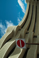
No entry- God's Playgroundby smykComment: oooo Greeting from the Critique Club oooo
Challenge
- Relevant to the Challenge? Hard not to be in this one. ;)
Compostion
- Good or Bad? How can it be fixed? I don't understand why you chose to rotate the image. I might understand if the sign weren't there, but it is and ruins the flow of the building. On or the other needs to change. No Rotate or no Sign.
- Is there anything missing?
- Good use of Depth of Field? Yes. This requires a wide DOF which looks good.
- Good focus? Yes
Lighting
- Good use of light? Yes & No. I like to see more of the shadows, but the design of the building overhang might not allow for thme in that area. I love the shape of the shadows in the bottom portion.
Aesthetics/Artistic Appeal:
- Colors and Contrast. The sky has a funny tealish tint to it and seems oversaturated.
- What is my reaction or feelings? I'd like to see this on re-shot without the sign. If you do go take a ladder with you to get the weight you need toshoot over the sign... |
| Photographer found comment helpful. |
Home -
Challenges -
Community -
League -
Photos -
Cameras -
Lenses -
Learn -
Help -
Terms of Use -
Privacy -
Top ^
DPChallenge, and website content and design, Copyright © 2001-2025 Challenging Technologies, LLC.
All digital photo copyrights belong to the photographers and may not be used without permission.
Current Server Time: 08/09/2025 05:03:53 PM EDT.