| Image |
Comment |
| 05/31/2008 07:04:49 PM |
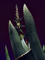
AgaveTall_IMG_2717eCZ-DPC.jpgby GeneralEComment: Great improvement here! Adds a lot of interest with this edit. I like the purplish tint in the background, though it seems a bit unreal, but it goes with the edit nicely. I think the one change I'd make is the highlight on the bottom... broken leaf? It seems to stand out and draw attention to a difference in the lighting to me. |
 Photographer found comment helpful. Photographer found comment helpful. |
| 05/24/2008 08:22:24 AM |
|
| Photographer found comment helpful. |
| 05/24/2008 08:14:13 AM |
Standing Tallby Nikolai1024Comment: Love the complimentary colors here and the lighting is very nice. I think the shot contains so much blue of varying shades, that the blue border is just too much. |
| Photographer found comment helpful. |
| 05/24/2008 08:10:30 AM |
The Queen's Courtby idnicComment: Great, fun shot and it's nice that they all have a smile. The mix of lighting is handled nicely. I think it could stand to be a tad brighter, if that is possible without completely losing those highlight areas. The symmetry here of the trees in the background gives a nice sense of balance, but the whole shot seems slightly tilted counterclockwise. |
| Photographer found comment helpful. |
| 05/24/2008 08:03:06 AM |
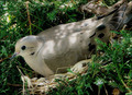
Dappled Doveby Blue MoonComment: I'm usually a fan of the diagonal compositions, however here it makes it feel like the bird is going to fall from the nest. The lighting is handled wonderfully though, with a nice balance of light and dark. |
| Photographer found comment helpful. |
| 05/24/2008 07:59:41 AM |
Follow the Dreamsby TimetorunComment: Lovely shot, and the bright and shadow areas are nicely balanced. The overall composition, however, with your model leaning towards the outside feels unbalanced, as if she is going to fall out of the shot. |
| Photographer found comment helpful. |
| 05/22/2008 05:28:29 PM |
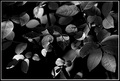
Castle view 1by MelethiaComment: Love the framing with the tiny leaves. Adds a little extra without covering anything up too much. Great choice to go b/w with this one too. I think the shapes are the most important thing here and color would have just gotten in the way. |
| Photographer found comment helpful. |
| 05/22/2008 05:27:10 PM |
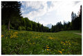
Garmisch meadowby MelethiaComment: This is beautiful. Great depth and the leading lines are perfect. I could sit there for hours! |
| Photographer found comment helpful. |
| 05/18/2008 12:02:26 PM |
Bah Humbugby JutildaComment: Too funny! My cat would never sit still long enough for me to even get one shot in! |
| Photographer found comment helpful. |
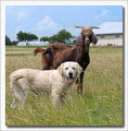
| 05/18/2008 12:01:49 PM |
of Dogs and Goatsby JutildaComment: This couldn't be posed any better! The symmetry here is great, and I love the wagging tails! Wonderful! |
| Photographer found comment helpful. |
Home -
Challenges -
Community -
League -
Photos -
Cameras -
Lenses -
Learn -
Help -
Terms of Use -
Privacy -
Top ^
DPChallenge, and website content and design, Copyright © 2001-2025 Challenging Technologies, LLC.
All digital photo copyrights belong to the photographers and may not be used without permission.
Current Server Time: 08/05/2025 03:00:20 PM EDT.