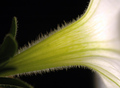
DPChallenge: A Digital Photography Contest You are not logged in. (log in or register
 
Browse Settings
Currently viewing:
Registered Userkteach

Show comments:

Per page:

Order:

Comments:


Comments Made by kteach
Pages:   ... [127] [128] [129] [130] [131] [132] [133] ... [194]
Showing 1291 - 1300 of ~1936
Image Comment
Trumpet
07/12/2006 03:44:01 PM
Trumpet
by Kronus

Comment:
Greetings from the Critique Club!

First Impression:
Ooh! I love macros! Love all the little hairy fuzzies on the flower, and how only one row of them is focused.

Composition/Background:
I think the black background works well here. With anything in the background, the little hairs (I really don't know what else to call them) wouldn't have stood out as well. My eye tends to wander around the focused areas of the shot around the greener part of the flower, and then to the leaf, but tends to avoid the brighter spot on the right. It took me a while to even see that the hairs went all the way up to the top.

Technicals:
I think my biggest issue technically is that bright white spot. I like the lighting you used, it just got a bit bright in that one spot. Perhaps a slightly faster shutter speed would have helped? Or maybe a very pastel color of flower?

Post Processing:
I think the crop you used works for what you started with. If you had left more to the right, it appears as if you may have left a dull grey which would have been unappealing. My only suggestion might be to rotate the shot slightly counter-clockwise to make the flower at more of an diagonal across the frame. Then again, without seeing it, I could be wrong.

Overall:
It looks like this shot was fairly well received by the voters with its score and the great comments. I didn't vote in this challenge, but probably would have given it a 7.

If you have any questions or comments, please feel free to PM me.
Photographer found comment helpful.
A lonely survivor
07/12/2006 09:56:08 AM
A lonely survivor
by Krisby

Comment:
Greetings from the Critique Club!

First Impression:
This is a nice shot, but doesn't necessarily have that "Wow!" factor that seems to bring in the high scores around here.

Compostion/Background:
I think you've placed the main subject well in the shot. Perhaps placing it a bit lower would follow the rule of thirds more closely, but if you went too much lower you would lose the leaves on the flower that you were shooting, and I like those. The background is good, as far as its coloring that doesn't distract from the subject, but I think a shallower dof could have helped to blur some of it out which would have put more focus on the flower itself.

Technicals:
As you noted in your photographer comments, you realize that your lighting is off, and it gives this shot a bit of a flat look. This is an area that I struggle with as well, and I find it easier to play around with lighting inside where I have more control. But back to this shot, perhaps playing with the flash, or a simple reflector could help. What I do like about the lighting you used is that you didn't just put the flash on or shoot in the middle of a sunny day and blow out the highlights of the white flower. So I think you're already understanding some of the important aspects of lighting.

Going back to the shallower dof, you used an aperture of f/7.1 which gives a relatively shallow dof, but bumping to to f/3.5 would have given you an even shallower dof, and an even more out of focus background. However, in order to do that, the shutter speed would have been too slow to hand hold, and a tripod would have been necessary.

Post Processing:
Clearly there have been varying thoughts on the use of the border here from other commenters, so I'll start with that. I like borders, and I like the use of a white border inside the shot. I think it works nicely here. However, I think it might have been a bit too thick and distracting for some voters. Perhaps a simple stroke of just a few pixels would have worked better. The other thing I noticed in your post processing is the extra rows of pixels to the right and bottom of the shot. It looks like you cropped the shot, but accidentally cropped outside the area of the photo, so you ended up with blank pixels in those areas.

Overall:
I think the 5.01 this shot received was partially due to the challenge it was in. In a challenge where voters are voting on hundreds of flower pictures, you need to really wow them in order to get the higher scores. You seem to know where some of your weaknesses are, so maybe reading up on some of the tutorials here or some of the learning threads in the forums would help you. Here is a thread on landscape photography where lightning was one of the first topics covered. Learning Thread - Landscape Photography

As for learning your camera, take it out of Auto mode and just start shooting and playing around. Look back at the EXIF data for the pictures to see what you changed and what you like best. Good luck in your future challenges! :)

Feel free to PM me if you have any questions or comments about this critique!
Photographer found comment helpful.
Staple City
07/11/2006 06:08:23 PM
Staple City
by Marston

Comment:
I like how you angled some of the staples so that they're not all facing one direction. Gives a little more depth to the shot. Nice!
Photographer found comment helpful.
Six
07/11/2006 06:05:51 PM
Six
by sherpet

Comment:
I like the composition here with the spiraling of the pencils and the colors. Seems just a tad oversharpened. Great job!
Photographer found comment helpful.
Indians of the Great (paper) Plain
07/11/2006 06:04:42 PM
Indians of the Great (paper) Plain
by PeterPic

Comment:
Ok, this is just way too creative! I love the little campfire! A great "thinking outside of the box" shot! :)
Photographer found comment helpful.
Ancient stationery
07/11/2006 10:15:31 AM
Ancient stationery
by manishk

Comment:
Trying to leave some more in depth comments on random photos, so here goes...

I like the slight tilt of the papers in the frame of the shot and the duotone coloring, though it seems just a tad yellow and I might have made it a bit more brown. Considering that I can't read what is written on the paper, I think if I had been able to it might distract from the idea of the photo, so it was a good choice. Suggestions for improvement? Besides the possible change in color for the duotoning, it seems like the tips of the fingers get lost in the lighting, and I'd like to see a bit more definition there. Nicely done!
Photographer found comment helpful.
Flying Diary
07/11/2006 10:11:23 AM
Flying Diary3rd Place
by De Sousa

Comment:
Trying to leave some more in depth comments on random photos, so here goes...

I like the unique perspective here, its much more interesting than a typical still shot of a diary with pen. The soft colors and reflections of color in the pages are wonderful. The movement of the pages is interesting, the pages are well focused with just a little bit of the movement being apparent, which unexpected, but nice. Suggestions for improvement? Maybe a slight crop to get rid of some of the dark colors on the bottom and right? I think you pulled this together very nicely. Well done and good luck!
Photographer found comment helpful.
-Sheets- of paper
07/11/2006 06:40:52 AM
-Sheets- of paper
by becky-lee

Comment:
Trying to leave some more in depth comments on random photos, so here goes...

After looking at this one for a few seconds, I finally got why the title has the dashes in it... *groan*. Very clever! I like the composition here with the clotheslines going straight across and at the angle. The bright colors of paper are just enough in this shot without being too overbearing. You also caught some great clouds here which I think make for a better picture than a plain blue sky. Suggestions for improvment? The clouds at the very left of the shot seem a bit overexposed, and draw my attention away from the paper. Also, seems to be a bit of either oversharpening or compression along the clotheslines and on the edges of the paper. Nicely done!
Photographer found comment helpful.
Looks Like I Need To "Sharpen" My Pencils!
07/11/2006 06:35:57 AM
Looks Like I Need To "Sharpen" My Pencils!
by BethieB

Comment:
Trying to leave some more in depth comments on random photos, so here goes...

I like the angle of this shot, and how the pencils are all lined up in the back, but vary in length to put some variety in the front. The diffused lighting also avoided what could have been some really harsh shadows under the tips of the pencils. It's even a clever title to go with the shot. Possible suggestions for improvement might be to shoot this from a bit more to the left so that it is more symmetrical and you can get the whole tip of that last pencil in. The words stand out on those two pencils too, so maybe rotating them so the words were hidden? Good luck in the challenge!
Photographer found comment helpful.
#10 Mike Hatzl
07/10/2006 10:01:21 PM
#10 Mike Hatzl
by xcharrier

Comment:
Nice action shot, and love the shallow dof too. Well done!
Photographer found comment helpful.
Pages:   ... [127] [128] [129] [130] [131] [132] [133] ... [194]
Showing 1291 - 1300 of ~1936


Home - Challenges - Community - League - Photos - Cameras - Lenses - Learn - Help - Terms of Use - Privacy - Top ^
DPChallenge, and website content and design, Copyright © 2001-2025 Challenging Technologies, LLC.
All digital photo copyrights belong to the photographers and may not be used without permission.
Current Server Time: 08/09/2025 03:30:59 AM EDT.