| Author | Thread |
|
|
07/17/2006 10:27:26 PM |
|
A little more attention with the lighting and this image would have finished much higher. However, the delivery of the image is great. Congratulations on your top 20 finish. |
|
 Photographer found comment helpful. Photographer found comment helpful. |
|
|
07/12/2006 11:26:30 AM |
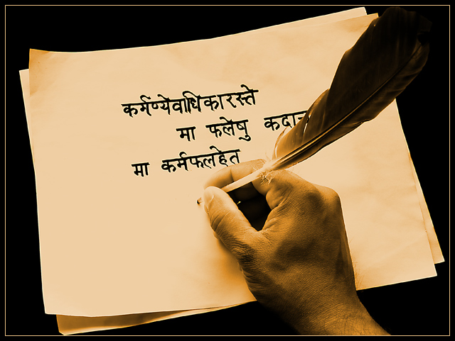
kteach: I fully agree with your observations. The finger does get lost in the paper. About the color: reducing the yellow was making the hand look like actual skin color and was not producing the ancient feel, but I agree that I need to learn sepia toning. This was my first attempt at making sepia.
lauralink: Yeah, it doesn't look ancient to me as well :) an older hand, and a better burning (not photoshop burning, but burning in oven) of the paper could have made it look ancient.
Commando303: You have it right.
Jutilda: I fully agree with you. It does need more negative space and a different angle.
once again, thanks every one for your excellent remarks.
Message edited by author 2006-07-12 12:15:02. |
|
Comments Made During the Challenge  |
|
|
07/11/2006 05:57:35 PM |
|
| Photographer found comment helpful. |
|
|
07/11/2006 10:15:31 AM |
Trying to leave some more in depth comments on random photos, so here goes...
I like the slight tilt of the papers in the frame of the shot and the duotone coloring, though it seems just a tad yellow and I might have made it a bit more brown. Considering that I can't read what is written on the paper, I think if I had been able to it might distract from the idea of the photo, so it was a good choice. Suggestions for improvement? Besides the possible change in color for the duotoning, it seems like the tips of the fingers get lost in the lighting, and I'd like to see a bit more definition there. Nicely done! |
|
| Photographer found comment helpful. |
|
|
07/11/2006 06:39:22 AM |
|
I understand tha a quill is a rather primitive tool, but it doesn't convey that the stationery is itself ancient. The photo is good, with sepia undertone, but it fails to match the "ancient" part of the title. There is also the fact that the photo captures the ongoing writing of the note, which is not an ancient event, but current for the photographer. |
|
| Photographer found comment helpful. |
|
|
07/10/2006 01:56:15 PM |
|
I saw another like this but this picture clearly has more of a "wow factor" to it. Nice job, and awsome tone. |
|
| Photographer found comment helpful. |
|
|
07/10/2006 01:23:38 PM |
|
| Photographer found comment helpful. |
|
|
07/08/2006 11:21:57 PM |
|
| Photographer found comment helpful. |
|
|
07/08/2006 01:28:14 AM |
karmanyay-vaadhikaarastay
maa phalayshu kadaan
maa karmphalhayt
Am I close?
Nice picture. |
|
| Photographer found comment helpful. |
|
|
07/07/2006 03:23:53 PM |
|
Very well done, crisp and with nice contrast. I like the sepia toning on it as well. 10 |
|
| Photographer found comment helpful. |
|
|
07/07/2006 03:17:56 PM |
|
| Photographer found comment helpful. |
|
|
07/07/2006 11:33:00 AM |
|
The paper doesn't convey the feeling of anchient stationery like the quill does. Oveall this is very well done and deserves a high score. |
|
| Photographer found comment helpful. |
|
|
07/06/2006 08:45:23 PM |
|
Very simple and very well done! |
|
| Photographer found comment helpful. |
|
|
07/06/2006 08:33:02 PM |
|
Nice contrast. What does it say? |
|
| Photographer found comment helpful. |
|
|
07/06/2006 06:34:42 PM |
|
| Photographer found comment helpful. |
|
|
07/06/2006 06:17:48 AM |
|
Very nice writing and composition. Good tonage. |
|
| Photographer found comment helpful. |
|
|
07/06/2006 03:46:30 AM |
|
| Photographer found comment helpful. |
|
|
07/05/2006 11:07:18 PM |
|
So what does it say? I like this shot. Duotones work well and it just a has an overall good feel to it. |
|
| Photographer found comment helpful. |
|
|
07/05/2006 08:18:58 PM |
|
Nice use of colur. And of light and shade - particularly the darkness of the quill providing a visual lead in to the centre of the composition. |
|
| Photographer found comment helpful. |
|
|
07/05/2006 07:42:07 PM |
|
Nice indeed but that quill pen does not look as if it is cut to write. 8. |
|
| Photographer found comment helpful. |
|
|
07/05/2006 12:46:27 PM |
|
| Photographer found comment helpful. |
|
|
07/05/2006 11:23:04 AM |
|
A beautifully contrasted image |
|
| Photographer found comment helpful. |
|
|
07/05/2006 09:29:19 AM |
|
I like the idea of this alot. I wonder if you had a different perspective with some more negative space, if it might have more impact. It's a bit too centered for my taste. |
|
| Photographer found comment helpful. |
|
|
07/05/2006 08:56:37 AM |
|
good in sepia, I like the lighting as well |
|
| Photographer found comment helpful. |
|
|
07/05/2006 01:49:52 AM |
|
Nicely done, and I like how you have done it in sepia tones..... |
|
| Photographer found comment helpful. |
|
|
07/05/2006 01:13:39 AM |
|
Good work! There was a time when i was able to read that! |
|
| Photographer found comment helpful. |
Home -
Challenges -
Community -
League -
Photos -
Cameras -
Lenses -
Learn -
Help -
Terms of Use -
Privacy -
Top ^
DPChallenge, and website content and design, Copyright © 2001-2026 Challenging Technologies, LLC.
All digital photo copyrights belong to the photographers and may not be used without permission.
Current Server Time: 06/27/2026 07:02:14 PM EDT.