| Image |
Comment |
| 09/22/2011 09:53:25 PM |
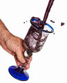
De la vigne à l'amourby littlemavComment: The processing seems to have darkened the wine and brought out more detail, which, to me, makes it look thick, like chocolate! With such a clean background, I would have preferred a dainty female hand. I think the male hand would have worked better with a restaurant scene in the background to make it look like a fancy waiter was pouring the drink. I lover the texture of the liquid inside the glass. |
 Photographer found comment helpful. Photographer found comment helpful. |
| 09/22/2011 09:51:02 PM |
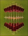
Redby StructorComment: This is over-sharpened for my taste. The green also looks sickly, which doesn't fit with a subject that is usually considered high-class. I think the green could have worked if either the title pulled it together or if the green was a more lush, dark shade. |
| Photographer found comment helpful. |
| 09/21/2011 12:28:05 AM |
|
| Photographer found comment helpful. |
| 09/16/2011 01:10:30 AM |
Gallery of Foolsby PennyStreetComment: I love all of the layers and the color in this. The repeating shapes help this from being too busy or disorganized. Such a great shot! |
| Photographer found comment helpful. |
| 09/12/2011 12:09:32 AM |
|
| Photographer found comment helpful. |
| 09/12/2011 12:05:56 AM |
Pathwayby NiallOTuamaComment: Woot woot! Nicely done, Niall! Congrats!
What a way to start off the WPL : ) Setting the bar high! |
| Photographer found comment helpful. |
| 09/06/2011 03:42:19 AM |
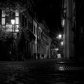
Untitledby JudiComment: Something about this feels very 1950s to me. I like it. I wonder if this would have been more striking if you had played up the old-time feeling through black and white. |
| Photographer found comment helpful. |
| 09/06/2011 03:39:37 AM |
|
| Photographer found comment helpful. |
| 09/06/2011 03:35:59 AM |
Bodyby fotomann_foreverComment: You got an extra point from me for using the title to acknowledge the true nature of the subject matter. Not that there's anything wrong with the subject matter, but I don't like when people try to make the photo/subject something it's not through an artsy title.
I think the texture and pattern in the chair and curtain compete with the subject. I think it would have would better for me with a solid color on the chair and a more out-of-focus curtain. The lighting highlights her curves in all the right places. |
| Photographer found comment helpful. |
| 09/06/2011 03:29:26 AM |
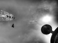
X i i i!i )i i i iby CoryComment: I have absolutely no idea what this is, but somehow it's still engaging and definitely visually interesting. I'm jealous of photogs who can do abstracts like this so effectively. I can't wait to find out what this is. |
| Photographer found comment helpful. |
Home -
Challenges -
Community -
League -
Photos -
Cameras -
Lenses -
Learn -
Help -
Terms of Use -
Privacy -
Top ^
DPChallenge, and website content and design, Copyright © 2001-2025 Challenging Technologies, LLC.
All digital photo copyrights belong to the photographers and may not be used without permission.
Current Server Time: 07/31/2025 12:03:58 PM EDT.