| Image |
Comment |
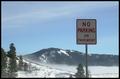
| 01/21/2003 07:30:58 PM |
Traumaby PHOTOCHlXComment: Over all this is not an exciting photo when you first look at it. Was having trouble seeing any thing special about the sign. THEN I spotted the helicopter and the whole photo took on a different look. Wish you could have focused in on it better. That would have grabbed the attention. That would have been closer to a 10. But I will still give it a 7, even though I had to look for the "wow". |
 Photographer found comment helpful. Photographer found comment helpful. |
| 01/21/2003 11:36:07 AM |
Roadlessby falveyComment: Beautiful photo of the surroundings. But you should have shown some of the pavement, because that's what the sign is talking about. Course, this is just my opinion. I would have liked it better and felt it met the challenge better. I do love the photo. And will still give it a 6. |
| Photographer found comment helpful. |
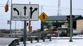
| 01/21/2003 11:32:49 AM |
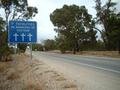
Street Signby STEINRComment: Doesn't look like there are that many directions to go and still be on the road, maybe in the tractor building. I hate signs like this. Bless the pedestrian. Great photo. Very clear and overall great shot. Worth a 7 in my book. |
| Photographer found comment helpful. |
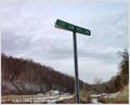
| 01/20/2003 06:54:12 PM |
No Crime Zoneby DianaComment: Something doesn't look quite right. What is the shadow of the sign on? How can it have a shadow against the sky? This upsets me. That's all I'll say. |
| Photographer found comment helpful. |
| 01/20/2003 06:30:17 PM |
The Crossingby howzaComment: What is supposed to use this crossing. Looks like it hasn't been used in years, many years. Nice photo but you need something to "wow' it up. It's looks too drab, which I realize it is a mess there. I can give it onyl a 6. |
| Photographer found comment helpful. |
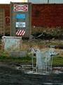
| 01/20/2003 06:21:26 PM |
Abandonedby miracComment: I'm glad you showed the sign going in the ground. Otherwise I would have thought it had been placed there by some kids. Sure hope the road wasn't that close to the building. Doesn't make sense. Great photo but still doesn't make sense putting a stop sign there. I'll give it an 8. |
| Photographer found comment helpful. |
| 01/20/2003 06:14:04 PM |
Sunset Beyond Sunsetby kate12303Comment: This could have been a winner. Nice photo of a play on words. But it needs to be much sharper. Much too soft focus for me personally. Good composition just need much better execution. It's a 5 mainly for the sunset and sign. |
| Photographer found comment helpful. |
| 01/20/2003 06:10:33 PM |
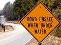
DUH!by MustbelostComment: Great photo. To me this should be number 1. It's a great photo and has to have to dumbest and most unnecessary sign ever. Great job of a really neat capture. It's a 10 in my book. |
| Photographer found comment helpful. |
| 01/20/2003 05:55:13 PM |
à la plageby paynekjComment: I don't understand what the signs say, nor do I understand your title. But I like the photo. It's well done. Nicely cropped, good focus, nice composition. I just wish I could understand at least your title so I could do a really fair score as to meeting the challenge. But I'll give it a 5. |
| Photographer found comment helpful. |
| 01/20/2003 05:51:00 PM |
Will you be next?by Delta_6Comment: Are they psychic or something? Or are they just too stupid and can't count? This takes the cake, for me. It's a 10 for stupidity. Also a great photo. Good composition with good execution. |
| Photographer found comment helpful. |
Home -
Challenges -
Community -
League -
Photos -
Cameras -
Lenses -
Learn -
Help -
Terms of Use -
Privacy -
Top ^
DPChallenge, and website content and design, Copyright © 2001-2025 Challenging Technologies, LLC.
All digital photo copyrights belong to the photographers and may not be used without permission.
Current Server Time: 08/08/2025 08:13:07 AM EDT.