| Image |
Comment |
| 01/11/2007 06:09:23 PM |
Far Awayby jwrobinsComment: Very beautiful shot, although I don't think the the centred composition carries the title as well. If the horizon was higher, the eye would have had to travel farther across the water to get to the point of interest (the bright island), and that might have conveyed the title better. Still, it'd make a great print that I'd be proud to have on my wall... Have you tried a square crop? |
 Photographer found comment helpful. Photographer found comment helpful. |
| 01/11/2007 06:07:15 PM |
Temperature by Sean Paulby ShmeeComment: Nice use of colour, and I love how you've gotten the hair to look like a flame on her head. Great lighting. |
| Photographer found comment helpful. |
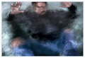
| 01/11/2007 06:06:34 PM |
Over My Head - The Frayby tcmartinComment: A very well set-up shot. I love how strong the form of the subject is, despite all the details being lost to the haze of the water. Very well executed. |
| Photographer found comment helpful. |
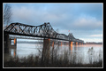
| 01/11/2007 06:05:34 PM |
Oh Susana - going to Louisianaby pitsamanComment: Lovely landscape shot. That strong leading diagonal pulls you right into the photo and across the bridge. Good DOF and nice sharpness. The tone is spot on too, with a nice range from that strong black of the bridge to the light horizon. |
| Photographer found comment helpful. |
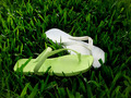
| 01/11/2007 06:04:07 PM |
Me & Uby LeooComment: Would make a nice stock photo. Has a clean and simple colour scheme. Not a ribbon winner, but a competent effort. |
| Photographer found comment helpful. |
| 01/11/2007 06:02:57 PM |
Savin' meby cristianoComment: Not a very interesting photograph. Need to get a more visually interesting angle on the subject, and also use less of that dead black space. |
| Photographer found comment helpful. |
| 01/11/2007 06:01:29 PM |
Mother Natures "Photograph" by NuzzerComment: Nice idea and use of selective colour. But somehow the colours inside the photo seem overprocessed, and not 'natural' at all. |
| Photographer found comment helpful. |
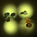
| 01/11/2007 06:00:35 PM |
Through the Eyes of a Button (Buttons)by russiansergeeComment: I like the 'through the button' lighting, but I think you could have done more with the arrangement of the buttons to mimic the pattern/create more visual interest. Also I think the yellow colour cast detracts from what could be interesting colours on the buttons. |
| Photographer found comment helpful. |
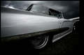
| 01/11/2007 05:59:04 PM |
ridin'by boysetsfireComment: Lovely shot of this impressive vehicle. I like the dramatic angle, and the muted tones and dark burning in give it a real hard-core attitude. Well done. |
| Photographer found comment helpful. |
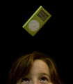
| 01/11/2007 05:57:57 PM |
Over My Headby MarkComment: Nicely done. The lighting is perhaps a bit flat, but I think you executed your idea very well. Good work. |
| Photographer found comment helpful. |
Home -
Challenges -
Community -
League -
Photos -
Cameras -
Lenses -
Learn -
Help -
Terms of Use -
Privacy -
Top ^
DPChallenge, and website content and design, Copyright © 2001-2025 Challenging Technologies, LLC.
All digital photo copyrights belong to the photographers and may not be used without permission.
Current Server Time: 06/20/2025 06:06:34 PM EDT.