| Image |
Comment |
| 11/20/2006 01:22:18 AM |
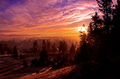
Spokane Sunriseby ZoomdakComment: Hello from the Tri-cities...I wish I could have caught a morning like that down here this week! |
 Photographer found comment helpful. Photographer found comment helpful. |
| 11/13/2006 12:48:19 AM |
|
| Photographer found comment helpful. |
| 10/04/2006 08:36:15 PM |
Blue jeansby alpharichComment: CRITIQUE CLUB COMMENT:
Keep your chin up...the following critique is a little rough to read. Don't take it too personally....take what you find usefull and forget th rest! :)
IMAGE QUALITY
The image quality is good but unfortunately the image fails to score high for two primary reasons. First, the image is not "abstract" enough. In abstract the idea is to have the subject not be immediately recognizable. This shot is very easy to figure out. Secondly, the macro part fails because it's just not macro enough. When I think macro I'm thinking REAL close like at least 1:1 ratio or greater (more like 4:1 or 5:1) Looks like you shot this with the 18-70 lens and that lens just doesn't give you a nice enough macro for this challange in my opinion. That's not your fault. I just might not have entered this challenge with that lens to work with.
CHOICE OF SUBJECT
The choice of subject hurt you because again, it's too readily identifiable. You'd have been better off shooting something people don't see every day, especially if your lens limits your macro ability. By shooting something people don't see every day or don't see in that perspective you could get away with not having a good macro lens.
COMPOSITION
The composition doesn't do anything for me either unfortunately - too many straight horizontal lines. Perhaps if you would have focused on a rivet and off centered it a little or focused on some stitching that zigged and zagged around a little it would have drastically helped the composition.
CREATIVITY
I'd deduct a point on creativity for titling the photo "Blue Jeans" because again, the idea is to be abstract (not identifiable) so you really don't want to identify the subject in your title.
POST PROCESSING
The post processing is fine. You might have gotten a better look if you increased the contrast a bit more and maybe even darkened the photo a bit.
By the way, nice camera! I've got the Minolta 5D and then Minolta sold out to Sony and I was very upset. When the first Sony DSLR came out for the Minolta mount I read up on it and it seems like a sweet camera. Hope you enjoy it! |
| Photographer found comment helpful. |
| 10/04/2006 12:47:05 PM |
Peach Pitby meyersComment: CRITIQUE CLUB COMMENT
IMAGE QUALITY
Good image quality...an excellent example of a macro shot for sure!
CHOICE OF SUBJECT
Excellent choice of subject! A lot of people fail to get the "abstract" part and you nailed it. I had no idea what I was looking at until I read your description and then it started to make sense. Also it is truly macro so bonus points there too. It is a horrible shame that your photo scored as low as it did because I saw photos that CLEARLY did not meet the challenge score much higher. I commend you for being brave enough to stick to the challenge description and capture something that perfectly meets it.
COMPOSITION
The composition of the photo is probably the number one thing that hurts you (along with the darkness I mention in the Post Processing section below). I can't really explain how the composition could have been better. I'll try to explain it this way....the subject almost fills too much of the image so that it apears to just be a blob on the screen. It's darn hard to be abstract and not have it look like a random blob at the same time so I again say, I don't know how it could have been better. It just doesn't seem interesting enough for me.
CREATIVITY
You showed good creativity on this one...the choice of a peach pit was really well done.
POST PROCESSING
The photo is a little dark for my tastes...maybe could have been better if you bumped up the exposure or brightened it in some way. Also playing with a little more color saturation on the reds and yellows would have made it pop a little more.
I probably would have scored this a 5 in voting because it doesn't appeal to me greatly but later would have felt guilty having only given you a five when I saw the photos that didn't even meet the challenge scoring higher. I'd then wish I could go back and give you a 7 to compensate a little.
Over all, excellent choice...keep up the good work. |
| Photographer found comment helpful. |
| 10/04/2006 11:36:02 AM |
Alienby tembaComment: CRITIQUE CLUB COMMENT
IMAGE QUALITY
Excellent image quality....a nice shallow depth of field with sharp clear focus on the subject. The colors really pop on this one...makes you sort of say "ooo" as soon as it opens.
CHOICE OF SUBJECT
The biggest drawbacks to this photo to me are the following. I immediately recognized what it was which takes away from my feeling it is truly abstract. Secondly, I see so many flower shots on DPC that flowers automatically give me a negative reaction. While you might think this is just my opinion, I have found that a lot of people complain about the overabundance of flowers so it might be something to take into consideration. The fact that you scored in the 6+ range with this AND it's a flower shows you had a REALLY GOOD flower!
COMPOSITION
The composition is very good on the photo but I have to agree with one of your commentors below. Had this been cropped more square you might have been able to achieve a less recognizable photo and therefore would have captured the essence of "abstract" a little better. I might have pulled in the sides on the crop and made it a little tougher to recognize.
CREATIVITY
I often score pictures higher that are creative in some way. Unfortunately this doesn't show a lot of creativity. As I said, flowers seem a bit overdone so unless you've done something unexpected, it doesn't stand out for me.
POST PROCESSING
The post processing looks good. I can't think of anything I would like to have seen enhanced or done differently. Looks like you just got a nice purely "good" photo that didn't need much. The only drawback to this is that it's an "advanced editing" challenge so you had more room to play with the photo which you didn't have the chance to take advantage of here. This would be a great shot for basic editing because it seems you just had a great photo that didn't need anything. Great job.
I think I would have scored this a 5 if I were voting because, as I said above, the subject is too easily recognizable and therefore doesn't really seem "abstract" to me and because I have a hard time enjoying pictures of flowers. Again, you shouldn't care whether I like flowers or not but I think I wouldn't be the only voter who tends to vote less favorably for flowers. |
| Photographer found comment helpful. |
| 10/04/2006 10:52:52 AM |
Bare Necessitiesby jeroweComment: CRITIQUE CLUB COMMENT
IMAGE QUALITY
The nice clean, crisp image on the left is visually applealing. I think because of it's sharp focus the image sort of popped for me when I first saw it. The blurred image of the second lens doesn't really help this shot though. Your use of lighting is excellent here.
CHOICE OF SUBJECT MATTER
The subject matter (lenses) is ok, however, because the challenge is ABSTRACT it is too easily identifiable. The primary point of abstract is that it is not at easily recognizable for what it really is. The instant I saw it I knew it was a lens and using a lens for your subject in a group of photographers probably was a bad choice.
COMPOSITION
The composition is nice in my opinion, but again, the challenge is MACRO and while technically this probably qualifies as a Macro shot...it's just not close enough for us to feel a true macro feel of the shot. If you had gotten in MUCH closer you would have better met the Macro part of the challenge and probably the abstract part as well.
CREATIVITY
Unfortunately it's not overly creative...again because you're shooting a lens for a group of photographers. Obviously we're all interested in the subject matter but ESPECIALLY in this case you want to surprise the voter when the find out what it really is. If you're going to shoot a lens for your subject it should be so close up macro and so abstract that the voter slaps themselves on the head when they figure it out and say, "I should have recognized that!" I often vote a picture not just on it's technical aspects but on its creativity so I would have dinged this picture a little for that.
POST PROCESSING
Your post processing is fine...I think there wasn't a lot you could have done with this to make the actual image better. I think adding the border in post processing was a good choice...your use of the yellow border helps enhance the photo. Excellent job!
As I voter I would have scored you around 5. Though I lean toward 6 because the image is very good, I just don't think it meets the challenge of being "abstract" or "macro" enough and would have compensated by giving a 5. |
| Photographer found comment helpful. |
| 08/27/2006 02:24:35 AM |
Surreal fire on iceby jsonComment: CRITIQUE CLUB COMMENT:
A visually arresting photograph! The moment I opened the photo it had high score written all over it.
POST PROCESSING
The colors are incredible, great choice to adjust the hue and saturation in RAW. In a "Fire" challenge the obvious colors are reds and yellows and your choice of purple tones really sets this apart. It's a gamble for you to do this but it really paid off. Excellent use of dodge and burn..it really makes the colors pop.
IMAGE QUALITY
The image quality is sharp and crisp...very clean. I love it.
COMPOSITION
The composition of the photo is good. The dark space above is ALMOST a bit too much in my opinion but in this case I think it's fine. I'm a little distracted by the lower left corner with the bright spot on the ground. My eye keeps going there to try and figure out what it is and that's bothering me.
SUBJECT CHOICE
My biggest gripe, if any, is that I'm not exactly sure what I'm looking at and that distracts me. The colors are incredible and standing back I have to say I like the image but then I keep getting bothered by "what is it?" The other drawback is that I'm not sure this picture demonstrates "fire" all that well. Because I can't tell what I'm really looking at I'm having a hard time seeing the "fire" aspect. You could have lost some points in the voting from those who thought you weren't really meeting the challenge. Obviously this didn't hurt you a lot as you scored very high.
Over all an outstanding shot. Congratulations.
|
| Photographer found comment helpful. |
| 08/24/2006 12:31:26 AM |
Enchanted cottage?by imagine74Comment: Not a particularly strong photo. The lighting is a little off and it doesn't really portray magic and mystery for me. |
| Photographer found comment helpful. |
| 08/24/2006 12:30:39 AM |
Fun with Physics!by Ecce_SignumComment: Interesting photo...a little dark without a particular reason for it. In other words I don't know how the dark or green cast really helps the photo. |
| Photographer found comment helpful. |
| 08/24/2006 12:29:52 AM |
Wally - The Magicianby gsalComment: Very solid photo...good use of shallow depth of field...great composition. Unfortunately he doesn't appear to be doing a magic act of any kind so it feels like a good photo trying to be passed off in a challenge that it doesn't really fit. I'll still give you the benefit of the doubt and an above average score. |
| Photographer found comment helpful. |
Home -
Challenges -
Community -
League -
Photos -
Cameras -
Lenses -
Learn -
Help -
Terms of Use -
Privacy -
Top ^
DPChallenge, and website content and design, Copyright © 2001-2025 Challenging Technologies, LLC.
All digital photo copyrights belong to the photographers and may not be used without permission.
Current Server Time: 08/01/2025 01:23:31 PM EDT.