| Image |
Comment |
| 10/11/2005 03:55:31 AM |
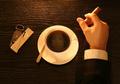
One Javanilla Please!by davidus428Comment: Good use of DOF, I like the clarity and sharpness of this image. Nicely done. The blurring of the background removes any possible distractions. The only nit I could pick, would be to extend the DOF just a little bit, so that the straws were entirely in focus. The colors all work together to make a very visually pleasing image with a sense of personality and action. Good job! |
 Photographer found comment helpful. Photographer found comment helpful. |
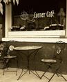
| 10/11/2005 03:48:39 AM |
Corner Caféby SJCarterComment: I wonder if this would have worked better as a pure B&W or regular color image, instead of a sepia. The edges of the chair and several of the other distinct lines suffer from JPG artifacts or compression loss (jagged edges). Also, there's something funky going on with the leaves in the top right.
The composition is spot on, nicely done. The lighting is great, the shot is clear and sharp. A nice shot. |
| Photographer found comment helpful. |
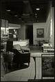
| 10/11/2005 03:45:53 AM |
Quiescentby BradComment: Very nice capture. The black and white goes really well here, the scene looks very retro, which fits the B&W. The border works nicely too. The composition and crop are very nice, the shot was set up very well.
On the downside, the lighting doesn't quite work. I understand the challenge of the highlights coming from the light sources, but the chalkboard and chair on the left are just too under exposed, in my humble opinion.
Overall, an excellent location and a nice shot. Thanks for capturing it. |
| Photographer found comment helpful. |
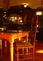
| 10/11/2005 03:39:13 AM |
Where everybody knows your name...by wavelengthComment: The orange/red cast creates a feeling of warmth, the chair pulled out makes you fee welcome, like you just want to sit down... The background seems fuzzy and out of focus. Was this shot at slow shutter speed, without a tripod? Good capture. |
| Photographer found comment helpful. |
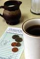
| 10/10/2005 01:09:07 PM |
Check, please!by 3eyedcrowComment: Nice shot! The lighting is great, I'm OK with the crop (maybe just a little tight), and I like the thin border. It lacks the viceral "WOW" that makes a 10, but is a very nice photo all the same. Well done. |
| Photographer found comment helpful. |
| 10/10/2005 01:03:58 PM |
Coffeeby saevarjoComment: Technically, it's got good composition, the tight crop is nice and the shot doesn't suffer from being smaller than most. But the only thing in focus are the coffee beans directly below and to the right of the flower. However, the flower is the central focal point, but it's woefully out of focus. Lighting and color are good though. Bumping up one on a second look. |
| Photographer found comment helpful. |
| 10/10/2005 01:02:45 PM |
Missing you... by MirceaComment: What to say, except INCREDIBLE! The color, focus, lighting, props, everything is just perfect. I can't find a single thing I would change with this picture. Great job!
P.S. Please tell us how this was done after the challenge is over. :) |
| Photographer found comment helpful. |
| 10/10/2005 12:39:20 PM |
Cappuccino & Muffin (circa 1780 AD)by redmoonComment: Initial reaction: Interesting. Very interesting.
It's a well set up shot. I like the lighting, I how everyting is so similarly toned, the mug and candlestick almost blend into the table. Very well done. I can't decide if the background is too distracting with the metal bars, perhaps a little less DOF to blur the background a little more? I don't know for sure though. I like the crop, many would be tempted to go too tight, but the space at the left side is good.
This isn't a 10 for me, and I'm not sure quite why. It lacks "WOW" factor, though it does have "wow" factor for me... A good capture, and a good entry. I think in the end brown and grey are not very exciting colors, and this photo suffers from the lack of any really exciting elements. But from an artistic standpoint it's very strong, and if Degas had painted it, it would have a spot in a museum. |
| Photographer found comment helpful. |
| 10/10/2005 12:28:26 PM |
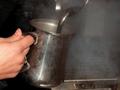
Steamin'by GoscheComment: I understand this was probably an action shor at a busy coffee shop, but the grungy pitcher isn't all that appealing. Everything in this shot just looks grungy and dirty, and that's not what I want to think of when I'm drinking my coffee. :( Focus also seems a bit off, and the lighting falls off too much in the back.
I think that maybe a longer exposure and some motion blur of the hand and the pitcher would have improved this shot. |
| Photographer found comment helpful. |
| 10/10/2005 12:26:12 PM |
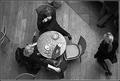
Coffeeby sigrun_thComment: Good composition and crop, too bad for the legs above the woman at the top of the frame, perhaps a slightly less tight crop on the top would attach them to a body a little more (the one in the upper right corner is perfect). Like the motion blur on the woman walking, in contrast to the people sitting still at the table. Emotes the struggle between rushing and resting.
Good conversion to B&W, though color probably would have been good too... Maybe just a hair overexposed? (The highlights seem blown out on the cups and saucers on the table...)
Nice capture. |
| Photographer found comment helpful. |
Home -
Challenges -
Community -
League -
Photos -
Cameras -
Lenses -
Learn -
Help -
Terms of Use -
Privacy -
Top ^
DPChallenge, and website content and design, Copyright © 2001-2025 Challenging Technologies, LLC.
All digital photo copyrights belong to the photographers and may not be used without permission.
Current Server Time: 08/04/2025 11:42:12 PM EDT.