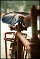
| Image |
Comment |
| 02/14/2006 01:47:26 AM |
|
 Photographer found comment helpful. Photographer found comment helpful. |
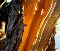
| 02/14/2006 01:46:58 AM |
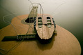
Guitar parts :-(by HeidieComment: This is a great subject, the DOF is really good and the quality colour values in the wood and the light through the stings are all really good. I find the composition a little too centred and there's something (a string?) angling from the head up to top-left. It really throws the perspective of the shot. It looks like a shadown and makes the image appear to be titlted. |
| Photographer found comment helpful. |
| 02/14/2006 01:43:02 AM |
Golden Shardsby banmornComment: Very nicely done and I do like the colouring. I find it perhaps a little too abstracted but am impressed by it as a piece of wall art |
| Photographer found comment helpful. |
| 02/14/2006 01:41:51 AM |
Quick Fixes to Broken Heartsby joshuadboothComment: Excellent creative response to teh challenge. If you'd used the Rule of Thirds I think it would have had even more impact as it would benefit from the extra neutral white space. You might just get close to the front page with this entry - good luck. |
| Photographer found comment helpful. |
| 02/14/2006 01:40:06 AM |
Broken Wingsby mawearComment: I really looked for the broken wing, but can't see it .. lol |
| Photographer found comment helpful. |
| 02/14/2006 01:37:57 AM |
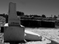
J. WOODSby seracComment: Terrific subject and for one, the B&W treatment looks appropriate and has been very well done. I am really impresed with the highlight on the top of the break and the contrast of the white fallen stone and the blackness of the hedge behind it. Through all of that you have maintained the texture and subtle colours of the marble in the bit left standing. The composition has let it down a bit in that the rest of the cemetary becomes a distracting background. Not sure how to beat that though. Could you have got a more neutral background from the rise behind the grave? Or perhaps even just crop it tighter. Unfortunately you've fallen foul of my pet-peeve, images not squared up. All you need to do is rotate to get your verticales correct. When you don't do that, it gives the impression that you've been sloppy in your preparation |
| Photographer found comment helpful. |
| 02/14/2006 01:31:55 AM |
|
| Photographer found comment helpful. |
| 02/14/2006 01:30:50 AM |
|
| Photographer found comment helpful. |
| 02/14/2006 01:29:39 AM |
Schnappedby owenComment: Sad but well found and shot. The de-sat is appropriate too |
| Photographer found comment helpful. |
| 02/14/2006 01:28:55 AM |
Salmonella, Anyone?by fotomann_foreverComment: Cool lighting and detail, not easy to get. Have you done some editing around the shadow or has it just been bleached out by exposure? |
| Photographer found comment helpful. |
Home -
Challenges -
Community -
League -
Photos -
Cameras -
Lenses -
Learn -
Help -
Terms of Use -
Privacy -
Top ^
DPChallenge, and website content and design, Copyright © 2001-2025 Challenging Technologies, LLC.
All digital photo copyrights belong to the photographers and may not be used without permission.
Current Server Time: 08/27/2025 08:59:02 PM EDT.