|
|
|
Showing 1061 - 1070 of ~2151 |
| Image |
Comment |
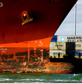
| 12/11/2005 02:59:30 PM | Tying Upby joezlComment: ::: Critique Club :::
Love to do a full critique on your image but it is difficult if you don't give us any information in your photographers comments. When we do a critique, we go past just the photographic result, that's what voters comments do. The critique looks at what you were trying to achieve, how you wanted it to look and what issues you had in getting the image captured and ready for voting.
First Impression - the most important one:
Captivating. Draws you immediately into the image looking for the story. The people play a big part in that immediate engagement.
Composition:
The bow forms a perfect leading line. The eye starts with the vibrant colour, and is taken by the bow to the people on the dock. Even the veritcal part of the bow is on a thirds line alough it's its almost impossible to strictly use thirds in an image like this, the concept is there. The people give the ship it's size.
Subject:
I love it. Heavy, massive and interesting. Just look at the bulb, it got me wondering about all the floating containers or sailboats it had met mid atlantic in the dead of night. You see, the viewer is engaged by this image because as I've just done, I start to weave stories into it. Superb stuff.
Technical (Colour and light):
Assuming that you were probably passing in another vessel and this was a spur of the moment snap (we'll never know, you didn't comment) makes it even more remarkable. The bright harshness of the sunlit orange contrasting with the silhouettes of the dockers is what gives this its depth beyond just 2D.
I'm almost certain that part of the drama in this shot is the way the light hits the bow itself. Bows are generally not razor sharp as this appears to be but the light has made it so and it is dramatic.
To get a Ribbon?:
It's hard to know how you can make this capture work any better. It's scored well and 88% is a damned fine place to be. I'd be interested in the effect of cropping at the water line but I suspect then that the bulb would teeter on the edge of frame with its impact lost.
I guess if you were doing this on assignment then you'd ask the port company to move the containers to give you a neutral backgound and maybe have the crew clean up the black smudgy bits.... :) It's the dirty part of the hull that is least pleasing to the eye and the only place I can see where it cost you a higher score.
Summary:
This image is not a one-off success, your portfolio shows that. I particularly like your minimalist eye in Wall and White. An average score of 5.7 is good and we look forward to your first top 10 and then ribbon. They're not far away.
Brett Message edited by author 2005-12-11 15:02:51. |  Photographer found comment helpful. Photographer found comment helpful. |
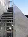
| 12/11/2005 01:58:11 AM | industrial power 260kvby stumpyComment: ::: Critique Club :::
Hi Steve and welcome to the DPC Challenge. Congratulations on a good start by scoring 58% in your first try.!
Thanks for putting in your photographer's comments, they help enormously in doing a critique. The Photograph information really helps a critique too. You can get it from your images by right-clicking it in Win Explorer -> Properties -> summary -> Advanced. That will give you the Aperture, ISO and shutter details plus a whole lot more. Be aware that if you edit in any way the file that comes out of your camera and save it to the same name, all that (EXIF) data will be lost. Always do a Save As for the first step.
First Impression - the most important one:
I'm a sucker for snow and winter, it's where my soul is, so my first impression is always a warm one:) Photographically, this really gets a comfortable reaction from the eye and as you see, has attracted votes accordingly.
Composition:
The composition in this image is that of a trained photographer or a very good photographer's natural eye. Whether by accident or design, you have used perfectly the two main basic rules of composition in this image.
The Rule of Thirds: the foremost pylon is on a vertical thirds line. It is comfortable to the eye there and strikes a chord with the viewer. Rule of Leading Lines: you've got the pylons leading the eye into the picture as they have the perspective lines to follow. Believe it or not, this gives the image 3D depth rather than a flat feel. Research proves these 'rules' to be effective pleasing elements to viewers of paintings or photographs.
There is a third 'rule'. Research again tells us that the eye naturally enters an image bottom left and goes out top right, failing that, at least left to right. That could apply in two ways to this image. You could say it already does that by the eye following the line from the small pylon to the large. Or, you could consider the large pylon as the starting point from which the eye travels along the perspective to the smaller one. To test the latter case, I would try a mirror of the image and see which works better.
Remember though that rules are for the Adherence of Fools and the Guidance of Wise Men.
Subject:
This is a simple mood and geometric image that meets the challenge well. Less is often more and this image has that. It's not overstated but a simple study of the one thing that no industry can do without - energy. I also applaud your lateral view of the obvious response to this challenge ... factories and smoke with water/clouds/reflections etc. It is "different" that has the most chance of cutting through all of the rest.
Technical (Colour and light):
This is the weakest aspect of the image. That it scored so well, yes it did, with this flat grey slightly overexposed look is a testament to how well you got those other elements so right.
In a way, the misty look is appealing. It gives the image mood and isolation, both are useful emotively on voters. You could preserve that feel whilst making the contrast a little more pronounced and giving the image some oomph. If you have editing software that does adjustment layers, you can make non-destructive (original pixels untouched) adjustments to things like brightness and contrast. If not, most graphics programs will let you adjust brightness, contrast or gamma.
Take this image and try some differing settings, they can transform your ex-camera original in ways you couldn't imagine. Don't push it though, they're a savvy lot here and they can tell when you're desperate and trying too hard :)
Summary:
This is a damned fine start, you have the eye. See you again we hope :)
Brett | | Photographer found comment helpful. |
| 12/11/2005 12:56:59 AM | To Industrial Heightsby ernaComment: ::: Critique Club :::
Great fun to do a critique on your image but it is difficult if you don't give us any information in your photographers comments. When we do a critique, we go past just the photographic result, that's what voters comments do. The critique looks at what you were trying to achieve, how you wanted it to look and what issues you had in getting the image captured and ready for voting.
First Impression - the most important one:
This is quite a fetching shot. The first impression is that you want to engage with it and explore it. That's the very best reaction you can get with any image (painting or photograph). That's a double-edged sword in this case because it's when you do look longer at the image that some of its failings show up.
Composition:
The composition is not bad at all. The rail forms a terrific leading line. Leading lines take the eye and give them a track to follow to the point of interest in the image. In this case, we take it that the open door is that focus. That was reinforced by one of the commenters saying it looked ominous - so it worked.
What does look lazy is that the verticals are all falling over. The inside of the rail is vertical, but that's not one of the elements that should be. Use walls or doors with your photo software grid display to rotate the image and get it looking right. If voters think you're lazy and don't care about details, they'll really hammer you hard.
Subject:
It's on challlenge and actually nicely industrial in look. The open door at the top of the stairs is tantalising because there's probably a story behind it. The whole idea of an attractive image is to tell a story above and beyond the title. I think you've started to do this ahead of an awful lot of entries. No, the voters didn't "get it" because it didn't vote well, but I don't believe that is a fault of the subject. If you want to try something like this in the future, think to yourself "what is the story I want to tell, what are the questions I want the viewer to be asking about what's happening here?". You might find then that a small prop helps the story.
Technical (Colour and light):
This is where you lost your voters. The light and colour are appropriate to industrial but perhaps they lack a wow factor or any implied drama. Sometimes all you need to do is ask yourself what everyone else would do with this shot ... and then go and do something completely different.
The noise, you got hammered with the noise. This is where we need your photographer's comments. If it was deliberate because you wanted a grungy, ominous look then we would discuss how to get that accepted and understood. If it was an accident, then we could discuss how to avoid it next time.
Summary:
This image was a good idea with some fine elements which just needed tweaking with quality and details to make it work.
Brett
| | Photographer found comment helpful. |
| 12/09/2005 09:57:56 PM | My rock collectionby hannafateComment: ::: Critique Club :::
Great fun to do a critique on your image but it is dificult if you don't give us any information in your photographers comments. When we do a critique, we go past just the photographic result, that's what voters comments do. The critique looks at what you were trying to achieve, how you wanted it to look and what issues you had in getting the image captured and ready for voting.
First Impression - the most important one:
A blast of colour, light and shapes. I wasn't quite sure what I was looking at, but studying it got me there.
Composition:
Composition is about leading the eye into an image (painting or photo), research shows that the eye enters bottom left and travels up to top right. Once in there, the same research tells us that the eye finds comfort in the point of interest (POI) that sits on a thirds line or intersection.
Your rocks are a little haphazard and so they confuse the eye. It doesn't know where to begin and can't find the main POI to settle on. Since we're basically lazy creatures we then don't make any further effort to decipher what we're seeing. This means the viewer disconnects from the image instead of engaging with it.
Subject:
The rocks have the most amazing structures, textures and form. They are a perfect subject to photograph as they are translucent and allow light into them and through them to explore their beuty and flaws.
Technical (Colour and light):
Light through stones, especially through the side or back just ignites their textures and mystical qualities. The truism of this is that we almost always hold them up to the light to look at them. By contrast the light in the image is more front-on which has flattened those beautiful structures and that's a shame.
With colour, the stones themselves have so much to offer. The red carpet has really sucked up all the light and colour and taken it away from the rocks - which is a pity. Look how diamonds are displayed on black velvet to bring out their colour and depth. Your collection would benefit from that too. It would make them glow and sparkle, the colour would radiate.
Summary:
The collection is lovely and the possibilities only need a little tweaking technically to really show them off to their best.
If you'd like to chat further via PM on any of the technicalities, please do.
Brett | | Photographer found comment helpful. |
| 12/09/2005 08:57:07 PM | Pointe Shoes by angela_packardComment: ::: Critique Club :::
I'd like to ask firstly why you say you don't comment on your photos, yet you are asking Critique Club to do so? It is difficult to do a proper critique without your input and it would normally take at least half an hour to 45mins to do it properly.
First Impression - the most important one:
Very stunning. When first opening it, I didn't see the collection of shoes, I thought it was just a very good protrait.
Composition:
Perfect, thirds used to perfection.
Subject:
Unusual and therefore captivating. You've met the challenge so well and have still managed to make the image a piece of art.
Technical (Colour and light):
Two things. The fade to black all around the POI is terrific. It's that which gives so much power to the shoes in particular.
Secondly, the spot on the background throws everything into a 3D dimension and is a very professional touch
Summary:
Stunning image, one that any professional photographer would be proud to have in their portfolio
Brett Message edited by author 2005-12-09 21:13:03. | | Photographer found comment helpful. |
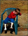
| 12/09/2005 07:34:01 PM | A Five Minute Breakby livitupComment: ::: Critique Club :::
This looks like a lot of fun
First Impression - the most important one:
Melancholy, it looks sad. He looks like he's in the Naughty Chair. What does that mean for the photo? I'm engaged, no longer passive. There's a story here and I'm interested in exploring it. Good stuff.
Composition:
Composition "rules" are almost certainly misnamed as they are not rules at all but protocols in illustrative composition that have been found to have been attractive to viewers.
So you've had a number of suggestions about cropping and layout, some conflicting. The composition rules will help you find a balance that will negate those comments.
Subject:
He's lovely, so very typically kid. A newspaper pictures editor will always tell you to get them a picture with a child in it - they are appealing photographically. In this case, we have one who looks upset and that becomes the basis for wondering what is going on. We are engaged and that sure beats ambivalence when it comes to art and photography.
Technical (Colour and light):
To be fair, you didn't have any time or opportunity to do anything else but snap the shot because he was being a typical boy. The trouble with that is that it does look like a snapshot. Hopefully with some of the things discussed around here it will be easy to turn the snapshot opportunity into a great pic.
With you trying to get some light and drama into it, the saturation has gone artificially too strong. I wonder what effect a colour de-saturistaion might have done to the 'mood'. I wouldn't go as far as gratuitous B&W.
It might be a funny thing to say but the light is your enemy in this shot. Bright noonday sun gives you harsh shadows and because it is coming ovedirectly overhead at the subject, it just flattens everything. The shadow under the chair is quite distracting. Overcast days give you great even light and no shadows.
To get a Ribbon?:
Given that you didn't have control of the model :) or the light and just took the split-second opportunity, there's some things you can do that might make some difference. Big voting scores come from drama, shock, awe, humour etc but they're always dramatic. So, what to do? I am always uncomfortable saying do this or do that. It is the photographer who decides what the ultimate effect is going to be. However there are some general principles that could help.
Look for the drama that could be in this shot.
- Get your main point of interest onto a thirds intersection.
- Perhaps if you'd lowered your POV to his height, a lot of empty field may come into view to frame him. You would also be taking a kids eye perspective rather than looking down.
- From a lower point, try a zoom out to include a whole lot of 'neutral space' of empty fields around him. From that would come this wonderful feeling of poor little boy all alone and desolate.
- The chair in a wide open space would be out of place - in a good quirky way.
- since the midday sun isn't going to move, move the camera. Go left or right and get the sun at nearly 90deg to the subject. This makes for great highlights and contrasts and sometimes gives you a dramatic feel.
Summary:
The subject and the pose are so evocative and it's a good eye that sees that emotive aspect and has camera at the ready to capture it. On the same day at the same time you could have then added the painters eye by using some of the techniques above. Sometimes they work, sometimes not - but that's the pure pleasure and fun of photography.
Give him a hug from us ... :)
Brett Message edited by author 2005-12-10 02:27:48. | | Photographer found comment helpful. |
| 12/09/2005 04:43:34 PM | Condosby banmornComment: ::: Critique Club :::
This is going to be interesting. As you'll see from my profile, this is a genre that I love and strive to do well - so far unsuccessfully. I'm going to enjoy this.
First Impression - the most important one:
"What is it?" That's the first thing that happens when you see the image. Success. You've engaged the viewer, their involvement with your image is no longer passive.
Composition:
Since this style of shot can't conform to any of the 'rules', you need to find a composition that attracts and involves. You did that with the angle of the capture. How boring and predictable this would have been with all the verticals nicely lined up to a grid.
Subject:
Isn't the english language cute. We invent a really cool word "condominiums" for what are really little boxes on a hillside :) I digress. The subject is terrific, this location is ideal for what you have conveyed. Many times I've looked for this kind of geometry and not found it. It takes a good eye to be on the lookout for these sorts of locations and then to both visualise and capture it successfully. I see from your portfolio how much you love and have an eye for this, it shows and I am slightly in awe. In this case, nicely abstract, interesting presentation and a good geometric puzzle.
Technical (Colour and light):
Often used as a crutch in DPC but not here, I believe this to be a perfect use of B&W. This image could not be displayed in colour.
The exposure values across the whole image are even which again turns the mundane into geometry. You used f8 to make sure you got good DOF too, anything else would have made the capture worthless.
To get a Ribbon?:
28th place is not a bad result. I suspect that most of the negative voting would be around the fairly tenuous connection to adulthood. sure its there but it's subtle. Subtle doesn't vote that well. The real question is, did you really want a ribbon with this image? Some images are just very good photographs and are not there to capture the popularity vote. What would or could you change anyway? Anything else done to this image and it would be something different (if that makes sense)
Summary:
You have an affinity, a feel and a talent for the geometric abstract genre. Few people do, we are enriched by your insights and contributions. The art is good, to hell with the votes :)
It's been a pleasure,
Brett | | Photographer found comment helpful. |
| 12/09/2005 06:04:55 AM | mmmmmmmm...........by ericwooComment: ::: Critique Club :::
Oh this wil be fun because as I said in my vote comment, I'm not familiar with the product and so don't really understand the story being told. I scored it a 6.
First Impression - the most important one:
I rather liked it on my first impression. It looked mysterious, imperious and very upmarket because of the way it is lit. On closer inspection, yes one can see where there are things that could make it even better.
Composition:
The positioning of the bottle is almost on the thirds line, there's not much room for it to move but I would have shuffled to line up with the right hand vertical thirds line. I particularly am impressed by the way the label is turned to face the centre of the frame rather than the camera, that makes quite a difference here. A lot of people on DPC don't like borders, their success lies in their composition with the image and in this case, it works well to balance the heavy black.
Subject:
I'm really sorry that i don't know what it is :) Having said that, others have commented that it is right on for the challenge so I can niftily slide out from undwer that one and move onto what it looks like photographically. The bottle looks regal, slightly upmarket and important. Those are clever things to capture in a simple image like this.
Technical (Colour and light):
You really didn't give us any information in your photographers comments about what you were trying to achieve, what sort of look that you wanted and what was the message that you were trying to send to the viewers. That makes it difficult to comment on here. I could follow others and say its too dark, but if you were to say you were trying for a dark look, then we would be able to discuss how well that was achieved and throw some ideas around on how to do it even better.
So I'm not going to be presumtuous and suggest it be lighter because I'm sure you know how to do that. I'm confident that you wanted it no other way than dark and mysterious. You see, I quite like the way this looks. It isn't like a 'normal' bottle shot, you can't see the edges of it. But the cleverness is that it is quite clearly a bottle and the viewer doesn't 'need' to see the edges to know that. Less is more.
The lighting being full frontal is well controlled because the label is perfectly exposed and I bet in the camera original it is sharp enough to read the bottom label line on it. I can't say it would be better if the light source was off centre because doing so might spoil the effect of what you're trying to communicate. It is generally true though that 60/30deg off to either side might have made it more dramatic, but again, one can't be sure until you try it an see.
Yes, your focus is out goin up the neck to the cap. The label of course is sharp. So what has caught you is the depth of field of the f2.8 setting. To get enough DOF, you might need at least f5.6 for this shot, experimenting will tell. That of course is 2 stops which you have to get back with shutter speed. At 1/50th you could have managed hand-held but any slower would require a tripod .... or ... more light.
To get a Ribbon?:
The voters didn't really like this did they. The focus/DOF was obviously an issue As was the darkness, some commenters assumed that's not what you were intending. It lacked a wow-factor. Wow-factors can be added with light, props, implied drama, shock, surprise, awe, cheek or humour. There are so many variables, that it's not for me to presume to suggest any one of them, just to say that in future look out for them.
Summary:
Perhaps to get around the "too dark" and "snapshot" critisms, you need to make all of the features you strove for to look deliberate. For example, you could change nothing in the bottle lighting but throw the beam of a torch across the back ground to put the bottle into relief and to show that the effect of the image is deliberate. You get the picture.
Glad to have the opportunity, thanks
Brett Message edited by author 2005-12-09 06:13:57. | | Photographer found comment helpful. |
| 12/07/2005 02:28:43 AM | Pointe Shoesby angela_packardComment: Originally posted by angela_packard:
Ok, I never add my own comments. But since I finally got a ribbon I think I should. |
I do too - always. I bet you like reading the comments of others if there's an image that you enjoy and would like to know more about.
For this image, I'm interested in your lighting setup as it is just so perfect. How did you manage to set the camera and get into position so perfectly?
| | Photographer found comment helpful. |
| 12/06/2005 07:40:51 PM | | | Photographer found comment helpful. |
|
Showing 1061 - 1070 of ~2151 |
Home -
Challenges -
Community -
League -
Photos -
Cameras -
Lenses -
Learn -
Help -
Terms of Use -
Privacy -
Top ^
DPChallenge, and website content and design, Copyright © 2001-2025 Challenging Technologies, LLC.
All digital photo copyrights belong to the photographers and may not be used without permission.
Current Server Time: 06/24/2025 01:34:14 AM EDT.
|