| Author | Thread |
|
|
12/11/2005 12:56:59 AM |
::: Critique Club :::
Great fun to do a critique on your image but it is difficult if you don't give us any information in your photographers comments. When we do a critique, we go past just the photographic result, that's what voters comments do. The critique looks at what you were trying to achieve, how you wanted it to look and what issues you had in getting the image captured and ready for voting.
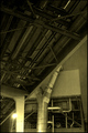
First Impression - the most important one:
This is quite a fetching shot. The first impression is that you want to engage with it and explore it. That's the very best reaction you can get with any image (painting or photograph). That's a double-edged sword in this case because it's when you do look longer at the image that some of its failings show up.
Composition:
The composition is not bad at all. The rail forms a terrific leading line. Leading lines take the eye and give them a track to follow to the point of interest in the image. In this case, we take it that the open door is that focus. That was reinforced by one of the commenters saying it looked ominous - so it worked.
What does look lazy is that the verticals are all falling over. The inside of the rail is vertical, but that's not one of the elements that should be. Use walls or doors with your photo software grid display to rotate the image and get it looking right. If voters think you're lazy and don't care about details, they'll really hammer you hard.
Subject:
It's on challlenge and actually nicely industrial in look. The open door at the top of the stairs is tantalising because there's probably a story behind it. The whole idea of an attractive image is to tell a story above and beyond the title. I think you've started to do this ahead of an awful lot of entries. No, the voters didn't "get it" because it didn't vote well, but I don't believe that is a fault of the subject. If you want to try something like this in the future, think to yourself "what is the story I want to tell, what are the questions I want the viewer to be asking about what's happening here?". You might find then that a small prop helps the story.
Technical (Colour and light):
This is where you lost your voters. The light and colour are appropriate to industrial but perhaps they lack a wow factor or any implied drama. Sometimes all you need to do is ask yourself what everyone else would do with this shot ... and then go and do something completely different.
The noise, you got hammered with the noise. This is where we need your photographer's comments. If it was deliberate because you wanted a grungy, ominous look then we would discuss how to get that accepted and understood. If it was an accident, then we could discuss how to avoid it next time.
Summary:
This image was a good idea with some fine elements which just needed tweaking with quality and details to make it work.
Brett
|
|
 Photographer found comment helpful. Photographer found comment helpful. |
Comments Made During the Challenge  |
|
|
12/04/2005 11:02:30 PM |
|
oversharpened, strange subject. basically the poor quality is distracting me from what the image is supposed to say... |
|
| Photographer found comment helpful. |
|
|
12/04/2005 04:47:03 AM |
|
Maybe my monitor, but there seems to be a lot of noise on this shot. Great idea nonetheless and good composition. In fact, a real shame about the noise. |
|
| Photographer found comment helpful. |
|
|
12/01/2005 01:49:03 PM |
|
| Photographer found comment helpful. |
|
|
12/01/2005 01:36:09 AM |
|
to high to climb but a good angled shot |
|
| Photographer found comment helpful. |
|
|
11/30/2005 09:37:38 PM |
|
alot of noise. Try a program like NeatImage to get rid of niose. |
|
| Photographer found comment helpful. |
|
|
11/30/2005 08:30:22 PM |
|
it doesn't look that high |
|
| Photographer found comment helpful. |
|
|
11/30/2005 06:27:39 PM |
|
6 - Like the potential. Criticism; in my opinion there is too much grain, whether it was intentional or not, not sure, either way, detracts from an already 'texturous' enough shot in my opinion. Like the perspective, but wonder if that roofing on the right detracts a little from the sharp perspective. Like to see the focal point perhaps a little more to the fore. |
|
| Photographer found comment helpful. |
|
|
11/30/2005 02:44:39 AM |
|
A feeling of foreboding, steps to the paymaster's office? 9 |
|
| Photographer found comment helpful. |
Home -
Challenges -
Community -
League -
Photos -
Cameras -
Lenses -
Learn -
Help -
Terms of Use -
Privacy -
Top ^
DPChallenge, and website content and design, Copyright © 2001-2026 Challenging Technologies, LLC.
All digital photo copyrights belong to the photographers and may not be used without permission.
Current Server Time: 07/01/2026 02:20:00 PM EDT.