| Image |
Comment |
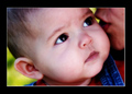
| 12/06/2005 08:29:53 AM |
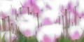
6 Monthsby K-RobComment: What a cutie! The border is too strong for the soft effect of the image. Otherwise, great shot. |
 Photographer found comment helpful. Photographer found comment helpful. |
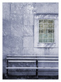
| 12/06/2005 08:27:30 AM |
Windowby FranziskaLangComment: I somehow like this. Makes for a nice poster pic. The window panes make it interesting. Maybe it's just my eye but it looks a tad bit tilted. |
| Photographer found comment helpful. |
| 12/06/2005 08:24:29 AM |
|
| Photographer found comment helpful. |
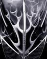
| 12/06/2005 08:22:28 AM |
Hellfire Four-Oby RKTComment: Nice perspective. Lovely play of the design and the black and white tones. The car looks familiar ... :) |
| Photographer found comment helpful. |
| 12/06/2005 07:01:06 AM |
|
| Photographer found comment helpful. |
| 12/06/2005 06:03:04 AM |
Dried Persimmons, Red Wallby Pug-HComment: Very striking and the interplay of harsh shadows make for some interesting design here. Wished it was more symmetrically balanced between the left and right with the left being less busy but I don't know how much room you had to adjust the composition. 7. |
| Photographer found comment helpful. |
| 12/05/2005 06:25:01 PM |
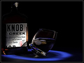
On The Rocksby RikkiComment: Hi Rikki, since you asked, gave you a 6. The reasons I like it:
- loved the blue "ring", reminded me of classy Manhattan jazz bar scenes, that kind of set-up
- the way the glass is tilted gives it some interest and originality combined with the lighting
Reasons I didn't vote it higher:
- in contrast to the "Manhattan" elegance, I found the bottle in a big way out of context. Rightly or wrongly, it seemed tacky compared to the elegance of the overall set-up.
- Meets the challenge ok but find the interpretation of the challenge rather soft. Nice but not that spot-on.
Having said that, this was a difficult challenge IMO.
|
| Photographer found comment helpful. |
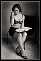
| 12/05/2005 05:47:55 PM |
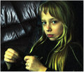
Boby messerschmittComment: Beautiful - the texture reminds me of old paintings in the Louvre and her rose lips against that blonde hair fits into the context well. I'd lose the background tho'. Looks like cheap leather and just doesn't go well with the texture applied and distracts from the overall magic. |
| Photographer found comment helpful. |
| 12/05/2005 05:23:33 PM |
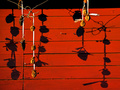
Zeroxby ChezComment: Came back to have a quick look on new stuff in your collection and wasn't disappointed. Found this didn't I? Love it. Now if I may, just find the minitiature right on the mouth very distracting. I don't know if there's a reason for placing the miniatures in the order you have but if you can move that particular one which is full of angry energy to the right side, it might be better. |
| Photographer found comment helpful. |
| 12/05/2005 05:09:38 PM |
tree_4052.jpgby puzzledComment: Great shot Amy. I don't know if the high contrast was intentional but it works well here especially as the tree and its interesting branches really stand out. Makes it unique! |
| Photographer found comment helpful. |
Home -
Challenges -
Community -
League -
Photos -
Cameras -
Lenses -
Learn -
Help -
Terms of Use -
Privacy -
Top ^
DPChallenge, and website content and design, Copyright © 2001-2025 Challenging Technologies, LLC.
All digital photo copyrights belong to the photographers and may not be used without permission.
Current Server Time: 08/07/2025 08:45:08 PM EDT.