| Author | Thread |
|
|
12/10/2005 09:32:29 AM |
|
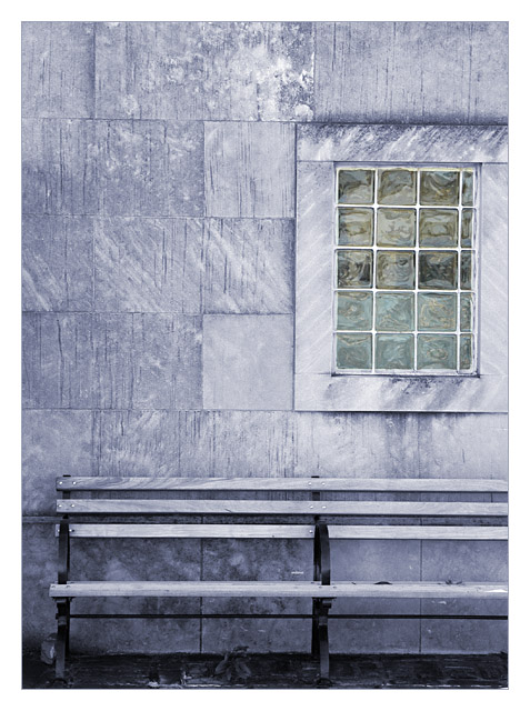
Awesome! I like the color tone! Lines and textures are splendid, and the subtle glass colors of the window are wonderful! :) |
|
 Photographer found comment helpful. Photographer found comment helpful. |
Comments Made During the Challenge  |
|
|
12/07/2005 11:18:51 AM |
|
Very nice and creative, I like the color tone a lot and I use a similar one frequently in my photos. |
|
| Photographer found comment helpful. |
|
|
12/07/2005 05:57:10 AM |
|
A very appealing photograph; interesting in spite of its apparent simplicity. 8. |
|
| Photographer found comment helpful. |
|
|
12/06/2005 09:11:05 AM |
|
love this. The colurs and the textures are fantastic! good luck! (8) |
|
| Photographer found comment helpful. |
|
|
12/06/2005 08:27:30 AM |
|
I somehow like this. Makes for a nice poster pic. The window panes make it interesting. Maybe it's just my eye but it looks a tad bit tilted. |
|
| Photographer found comment helpful. |
|
|
12/05/2005 11:09:59 AM |
"Simply" effective.
Nice work. |
|
| Photographer found comment helpful. |
|
|
12/05/2005 09:52:29 AM |
|
Nice composition and color. |
|
| Photographer found comment helpful. |
|
|
12/04/2005 10:23:30 PM |
|
|
|
12/04/2005 01:34:11 PM |
|
| Photographer found comment helpful. |
|
|
12/02/2005 09:13:39 PM |
|
Would have loved to see the other end of the bench. Other than that - Excellent! |
|
| Photographer found comment helpful. |
|
|
12/02/2005 04:19:08 PM |
|
This is a very beautiful composition. Love the lines. Two things: somewhat soft -would prefer deeper contrast. Second, lose the boarder . . . at least the thichness of it. BOL 6 |
|
| Photographer found comment helpful. |
|
|
12/02/2005 03:46:08 PM |
|
Really like-able shapes, lines and tones in this photograph! |
|
| Photographer found comment helpful. |
|
|
12/02/2005 12:16:12 PM |
|
Simple architectural shots like this really appeal to me. I like the glas blocks immitating the lines of the larger stone squareso fht e building. It's all so geometric. I can't figure out if the window is the only color of the shot, or if indeed the bench and building are the same color. Well, whatever, it is striking and I like it. |
|
| Photographer found comment helpful. |
|
|
12/02/2005 02:31:09 AM |
|
Nice image, love the subtle colours, needs a slight title to the left though. |
|
| Photographer found comment helpful. |
|
|
12/01/2005 02:52:29 PM |
|
simple but very well done good use of colour |
|
| Photographer found comment helpful. |
|
|
12/01/2005 11:59:38 AM |
|
Strangely muted colours - I suspect that's just how they are in reality - makes this quite intriguing. Nice composition, great textures, nice even lighting too. Something in this just clicks for me. |
|
| Photographer found comment helpful. |
|
|
12/01/2005 10:21:30 AM |
|
i LOVE this picture, solid use of line work. |
|
| Photographer found comment helpful. |
|
|
12/01/2005 07:05:13 AM |
|
I really like this but i think it might have been even better if it wasn't cropped so tighly. I woul have like to see the right end of the bench and the edge of the window frame. well done though 7 |
|
| Photographer found comment helpful. |
|
|
12/01/2005 01:41:31 AM |
|
Interesting. Little rotation right bothers... |
|
| Photographer found comment helpful. |
|
|
12/01/2005 12:56:58 AM |
|
I really love this photo. It's simple, beautiful and calm. The only little nitpick i have is that I's slightly crooked. Still, a 10 from me and to my favourites. |
|
| Photographer found comment helpful. |
Home -
Challenges -
Community -
League -
Photos -
Cameras -
Lenses -
Learn -
Help -
Terms of Use -
Privacy -
Top ^
DPChallenge, and website content and design, Copyright © 2001-2026 Challenging Technologies, LLC.
All digital photo copyrights belong to the photographers and may not be used without permission.
Current Server Time: 06/28/2026 02:46:14 AM EDT.